


Format CellTypes Dialog
The Format CellTypes dialog allows you to define how data is entered and displayed in specific cells by selecting different cell types. Each cell type provides unique functionality to improve data integrity, user interaction, and formatting.
To access this dialog, follow the below steps:
Click on the HOME tab.
Open the CellType dropdown to display the list of available cell types.
Select any cell type from the list to open the Format Cells dialog.
Alternatively, you can also click on the icon
 in the CellType group to access the Format Cells dialog.
Types of CellTypes
There are variety of cell types that can be assigned to the selected cells. These are as follows:
ButtonCellType
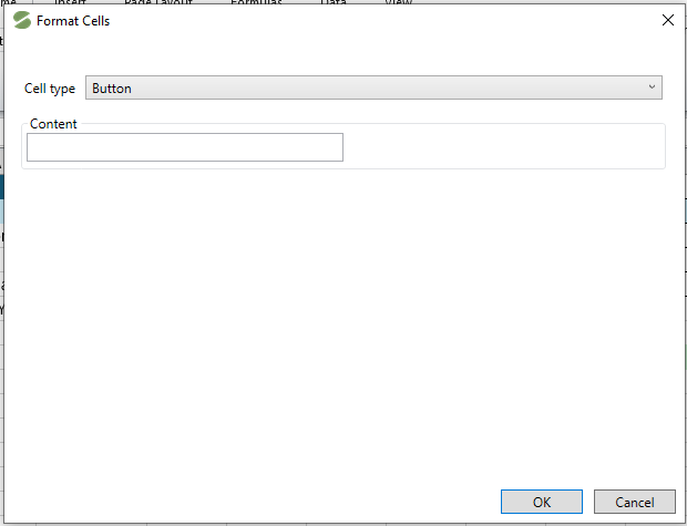
The button cell type inserts a clickable button inside the cell. The button can trigger events, such as opening a dialog, submitting data, or executing a function when clicked. The customizable properties of button cell type include text, size, and event handlers.
The image below displays the Format Cells dialog for a button cell type.
CheckboxCellType
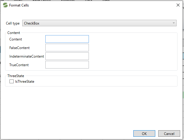
The checkbox cell type adds a checkbox inside the cell, which users can toggle between checked (true) and unchecked (false) states. It is helpful for tasks such as marking completion, selecting options, or filtering data.
The image below displays the formatting options available for a checkbox.
ImageCellType
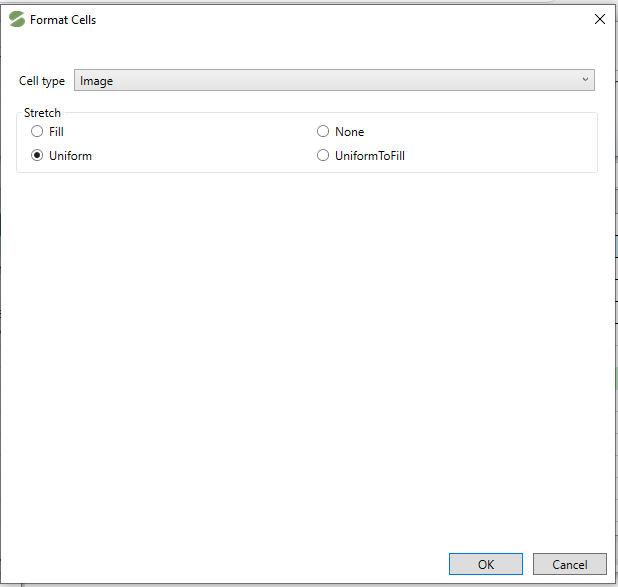
The Image cell type displays an image directly inside the cell instead of text or numerical data. Images can be sourced from local files, URLs, or embedded resources. These are useful for inserting logos, icons, or graphical representations.
The image cell type contains the below formatting options as displayed in image.
TextCellType
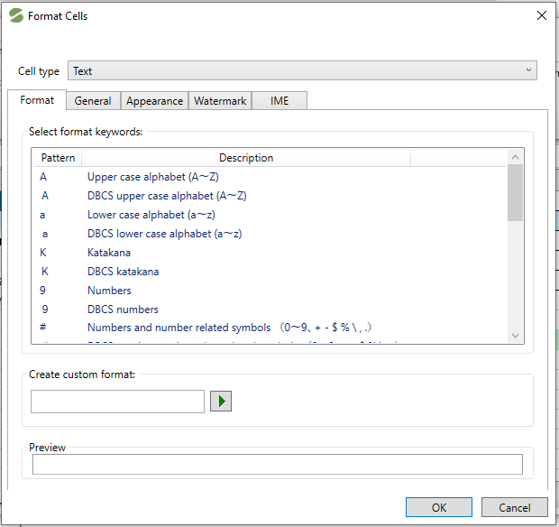
The text cell type defines the cell as a plain text input field. It supports standard text input, including alphanumeric characters. Useful for entering names, descriptions, or other textual information.
The image below displays the formatting options available for a text cell type.
DatetimeCellType
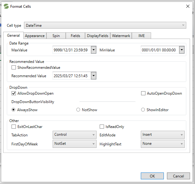
The DateTime CellType configures the cell to accept and display date and time values. Users can select a date using a built-in calendar picker. It also supports various date formats, such as MM/DD/YYYY or DD-MM-YYYY. Useful for scheduling, tracking deadlines, or logging timestamps.
The image below displays the Format Cells dialog for DateTime cell type.
ComboBoxCellType
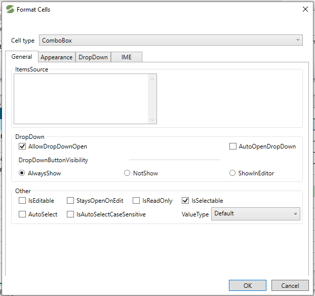
The ComboBox cell type provides a dropdown list within the cell, allowing users to select from predefined options. It prevents manual data entry errors by restricting input to predefined values. It can be used for choosing categories, status, or pre-defined labels.
The image below displays different formatting options available for a ComboBox cell type.
MaskCellType
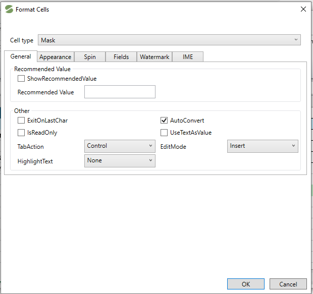
The mask cell type enforces a structured input format by applying an input mask. It is used for data such as phone numbers ((XXX) XXX-XXXX), social security numbers (XXX-XX-XXXX), or ZIP codes (XXXXX) etc.
The image below displays the different formatting options available in Mask cell type.
NumberCellType
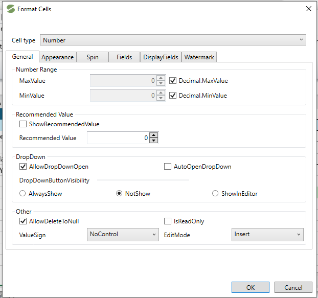
The number CellType formats the cell to accept only numerical input. It displays numbers in various formats, such as integers, decimals, percentages, or currency. Helpful with calculations, financial data, and statistical analysis. Additionally, it supports customization of decimal places and number formatting.
The image below displays the different formatting options available in Number cell type.
Note: If you want to remove the cell type from any cell, use the Clear CellType option available in the CellType dropdown under the HOME tab.