
- SpreadJS Overview
- Getting Started
- JavaScript Frameworks
- Best Practices
- Features
- SpreadJS Designer
- SpreadJS Designer VSCode Plugin
- Tutorials
-
SpreadJS Designer Component
- Getting Started
- Quick Start
- Theme
- Designer Interface
- JavaScript Frameworks
- Template-Based Workbook Initialization
- Customizations
-
Work in Designer Component
- AutoSum Functions
- Set Range Template Cell
- Name Box
- Select Cells Using Go To
- Find and Replace
- Edit Font Size
- Edit Font Family
- Manage Conditional Formatting Rules
- Shape Selection Pane
- Automatic Outline
- Format Painter
- Table Slicer
- Data Source
- TableSheet
- GanttSheet Designer
- ReportSheet Designer
- Data Chart Designer
- Text to Columns
- Remove Duplicates
- Pivot Table
- Dockable Side Panel
- Command Palette
- Transform Cells with LAMBDA Formula
- Threaded Comments Panel
- What-If Analysis
- Insert Function Dialog
- Named Cell Templates
- Insert Pictures in Designer
- Toolbar Ribbon
- API Documentation
- SpreadJS Collaboration Server
- Touch Support
- Formula Reference
- Import and Export Reference
- Events
- API Documentation
- Release Notes
Appearance and Style Settings
SpreadJS enables you to apply different styles on Data Charts to make them easier to understand and visually appealing. Applying styles also helps users to highlight important details and keep everything clear and consistent.
Using the Inspector tab in the Data Chart Panel, you can set various appearance and style settings for the Data Charts.
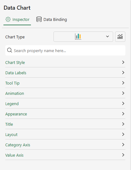
There are a number of configuration settings for Data Chart styles, some of the common settings are listed below.
Chart Style
The Chart Style settings control the overall visual appearance of a Data Chart.
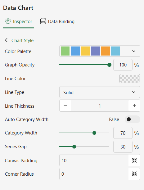
Available options vary depending on the selected chart type.
General Appearance
Property | *Description |
|---|---|
Color Palette | Select a color set to distinguish different legends. Available options: Theme, Standard, Custom. |
Graph Opacity | Adjust the transparency of chart data points. |
Canvas Padding | Adjust the padding of the chart drawing area. |
Line and Symbol Settings
(Available for line-based charts only)
Property | Description |
|---|---|
Line Color | Set the color of series lines or data point borders. |
Line Type | Set the line style as solid or dashed. |
Line Thickness | Set the width of series lines or data point borders. |
Line Aspect | Defines how series lines are rendered, such as straight, spline, step, or curve styles. Available options depend on the chart type. |
Show Symbol | Display symbols at data points. |
Symbol Shape | Set the shape of data point symbols. |
Symbol Size | Set the size of data point symbols. |
Notes
Line Aspect is available only for chart types that render series lines.
Supported options vary by chart type:
Line, Area, Stacked Area, Percent Stacked Area:
Default,Spline,Step Left,Step Right,Step Center,Bezier CurveRange Area:
Default,Spline,Bezier CurveRadar and Filled Radar:
Default,SplineIf the chart type changes to one that does not support the current Line Aspect setting, rendering reverts to the default behavior for that chart type.
Pie and Doughnut Settings
(Available for pie-based charts only)
Property | Description |
|---|---|
Start Angle | Set the starting angle of the chart. |
Radius | Set the inner and outer radius. |
Sweep | Set the angular span occupied by the chart. |
Corner Radius | Set the rounded corner radius of data segments. |
Treemap Header Settings
(Available for Treemap charts only)
Header Visibility
Property | Description |
|---|---|
Show Header Label | Enable header labels for the treemap. When turned on, the Detail, Value, and Label Separator settings apply to the header content. |
Header Content (Available when Show Header Label is enabled)
Property | Description |
|---|---|
Detail | Display detailed information in each treemap header. |
Value | Display the value in each treemap header. |
Label Separator | Specify the separator between label elements in the header. |
Header Text Style
Property | Description |
|---|---|
Font Color | Set the header text color. |
Font Family | Set the header font family. |
Font Size | Set the header font size. |
Font Style | Set the header font style. |
Font Weight | Set the header font weight. |
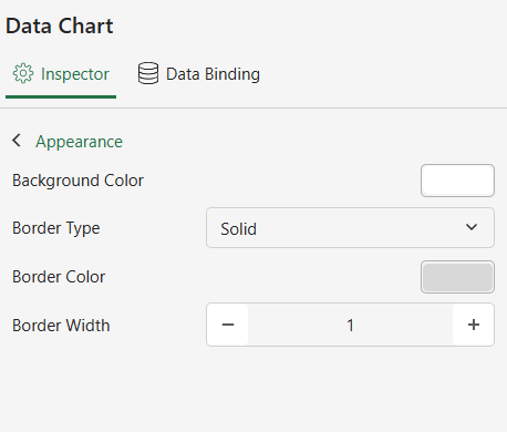
Appearance
The properties of this setting are useful for adjusting visual details of the Data Chart, such as background colors, border type, and color to enhance readability.
Property | Description |
|---|---|
Background Color | Set the background color of the Data Chart. |
Border Type | Set the Data Chart's border type as solid or dashed. |
Border Color | Set the Data Chart's border color. |
Border Width | Set the border line width of a Data Chart. |
Title
The properties of this setting can be used to customize the styles of the chart titles. The title refers to the text fields that appear on a Data Chart that provides a descriptive heading for the chart data.

Property | Description |
|---|---|
Show Title | Set whether the Data Chart displays the title. |
Title | Enter the text content of the Data Chart title. |
Background Color | Set the background color of the Data Chart title area. |
Border Color | Set the border color for the header area of the Data Chart. |
Border Type | Set the line shape of the border for the header area of the Data Chart as Solid or Dashed. |
Border Width | Set the line width of the border for the header area of the Data Chart. |
Alignment | Set the alignment of the text content of the Data Chart title text. |
Font Family | Set the Data Chart title text font. |
Font Size | Set the size of the Data Chart title text font. |
Font Weight | Set the weight of the Data Chart header text font. |
Font Style | Set the Data Chart header text font style as Normal or Italic. |
Font Color | Set the color of the Data Chart header text font. |
Padding | Adjust the padding of the Data Chart header area. |
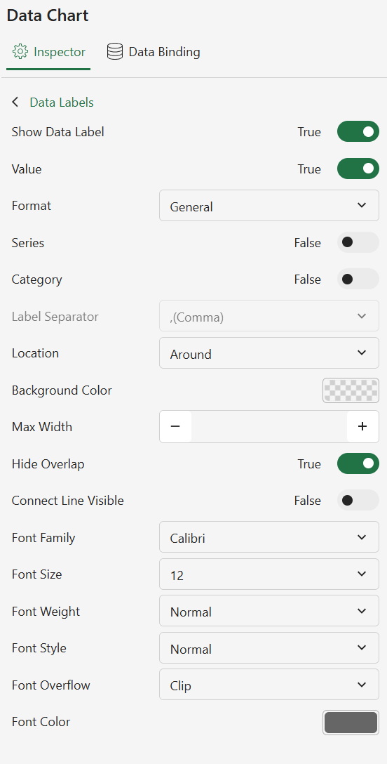
Data Labels
The properties of this setting let you configure the data labels to display values directly on the chart for a clear and easy-to-understand data interpretation.
Setting | Description |
|---|---|
Show Data Label | Enable the display of Data Labels on the Data Chart, which needs to be used in conjunction with the Value, Series, and Category properties. |
Label Separator | Set the separator between the values of the Value, Series, and Category attributes in the Data Label, such as comma, semicolon, period, etc. |
Value | Set whether the value of the Value field is displayed in the Data Label. |
Format | Set the Format of the value of the Value field in the Data Label. |
Series | Set whether the value of the Series is displayed in the Data Label. |
Category | Set whether the value of Category is displayed in the Data Label. |
Location | Set the position of the Data Label as Around or On Slice. |
Hide Overlap | Enable to hide some label when there is overlapping. |
Background Color | Sets the background color of the Data Label. |
Connect Line Visible | Set whether to show a connection line between Data Label and Data Points. |
Line Color | Set the color of the line connecting the Data Label to the Data Points. |
Line Width | Set the width of the line connecting the Data Label to the Data Points. |
Max Line Length | Set the maximum length of the line between the Data Label and the Data Points. In the Cartesian coordinate system, the line is a straight line, so only the maximum length can be set. |
First Line Length | Set the length of the first segment of the line connecting the Data Label and Data Points. In the polar coordinate system, the line is a line consisting of two segments, so the length of the first segment is set here. |
Second Line Length | Set the length of the second segment of the line connecting the Data Label to the Data Points. In the polar coordinate system, the line consists of two segments, so the length of the second segment can be set here. |
Font Family | Set the font for the text of the Data Label. |
Font Size | Set the text size of a Data Label. |
Font Weight | Set the text weight of the Data Label. |
Font Style | Set the text style of the Data Label as Normal or Italic. |
Font Color | Set the text color of a Data Label. |
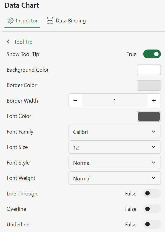
Tool Tip
The properties of this setting enable and style the tooltips to provide interactive details when users hover over a particular chart area.
Setting | Description |
|---|---|
Show Tool Tip | Show/hide the tip content in the data binding panel. By default, the Data Chart will show the value as a tooltip. |
Style Settings | Customize the following tooltip styles:
|
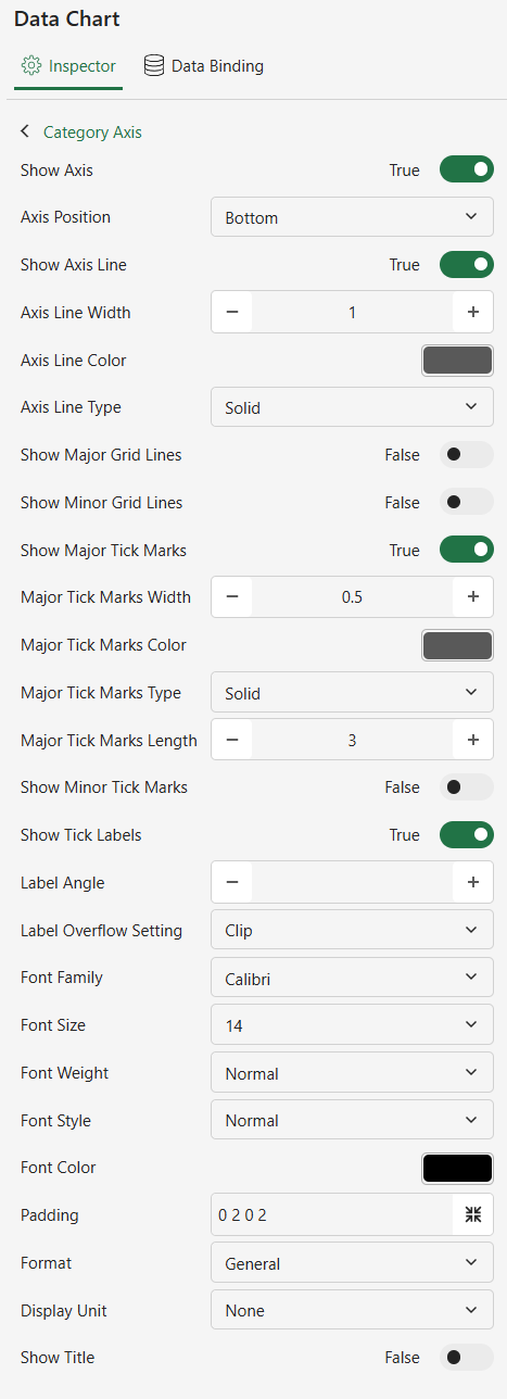
Axis
The properties of this setting are helpful while customizing the Category (X-axis) and Value (Y-axis) to define scale, intervals, and formatting that align your dataset.
Setting | Description |
|---|---|
Show Axis | Set whether the Data Chart displays the Category and Value axes. |
Axis Position | Set the position of the Data Chart's axes. |
Show Axis Line | Enable to show axis lines of Data Chart axes. |
Axis Line Width | Set the line width of the Data Chart axes. |
Axis Line Color | Set the line color of the Data Chart axes. |
Axis Line Type | Set the axis line type of the Data Chart axes. |
Show Grid Lines | Enable to display gridlines in the direction of the Data Chart axes. |
Grid Line Width | Set the width of the grid lines. |
Grid Line Color | Setting the color of the grid lines. |
Grid Line Type | Setting the line type of the grid lines. |
Show Tick Marks | Enable to display the tick marks of the axes. |
Show Tick Labels | Enable to display the label for the scale of the axes. |
Label Direction | Set the display direction of the ticker label for the axes. |
Label Overflow Setting | Set the display when the scale label of the axis overflows as Clip, Ellipsis, or Wrap. |
Show Title | Enable to display the name of the axes. |
Font Family | Set the text font in the axes. |
Font Size | Set the text size in the axes. |
Font Weight | Set the text weight in the axes as Lighter, Normal, or Bold. |
Font Style | Set the text style of the axes as Normal or Italic. |
Font Color | Set the text color in the axes. |
Max Value | Set the maximum scale of the Value axis. |
Min Value | Set the minimum scale of the Value axis. |
Interval | Set the Value axis scale step. |
Reversed | Enable to display of the reversed Value axis. |
Axis Position | Set the display position of the Value axis. |
Format | Set the format of the Label data for the Value axis. |
Display Unit | Set the magnitude of the Label data on the Value axis. |
Note that the below settings are only available for Data Charts of type ‘Bubble’ and ‘Scatter’. | |
Scale | Set the scale type of the axes, e.g. you can set it to ‘Date’. |
Date Mode | Set the interval unit of the date, e.g. year, month, day, etc. |
Major Interval | Set the interval of the major scale, used with ‘Date Mode’. |
Minor Interval | Setting the interval of the minor scale, used with ‘Date Mode’. |
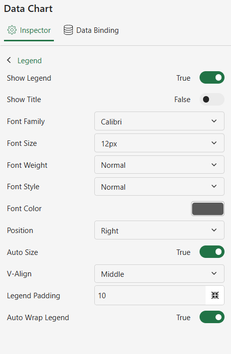
Legend
Using the properties of this setting, you can manage the legend styles to present the data effectively.
Setting | Description |
|---|---|
Show Legend | Enable to display of legends on the Data Chart. |
Title | Enable to display the title of the Data Chart's legend. |
Font Family | Set the text font of the legend. |
Font Size | Set the text size of the legend. |
Font Weight | Set the text weight of the legend as lighter, normal, or bold. |
Font Style | Set the text style of the legend as normal or italicized. |
Font Color | Set the text color of the legend. |
Position | Set the display position of the legend as top, bottom, right, or left. |
Auto Size | Enable automatic adjustments of the legend area. |
H-Align | Set the horizontal alignment of the legend in the Data Chart. |
V-Align | Set the vertical alignment of the legend in the Data Chart. |
Auto Wrap Legend | Enable automatic line breaks when there are many items in the legend. |
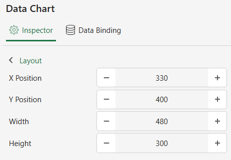
Layout
The properties of this setting are necessary for organizing the chart layout to improve visual clarity.
Setting | Description |
|---|---|
X Position | Set information about the current x-position of the Data Chart. |
Y Position | Set information about the current y-position of the Data Chart. |
Width | Set the width of the Data Chart. |
Height | Set the height of the Data Chart. |
Animation
The properties of this setting help you to add smooth effects to animate the data representation to enhance user engagement.
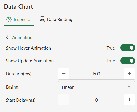
Setting | Description |
|---|---|
Show Hover Animation | Enable an animation when the mouse hovers over the data point. |
Show Update Animation | Enable an animation when the Data Chart setting changes. |