
- SpreadJS Overview
- Getting Started
- JavaScript Frameworks
- Best Practices
- Features
- SpreadJS Designer
- SpreadJS Designer VSCode Plugin
- Tutorials
-
SpreadJS Designer Component
- Getting Started
- Quick Start
- Theme
- Designer Interface
- JavaScript Frameworks
- Template-Based Workbook Initialization
- Customizations
-
Work in Designer Component
- AutoSum Functions
- Set Range Template Cell
- Name Box
- Select Cells Using Go To
- Find and Replace
- Edit Font Size
- Edit Font Family
- Manage Conditional Formatting Rules
- Shape Selection Pane
- Automatic Outline
- Format Painter
- Table Slicer
- Data Source
- TableSheet
- GanttSheet Designer
- ReportSheet Designer
- Data Chart Designer
- Text to Columns
- Remove Duplicates
- Pivot Table
- Dockable Side Panel
- Command Palette
- Transform Cells with LAMBDA Formula
- Threaded Comments Panel
- What-If Analysis
- Insert Function Dialog
- Named Cell Templates
- Insert Pictures in Designer
- Toolbar Ribbon
- API Documentation
- SpreadJS Collaboration Server
- Touch Support
- Formula Reference
- Import and Export Reference
- Events
- API Documentation
- Release Notes
Combo Chart Settings
The Combo Chart provides a flexible visualization tool that combines multiple chart types (e.g., column, line, area) into a single, unified chart. This allows users to represent and compare different types of data—such as quantities, trends, or percentages—within one graphical display.
Create a Combo Chart in Designer
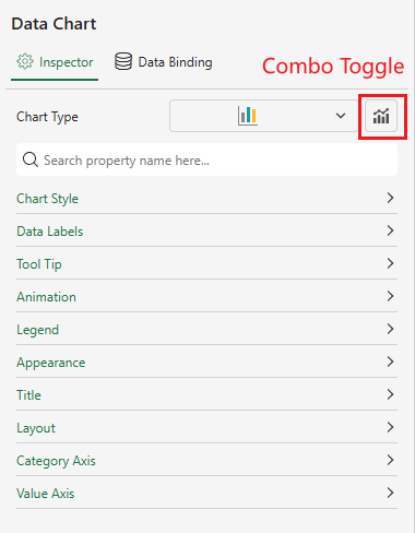
Users can initiate combo chart creation by first creating a base data chart. The toggle for combo chart creation is displayed in both Inspector or Data Binding panels.
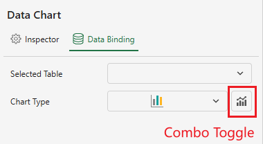
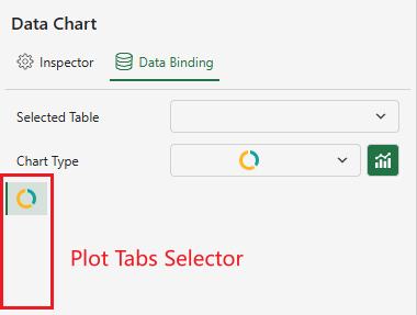
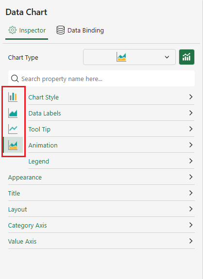
When you turn on the Combo toggle, a tab list is added to the left side of the Panel.
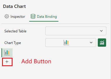
If the current data chart type supports combo charts, a “+” button (for adding a new plot) appears under the active tab.
Notes:
The following chart types support combo chart configuration: Column, Area, Line, Candlestick, OHLC, Bar, Radar, Scatter。
Some chart variations (for example, Range Column, Stacked Column and Percent Stacked Column) follow the same combination rules.
Up to 4 tabs are supported.
When the maximum number of tabs (4) is reached, the “+” button is automatically hidden.
For implementation details, refer to the documentation: Combo Chart.
After clicking the “+” button, a matrix of compatible chart types is displayed. Unsupported types are grayed out.
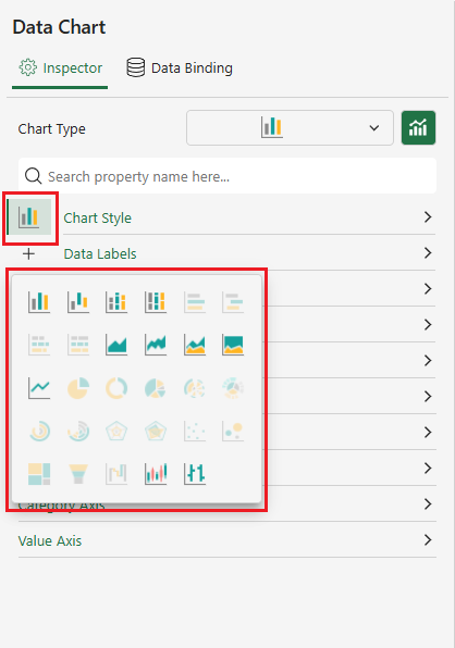
Each subplot can be configured independently by selecting the corresponding tab from the left column.
Selecting a tab switches the view to the configuration panel for that subplot.
All plots in a Combo Chart share the same settings for Category Axis, Appearance, Title, and Layout configurations of the primary chart. Modifying any of these settings will automatically synchronize updates across all subplots.
When you want to delete a plot, click the close button at the top right corner of the corresponding tab.
Below is a interactive demo:
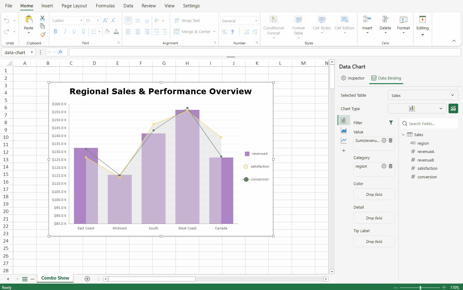
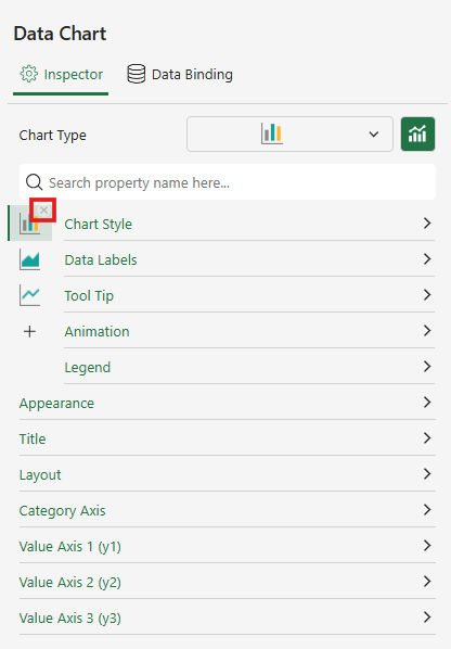
Work with Multiple Y‑Axes
A combo chart supports multiple value axes, allowing plots with different value ranges to be displayed within the same chart.
Value Axis Binding
To bind a value to a specific value axis:
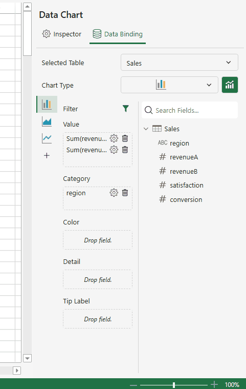
In the Data Binding panel, select the value field you want to configure.
Click the gear icon next to it, and choose Value Axis.
Hover over the Value Axis option to display a list of existing value axes.
Select the desired axis to bind the current value field to that axis.
The following rules apply to axis binding:
Each plot must be bound to at least one value axis.
Up to four value axes (Y1–Y4) are available.
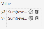
By default, all value fields are bound to a common axis (Y1).
A value field’s Y‑axis binding can be switched to another axis.
When a value field is assigned to Y2–Y4, the Data Binding panel automatically prefixes the field with the axis label (e.g., “y3”) to indicate its binding.
Value Axis Customization
Each Y‑axis can be configured independently. Users can modify its scale, style, and properties through the configuration panel.
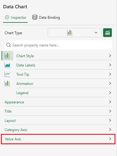
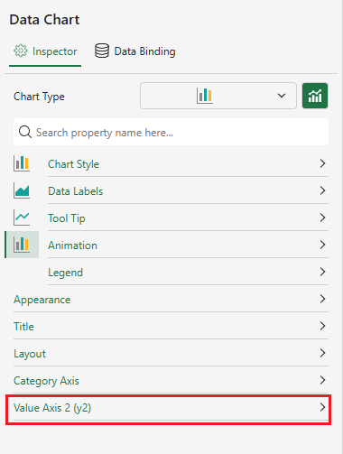
Dynamic Value Axis Display in the Inspector Panel
The Inspector panel dynamically generates separate Y‑Axis Settings panels based on the number of active value axes. These panels allows users to configure each axis independently.
Binding Scenario | Inspector Panel Display | UI Example |
|---|---|---|
Single Y‑axis -Bound to Y1 | For a single Y‑axis, one Value Axis panel is displayed.
|
|
Multiple Y‑axes | A separate configuration panel is dynamically generated for each active Y‑axis. |
|
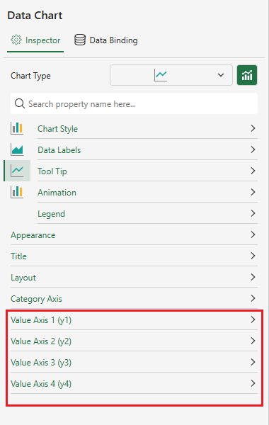
The following rules apply to axis binding:
A Y‑axis panel appears only when at least one value field is bound to that axis.
Unused axes remain hidden automatically from both the chart and the Inspector panel.
When only Y1 is used, the “Y1” label is omitted by default.
Panels are listed in descending order (Y1 → Y4) within the Inspector panel.