


- SpreadJS Overview
- Getting Started
- JavaScript Frameworks
- Best Practices
- Features
- SpreadJS Designer
- SpreadJS Designer VSCode Plugin
- Tutorials
-
SpreadJS Designer Component
- Getting Started
- Quick Start
- Theme
- Designer Interface
- JavaScript Frameworks
- Template-Based Workbook Initialization
- Customizations
-
Work in Designer Component
- AutoSum Functions
- Set Range Template Cell
- Name Box
- Select Cells Using Go To
- Find and Replace
- Edit Font Size
- Edit Font Family
- Configure Cell Borders
- Manage Conditional Formatting Rules
- Shape Selection Pane
- Automatic Outline
- Format Painter
- Sort and Filter
- Table Slicer
- Data Source
- TableSheet
- GanttSheet Designer
- ReportSheet Designer
- Data Chart Designer
- Text to Columns
- Remove Duplicates
- Pivot Table
- Dockable Side Panel
- Command Palette
- Transform Cells with LAMBDA Formula
- Threaded Comments Panel
- What-If Analysis
- Insert Function Dialog
- Named Cell Templates
- Insert Pictures in Designer
- Toolbar Ribbon
- API Documentation
- SpreadJS Collaboration Server
- Touch Support
- Formula Reference
- Import and Export Reference
- Events
- API Documentation
- Release Notes
Data Binding Settings
The Data Binding tab in the Data Chart Panel allows you to bind a Data Chart to a DataManager table or to a specific cell in a ReportSheet.
Data displayed in the chart is configured through this panel.
Binding Modes
The Data Chart Panel provides two binding modes:
Table Binding
Cell Binding (ReportSheet only)
Table Binding
When binding a Data Chart to a DataManager table:
Select the table from the Selected Table dropdown.
Bind the required fields to the corresponding data areas.
Configure field options if needed.
If you switch the bound table, all previously bound fields are cleared and must be configured again.
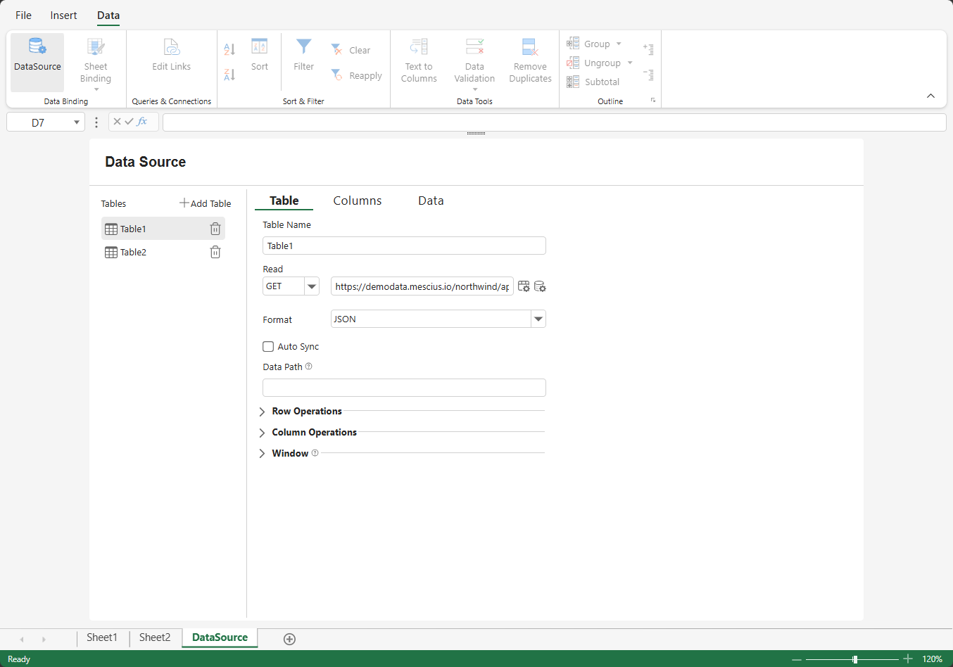
To add a data source:
Go to DATA > Data Binding
Click DataSource
Add a table and configure the external URL for CRUD operations (if applicable)
Use the Columns tab to fetch table columns
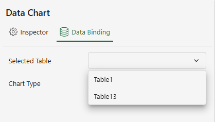
After fetching the data source, select the table in the Data Chart Panel.
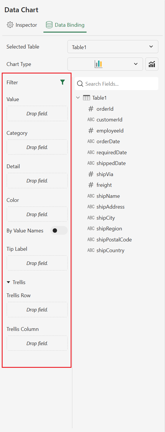
Field Areas in the Data Chart Panel
The following binding areas are available:
Values – Defines the numeric data displayed in the chart.
Category – Defines the primary grouping field(s).
Detail – Adds additional grouping dimensions by slicing the data.
Color – Assigns colors to data points and generates color legend items.
Tip Label – Adds additional information to chart tooltips.
Row – Creates trellis panels organized by row values.
Column – Creates trellis panels organized by column values.
Filter – Applies source-level filtering to the bound data.
Note:
The Color By Value Names option is displayed only for chart types that support multiple value fields.
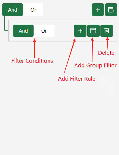
Use the Filter icon to create filter rules for fields in the currently selected table.
Category Field Binding
Users can drag one or more categorical fields into the Category drop zone.
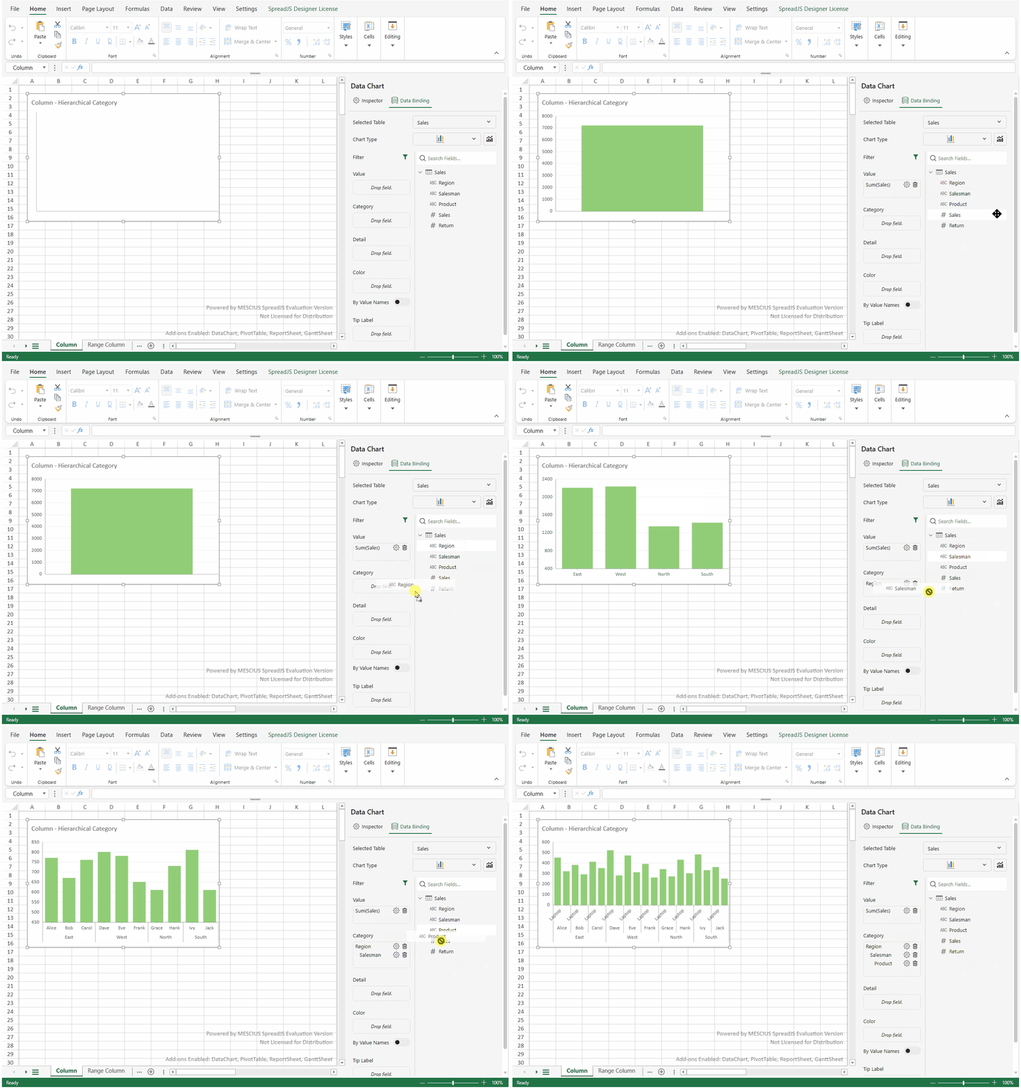
The drop zone is the same single area used for standard Category binding.
All dropped fields are stored internally as an ordered array.
Multiple fields can be added sequentially. During drag‑and‑drop, the editor displays an insertion indicator showing where the field will be inserted.
The drop order determines the hierarchy from outer level to inner level.
Produces a hierarchical category structure ordered by drop sequence.
After binding a field, click the Settings button next to it to configure options such as sorting, aggregation, formatting, or chart-specific behavior.
Date Mode for Category Fields
When a Date field is bound to the Category area, you can set Date Mode from the field settings menu to control how Date values are grouped.
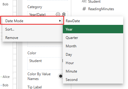
Available Date Mode options include:
RawDate
Year
Quarter
Month
Day
Hour
Minute
Second
RawDate uses the original Date values. Other Date Mode options group Date values by the selected time unit.
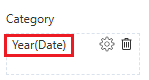
When Date Mode is applied, the Category field chip displays the selected transformation. For example:
Datewith RawDate appears asDate.Datewith Month appears asMonth(Date).Datewith Quarter appears asQuarter(Date).
For hierarchical categories, each Date field level can use its own Date Mode setting.
Note:
Different chart types require different binding structures. Refer to the documentation for each chart type for detailed binding requirements.
When switching between chart types in the Designer:
If both the current and target chart types support hierarchical categories, the full category hierarchy is preserved.
If the target chart type uses a single category level only, only the first category level is kept.
If the target chart type does not use category binding, the category binding is removed.
Trellis Row and Column Binding
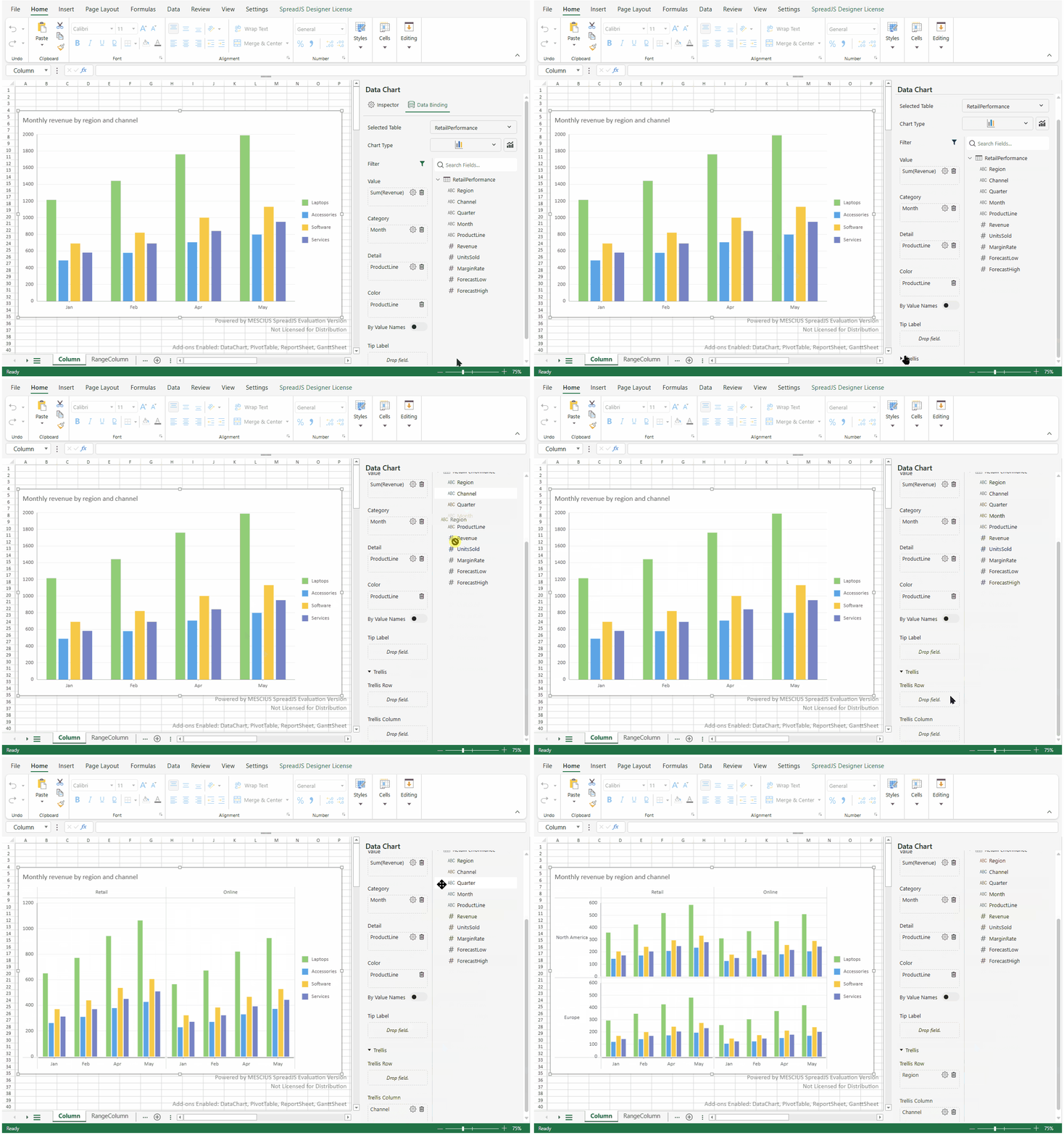
Trellis binding creates small multiples by splitting one dataset into multiple chart panels. In the Data Binding tab, use the Row and Column areas to define how trellis panels are organized.
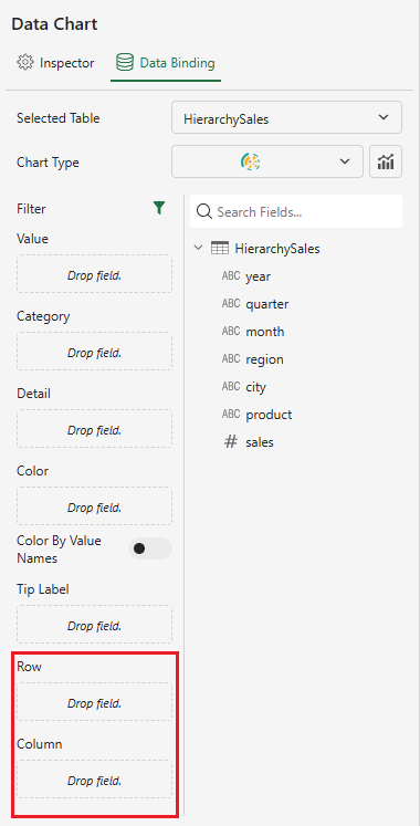
Fields bound to Row create row-based trellis groups.
Fields bound to Column create column-based trellis groups.
Binding both Row and Column fields creates a grid of trellis panels.
Each trellis panel uses the same chart type and visual configuration, but displays data filtered by the corresponding row and column values.
Row and Column bindings support multiple fields. When multiple fields are added, their order defines the trellis hierarchy from outer level to inner level.
Details and Color Binding
The Details area slices data into additional groups. The Color area controls how colors are assigned to those groups or data points.
In the Designer, when a field is dragged into Details and Color is empty, the same field is also added to Color. This helps show different detail groups with different colors.
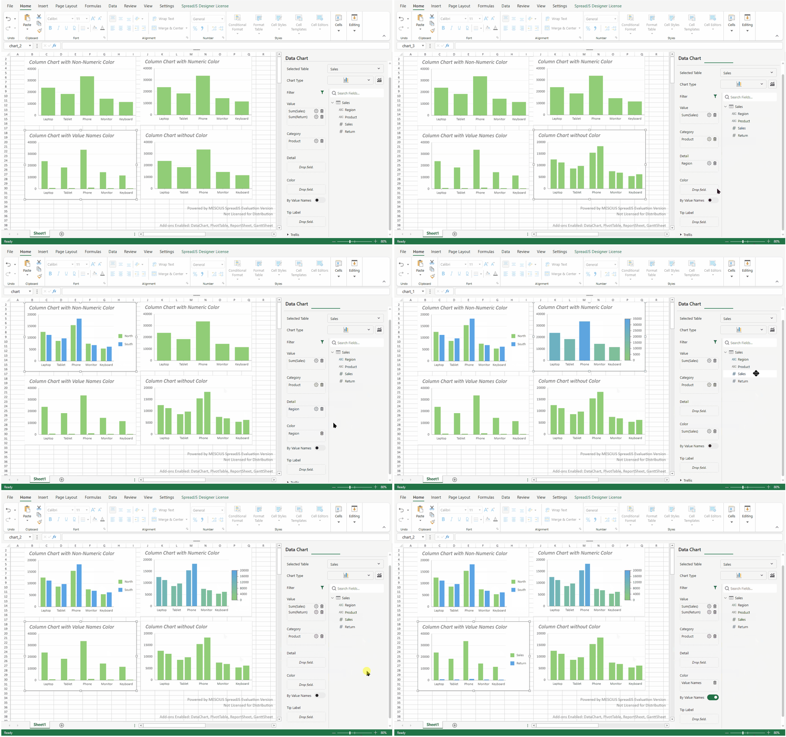
If Color already contains a field, dragging a field into Details does not change the existing color binding.
Only one field can be used in Color at a time. If a field is not supported by the selected chart type or current binding structure, it cannot be dropped into the Color area.
Color By Value Names
Use Color By Value Names to assign a separate color to each value field.
This option is useful when multiple fields are bound to Values and each value field should appear as a separate legend item.
If Color already contains a field, enabling Color By Value Names replaces the existing color binding.
Unsupported Field Behavior
The Data Chart Panel prevents unsupported fields from being dropped into an encoding area.
For example, if the selected chart type does not support numeric color encoding, a numeric field cannot be dropped into Color. If a string field is not valid for the current chart binding, it also cannot be dropped into Color.
Cell Binding (ReportSheet Only)
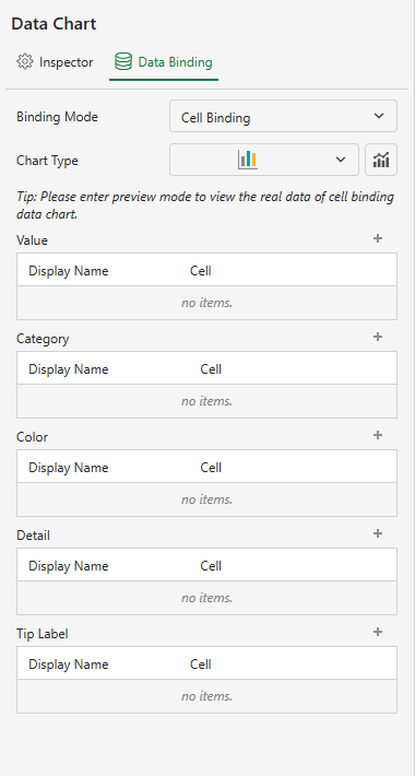
In a ReportSheet, you can bind a Data Chart to an individual expandable cell.
Select Cell Binding from the Binding Mode dropdown.
Click the + button in each binding area.
Select the target cell.
Each bound cell has a Display Name, which acts as an alias and is displayed in the chart.
Note:
When a Data Chart in a ReportSheet is bound to a cell reference, the chart renders default binding data during design time.
Switch to Preview or Paginate mode to view actual bound data.