
- SpreadJS Overview
- Getting Started
- JavaScript Frameworks
- Best Practices
-
Features
- Workbook
- Worksheet
- Rows and Columns
- Headers
-
Cells
- Work with Cells
- Cell Types
- Cell Format
- Cell States
- Cell Range
- Get Dirty Status
- Cell Buttons
- Cell Dropdowns
- Cell Comments
- Cell Threaded Comments
- Hyperlink
- Auto Merge Cells
- AutoFit
- Auto Fill Data
- Mask Input
- Shrink to Fit
- Cell Overflow
- Ellipsis or Tips for Cell Overflow
- Cell Alignment and Indentation
- Cell Padding and Label Styles
- Cell Span
- Cell Tags
- Styles
- Cell Decoration
- Cell Colors
- Cell Background Image
- Borders, Gridlines and Diagonal Lines
- Quote Prefix
- Insert Cut or Copied Cells
- Rotate Text In Cells
- Text Direction
- Text Decoration
- Rich Text
- Image Rich Data
- Wrap Text
- Drag and Drop
- Drag and Merge
- Editing
- Watermark
- Display Zero as Blank
- IME Mode
- Pattern Fill and Gradient Fill
- Paste Options
- Data Binding
- Data Manager
- TableSheet
- GanttSheet
- ReportSheet
- Data Charts
- JSON Schema with SpreadJS
- SpreadJS File Format
- Data Validation
- Conditional Formatting
- Sort
- Group
- Formulas
- What-If Analysis
- Serialization
- Keyboard Actions
- Shapes
- Floating Objects
- Barcodes
- Charts
- Sparklines
- Tables
- Pivot Table
- Slicer
- Theme
- User Management
- Culture
- AI Assistant
- SpreadJS Designer
- SpreadJS Designer VSCode Plugin
- Tutorials
- SpreadJS Designer Component
- SpreadJS Collaboration Server
- Touch Support
- Formula Reference
- Import and Export Reference
- Events
- API Documentation
- Release Notes
Check Box List Cell
The CheckBoxList CellType renders a collection of selectable items within a single cell.
Each item is displayed as an independent checkbox, allowing multiple selections.
Unlike the single CheckBox CellType, CheckBoxList represents a collection of values rather than a single boolean state.
Three display modes are supported:
checkboxmoderntoggle
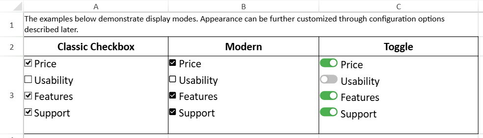
Display Modes
The mode property controls the visual presentation of each item.
cellType.mode(value);Supported values:
'checkbox' | 'modern' | 'toggle'Mode Capabilities
Feature | checkbox | modern | toggle |
|---|---|---|---|
Multi-selection | ✓ | ✓ | ✓ |
Three-state | ✗ | ✗ | ✗ |
Box Size | ✓ | ✓ | ✗ |
toggleOptions | ✗ | ✗ | ✓ |
TextAlign: inside | ✗ | ✗ | ✓ |
Three-state behavior is not supported in CheckBoxList.
Selection Model
The CheckBoxList CellType supports multiple selections within a single cell.
The cell value is represented as an array containing the value field of each selected item.
Example:
checkBoxListCellType.items([
  { text: "Price", value: "1749" },
  { text: "Usability", value: "5495496" }
]);
If both items are selected:
sheet.getCell(1, 3).value();
// ["1749", "5495496"]
If no items are selected, the value is an empty array.
The type of each array element corresponds to the defined value of the item.
Item Configuration
Items are defined using the items() method:
cellType.items([
  { text: "Price", value: 1 },
  { text: "Usability", value: 2 }
]);
Each item includes:
text– displayed labelvalue– stored data value
Layout Model
The layout of items within the cell is controlled by:
direction(horizontal or vertical)isFlowLayoutmaxRowCountmaxColumnCountitemSpacing
When isFlowLayout is enabled, items automatically wrap based on available cell space and layout direction.
Text Alignment
The text alignment of each item is controlled using textAlign.
Supported values:
leftrightinside(toggle mode only)
Box Size
The size of each checkbox can be configured using boxSize.
Accepts a number or
"auto"Default size is 12 × 12
Not available in toggle mode
Toggle Mode Configuration
Toggle mode renders each item as a switch-style control.
cellType.mode('toggle');Additional appearance options are configured using toggleOptions:
cellType.toggleOptions({
  width: 60,
  height: 30,
  trackColorOn: '#4CAF50',
  trackColorOff: '#767577',
  sliderColorOn: '#ffffff',
  sliderColorOff: '#ffffff',
  sliderMargin: 2,
  animationDuration: 100,
  trackRadius: 8,
  sliderRadius: 4
});
When toggleOptions() is called without parameters, it returns the current configuration.
In toggle mode:
boxSizeis not supportedState changes require clicking the toggle control
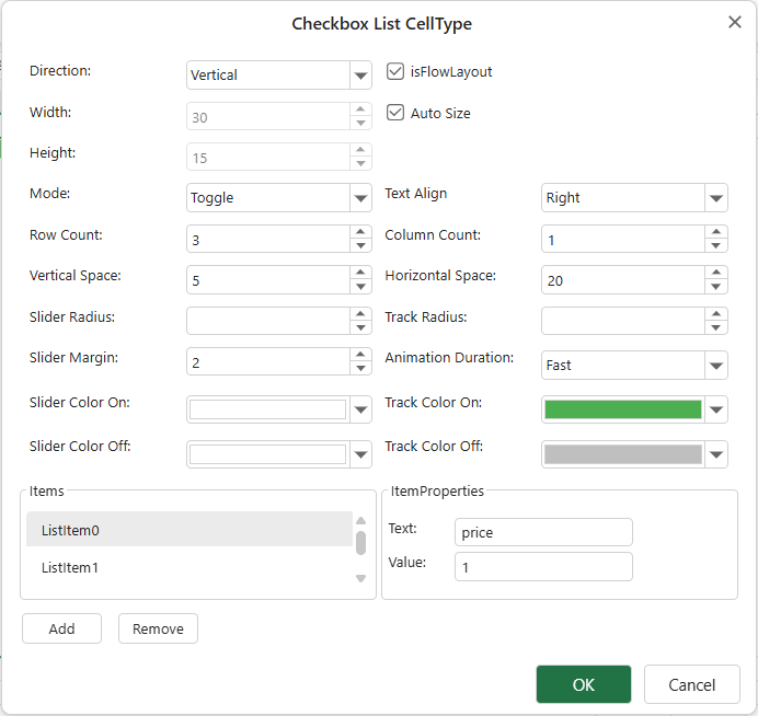
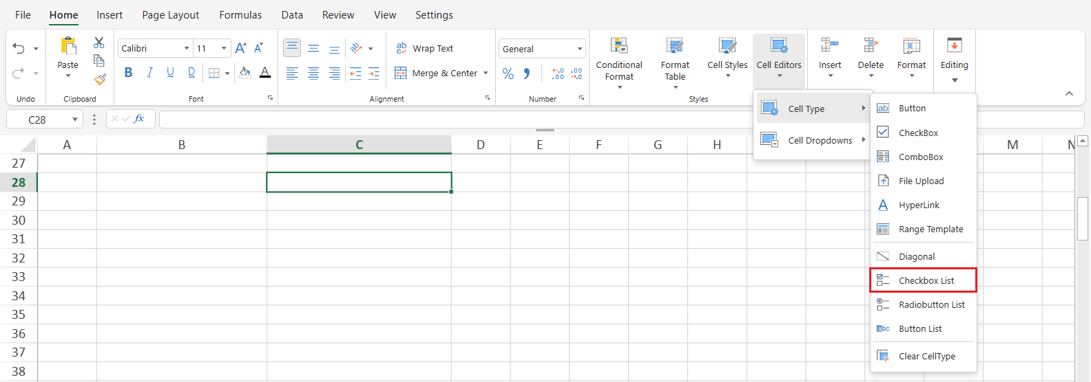
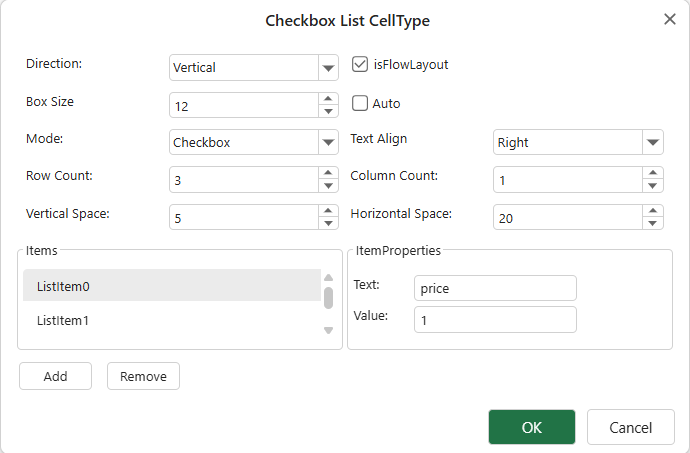
Using CheckBoxList in Designer
In Designer, a CheckBoxList can be applied by setting the cell type:
Home → Styles → Cell Editors → Cell Type → CheckBoxList
After applying the cell type, configure items and layout options in the CellType dialog.
Right-click the cell and select Edit CellType…
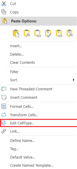
This opens the CheckBox configuration dialog.
When the mode is set to toggle, a different dialog is displayed.