
- Document Solutions for Excel Java Overview
- Key Features
- Getting Started
- Features
- Templates
- Formula Reference
- File Operations
-
Tutorials
- Saving and Export Excel XLSX Files Using Java
- Creating and Formatting Excel Tables Using Java
- Creating Pivot Tables in Excel Using Java
- Adding Charts to Excel Files Programmatically in Java
- Use Excel Formulas and Named Ranges Programmatically in Java
- Apply Excel Styles, Formatting, and Conditional Formatting in Java
- Use JDK 8 Date Time API
- Document Solutions Data Viewer
- API Reference
- Release Notes
Adding Charts to Excel Files Programmatically in Java
This tutorial shows how to visualize raw worksheet data by creating Excel charts programmatically using Document Solutions for Excel, Java Edition (DsExcel Java).
You’ll learn how to:
Add a new worksheet dedicated to charts
Insert a chart using the addChart() method
Build chart series from worksheet ranges
Format chart axes (number formats, labels)
Export a final workbook containing a rendered Excel chart
Prerequisites
JDK 8+
DsExcel Java (JARs added to your classpath)
import com.grapecity.documents.excel.*;
import com.grapecity.documents.excel.drawing.*;
1) Create a Chart Worksheet
First, we’ll create a workbook and add a dedicated worksheet for the chart.
Workbook workbook = new Workbook();

IWorksheet chartSheet = workbook.getWorksheets().add();
chartSheet.setName("Chart");
2) Add Sample Data for the Chart
Charts require a data range. Here we’ll add a small dataset that includes labels and values.
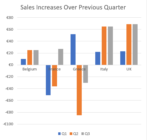
chartSheet.getRange("A1:D6").setValue(new Object[][] {
    {null, "Q1", "Q2", "Q3"},
    {"Belgium", 10, 25, 25},
    {"France", -51, -36, 27},
    {"Greece", 52, -85, -30},
    {"Italy", 22, 65, 65},
    {"UK", 23, 69, 69},
});
(Optional formatting for readability)
chartSheet.getRange("B1:D1").setHorizontalAlignment(HorizontalAlignment.Right);
chartSheet.getRange("B1:D1").getFont().setBold(true);
chartSheet.getRange("B2:D6").setNumberFormat("€#,##0");
3) Add an Excel Chart with addChart(...)
Use the getShapes().addChart() method to insert a chart object into the worksheet.
IShape shape = chartSheet.getShapes()
    .addChart(ChartType.ColumnClustered, 300, 10, 300, 300);

shape.getChart().getChartTitle().setText("Sales Increases Over Previous Quarter");
4) Create Chart Series from Worksheet Ranges
Now connect the chart to your data range by creating a series collection from a worksheet range.
shape.getChart().getSeriesCollection()
    .add(chartSheet.getRange("A1:D6"), RowCol.Columns, true, true);
This tells DsExcel to treat the dataset as:
Series grouped by columns
First row contains category labels (Q1, Q2, Q3)
First column contains series names (Belgium, France, etc.)
5) Format the Chart Axis (Number Format)
You can format the value axis to match your dataset’s number formatting.
IAxis valueAxis = shape.getChart().getAxes().item(AxisType.Value);
valueAxis.getTickLabels().setNumberFormat("€#,##0");
Final Rendered Chart Output
When you open the generated workbook in Excel, the Chart worksheet will contain:
A clustered column chart
A chart title
Multiple series (Belgium, France, Greece, etc.)
Q1/Q2/Q3 category labels
A formatted value axis using the specified currency format
Save the Workbook
workbook.save("ExcelChart.xlsx");Next Steps
Explore the complete chart documentation here
View our full-featured chart demos online