


- Document Solutions for Excel Java Overview
- Key Features
- Getting Started
-
Features
- Worksheet
- Workbook
- Comments
- Hyperlinks
- Sort
- Filter
- Group
- Conditional Formatting
- Data Validations
- Data Binding
- Import Data
- Digital Signatures
- Formulas
- Custom Functions
- Shapes
- Document Properties
- Styles
- Form Controls
- Barcodes
- Themes and Colors
- Chart
- Table
- Pivot Table
- Pivot Chart
- Sparkline
- Slicer
- Print Settings
- Logging
- Defined Names
- AI Assistant
- Templates
- Formula Reference
- File Operations
- Tutorials
- Use JDK 8 Date Time API
- Document Solutions Data Viewer
- API Reference
- Release Notes
Chart
DsExcel Java allows users to communicate, display and manipulate useful information in charts.
This feature not only helps users in visualizing trends swiftly and effectively but also helps business analysts and managers to compare numbers across bulk data, analyse essential patterns and visualize significant trends quickly and effectively.
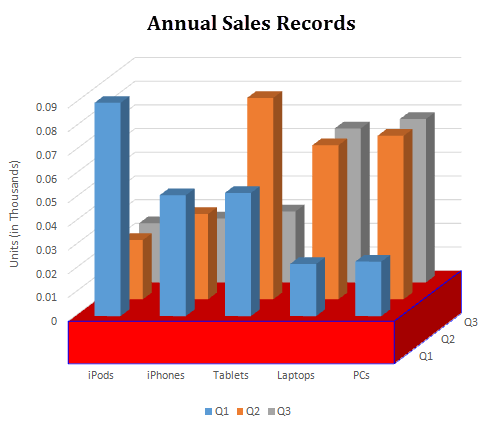
You can use charts in spreadsheets to graphically interpret data and visualize large volumes of information quickly and efficiently.
Working with charts involves the following tasks: