Themes
An easy way to enhance the appearance of the FlexChart control is to use pre-defined themes instead of customizing each element. The Palette property is used to specify the theme to be applied on the control.
type=note
Note: Remove the Palette property from code to apply default theme.
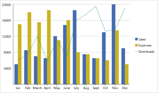
The image below shows how the FlexChart control appears when the Palette property is set to Cocoa.

The following code examples demonstrate how to apply themes in C# and XAML.
In Code
//setting the Palette
chart.Palette = Palette.Cocoa;
In XAML
<c1:FlexChart x:Name="chart" ItemsSource="{Binding Data}" BindingX="Name" ChartType="Column"
    Grid.Row="1" Grid.ColumnSpan="2" VerticalOptions="FillAndExpand" Palette="Cocoa"/>
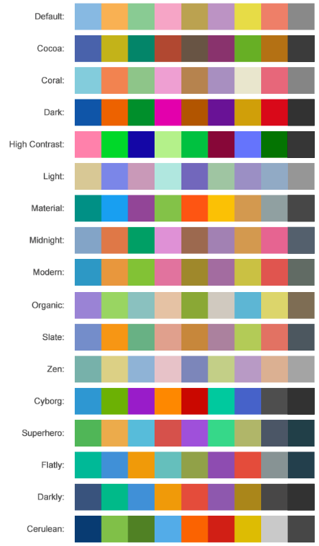
FlexChart comes with pre-defined templates that can be applied for quick customization. Here are the 17 pre-defined templates available in the Palette enumeration.


