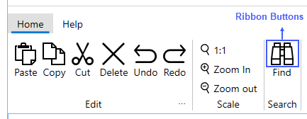
Buttons
The C1ButtonTool class defines a ribbon button. A button can include text, image, or text and an image as shown below.

The buttons can be added using the C1ButtonTool class of C1Ribbon as shown in the below XAML code.
<c1:C1ButtonTool Command="{StaticResource cmdFind}" Label="Find">
                        <c1:C1ButtonTool.IconTemplate>
                            <c1:C1IconTemplate>
                                <c1:C1PathIcon Data="M458.369,80H430V0H275v80h-60V0H60v80H31.631L0.099,353.281L0,354.138V490h215V300h60v190h215V354.138L458.369,80z     M185,460H30v-90h155V460z M185,340H31.83l26.539-230H185V340z M185,80H90V30h95V80z M275,270h-60V170h60V270z M275,140h-60v-30    h60V140z M305,30h95v50h-95V30z M305,110h126.631l26.539,230H305V110z M460,460H305v-90h155V460z"/>
                            </c1:C1IconTemplate>
                        </c1:C1ButtonTool.IconTemplate>
                    </c1:C1ButtonTool>
Note that IconTemplate in the C1Tool class is the main property to set the icon, and if the icon is a vector this could work in all sizes rendering a perfect, sharp icon. Also, all the tools except C1SelectTool show icon that can be configured to display differently depending on the size. Further, there are properties such as SmallIconTemplate and LargeIconTemplate in C1Tool class. When the icon size is smaller or equal to 12 pixels and the SmallIconTemplate property is specified, the icon with SmallIconTemplate will be used automatically. Similarly, when the icon size larger than 24 pixels and the LargeIconTemplate is specified, the icon is created from the LargeIcon template.


