
Quick Start
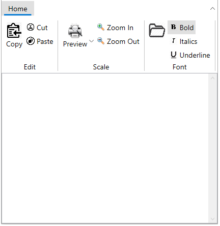
The following quick start guide is intended to get you up and running with WPF Ribbon. In this quick start, you'll start with Visual Studio and create a new project, add WPF Ribbon to your application, and other elements as shown in the image below.
To set up your project and add a C1Ribbon control to your application, complete the following steps.
Create a new WPF project in Visual Studio.
Add a reference to the C1.WPF.Ribbon assembly. Add the C1Ribbon control to the XAML designer using C1Ribbon class.
<c1:C1Ribbon FontSize="14" SelectedIndex="0">
</c1:C1Ribbon>
Add a ribbon tab "Home" using RibbonTabItem class. In the tab, add ribbon group "Edit" using RibbonGroup class.
<c1:C1Ribbon FontSize="14" SelectedIndex="0">
            <c1:RibbonTabItem Header="Home">
                <c1:RibbonGroup Header="Edit">
                    </c1:RibbonGroup>
            </c1:RibbonTabItem>
        </c1:C1Ribbon>
In the next step, you can add different elements to Ribbon, such as Ribbon button using C1ButtonTool class, Ribbon Toggle button using C1ToggleButtonTool class and drop down item using C1DropDownTool class.
<c1:C1Ribbon FontSize="14" SelectedIndex="0">
           <c1:RibbonTabItem Header="Home">
               <!-- Adding first group -->
               <c1:RibbonGroup Header="Edit">
                   <c1:C1ButtonTool Label="Copy">
                           <c1:C1ButtonTool.IconTemplate>
                               <c1:C1IconTemplate>
                                   <c1:C1BitmapIcon Source="/copy.png"/>
                               </c1:C1IconTemplate>
                           </c1:C1ButtonTool.IconTemplate>
                       </c1:C1ButtonTool>
                       <c1:C1ButtonTool Label="Cut">
                           <c1:C1ButtonTool.IconTemplate>
                               <c1:C1IconTemplate>
                                   <c1:C1BitmapIcon Source="/cut.png" />
                               </c1:C1IconTemplate>
                           </c1:C1ButtonTool.IconTemplate>
                       </c1:C1ButtonTool>
                   <c1:C1ButtonTool Label="Paste">
                       <c1:C1ButtonTool.IconTemplate>
                           <c1:C1IconTemplate>
                               <c1:C1BitmapIcon Source="/paste.png"/>
                           </c1:C1IconTemplate>
                       </c1:C1ButtonTool.IconTemplate>
                   </c1:C1ButtonTool>
               </c1:RibbonGroup>
               <!-- Adding second group -->
               <c1:RibbonGroup Header="Scale">
                   <c1:C1DropDownTool Label="Preview">
                       <c1:C1DropDownTool.IconTemplate>
                           <c1:C1IconTemplate>
                               <c1:C1BitmapIcon Source="/preview.png"/>
                           </c1:C1IconTemplate>
                       </c1:C1DropDownTool.IconTemplate>
                   </c1:C1DropDownTool>
                   <c1:C1ButtonTool Label="Zoom In">
                       <c1:C1ButtonTool.IconTemplate>
                           <c1:C1IconTemplate>
                               <c1:C1BitmapIcon Source="/zoom_in.png" />
                           </c1:C1IconTemplate>
                       </c1:C1ButtonTool.IconTemplate>
                   </c1:C1ButtonTool>
                   <c1:C1ButtonTool Label="Zoom Out">
                       <c1:C1ButtonTool.IconTemplate>
                           <c1:C1IconTemplate>
                               <c1:C1BitmapIcon Source="/zoom_out.png"/>
                           </c1:C1IconTemplate>
                       </c1:C1ButtonTool.IconTemplate>
                   </c1:C1ButtonTool>
               </c1:RibbonGroup>
               <!-- Adding third group -->
               <c1:RibbonGroup Header="Font">
                   <c1:C1ButtonTool>
                       <c1:C1ButtonTool.IconTemplate>
                           <c1:C1IconTemplate>
                               <c1:C1BitmapIcon Source="/open.png"/>
                           </c1:C1IconTemplate>
                       </c1:C1ButtonTool.IconTemplate>
                   </c1:C1ButtonTool>
                   <c1:C1ToggleButtonTool Label="Bold" IsChecked="True">
                       <c1:C1ToggleButtonTool.IconTemplate>
                           <c1:C1IconTemplate>
                               <c1:C1BitmapIcon Source="/bold.png"/>
                           </c1:C1IconTemplate>
                       </c1:C1ToggleButtonTool.IconTemplate>
                   </c1:C1ToggleButtonTool>
                   <c1:C1ToggleButtonTool Label="Italics">
                       <c1:C1ToggleButtonTool.IconTemplate>
                           <c1:C1IconTemplate>
                               <c1:C1BitmapIcon Source="/italic.png"/>
                           </c1:C1IconTemplate>
                       </c1:C1ToggleButtonTool.IconTemplate>
                   </c1:C1ToggleButtonTool>
                   <c1:C1ToggleButtonTool Label="Underline">
                       <c1:C1ToggleButtonTool.IconTemplate>
                           <c1:C1IconTemplate>
                               <c1:C1BitmapIcon Source="/underline.png"/>
                           </c1:C1IconTemplate>
                       </c1:C1ToggleButtonTool.IconTemplate>
                   </c1:C1ToggleButtonTool>
               </c1:RibbonGroup>
           </c1:RibbonTabItem>
       </c1:C1Ribbon>
Here, there are three groups, Edit, Scale and Search. The Edit group has three buttons, Copy, Cut and Paste, the Scale group has a Preview dropdown tool, Zoom In and Zoom Out buttons and the Font group has three toggle button tools, Bold, Italics and Underline and a color-picker button tool.
Congratulations! You've now completed creating a basic ribbon user interface.