
TileListView
TileListView is a type of listview control that can be used to display tiles in a mosaic manner. It lets the user represent a small amount of data in shapes of tiles so that the end-user to smoothly scroll left or right.
The TileListView lets you display the list of items in columns determined by the size of the items. TileListView is the right option to achieving easy Modern Style UI for your WPF applications.
Create TileListView
Create a new WPF project.
Add references to the C1.WPF.ListView assembly.
Add TileListView as given in the following code snippet:
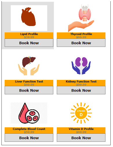
<c1:C1TileListView x:Name="tileListView"
                           ShowSelectAll="True"
                           SelectionMode="Extended"
                           ItemTemplate="{StaticResource HealthCheckTemplate}"
                           ItemHeight="164"
                           ItemWidth="180">
</c1:C1TileListView>
Add items to the TileListView using the ItemTemplate property, which applies a template to all the items of the list.
xml
<UserControl.Resources>
        <!-- Tile ListiView Item template-->
        <DataTemplate x:Key="HealthCheckTemplate">
            <StackPanel Orientation="Vertical">
                <Image Source="{Binding Image}"  Height="98" Width="126"/>
                <TextBlock TextWrapping="Wrap" Background="Orange" FontFamily="Verdana" FontWeight="Bold" TextAlignment="Center">
                    <Run Text="{Binding Caption}" Foreground="Black" FontSize="9"/>
                    <LineBreak/>
                    <Run Text="{Binding Amount, StringFormat=C}" FontSize="9" Foreground="Gray"/></TextBlock>
                <Button Content="Book Now" Height="29" FontFamily="Verdana" FontWeight="Bold" Width="168" >
                </Button>
            </StackPanel>
        </DataTemplate>
    </UserControl.Resources>
    <Grid>
        <c1:C1TileListView x:Name="tileListView"
                           ShowSelectAll="True"
                           SelectionMode="Extended"
                           ItemTemplate="{StaticResource HealthCheckTemplate}"
                           ItemHeight="164"
                           ItemWidth="180">
        </c1:C1TileListView>
</Grid>
csharp
// health checks
var checks = new List<HealthCheck>();
checks.Add(new HealthCheck() { Image = "../Images/cholesterol-clipart.jpg", Caption = "Lipid Profile", Amount = 39.99 });
checks.Add(new HealthCheck() { Image = "../Images/thyroid-clipart.jpg", Caption = "Thyroid Profile", Amount = 66.99 });
checks.Add(new HealthCheck() { Image = "../Images/livercare.jpg", Caption = "Liver Function Test", Amount = 69.99 });
checks.Add(new HealthCheck() { Image = "../Images/kidneytest.png", Caption = "Kidney Function Test", Amount = 89.99 });
checks.Add(new HealthCheck() { Image = "../Images/rbc.png", Caption = "Complete Blood Count", Amount = 59.99 });
checks.Add(new HealthCheck() { Image = "../Images/vit-d.jpg", Caption = "Vitamin D Profile", Amount = 69.99 });
tileListView.ItemsSource = checks; // setting C1TileListView ItemSource
As you can observe from the code snippet, a StackPanel is added to each TileListView item, in which you can add an image and a text block. In this manner, the TileListView control gives the user full control of the image and text rendering.