- FlexReport for WinForms Overview
- Key Features
- FlexReport versus other Reporting Controls
- Core Classes
- Design-Time Support
- Quick Start
- FlexReport Designer
- FlexReportDesigner Control
- Data Binding
- Load Reports
- Create Reports
- Sections of FlexReport
- Fields and Custom Fields
- Modifying the Fields
- Parameters
- VBScripting with ExpressionEditor
- Filtering Data
- Grouping Data
- Sorting Data
- Customize Reports
- Styling the Reports
- Export Reports
- Preview and Print Reports
- Deployment
- FlexViewer
UI Elements
The FlexReportDesigner application features major visual elements that make up the UI of the Designer, such as the toolbar, tabs, statusbar and designer grid. The application UI elements are elaborated in the sections below.
FlexReportDesigner Toolbar
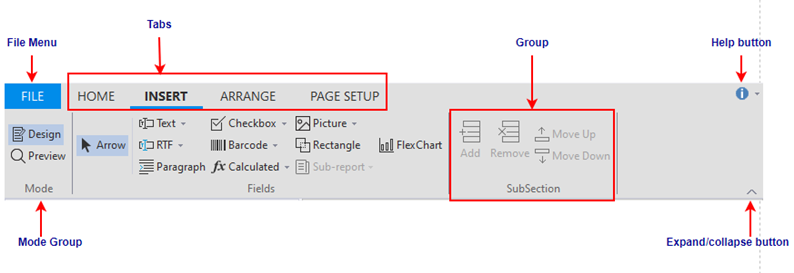
The FlexReportDesigner comprises ribbon-like toolbar with major UI elements such as File menu, Tabs, Groups and Help button.
The labeled snapshot depicts the fluent design of the designer toolbar.

The following list presents a summary of the different UI elements and their usage in the designer toolbar:
File menu: It contains information about handling report definition files such as, load, save, import and export options.
Toolbar Tabs: The FlexReportDesigner commands are grouped and put under different Tabs. The designer has four tabs, Home, Insert, Arrange and Page Setup. The tabs provide all functionalities related to a report definition, like editing, formatting, inserting fields and sections, positioning and sizing, and page layout and printer settings.
Groups: All the designer tabs contain groups that can keep many Items together. Consecutive groups are partitioned via a separator line within a tab.
Mode group: All the tabs in FlexReportDesigner provides a common group, the Mode group. It consists of Design and Preview toggle buttons. Clicking on the Design button displays the report in the designer mode, while the Preview button shows the report in the preview mode.
Help button: The Help button provides options to open the online help file and view the About FlexReportDesigner screen, which displays information about the application.
Expand/collapse button: This button lets you expand or collapse the FlexReportDesigner toolbar. It lets you switch between full and simplified views.

Customize Quick Access Toolbar
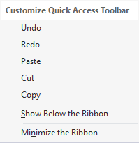
The Customize Quick Access Toolbar gives you quick access to commonly-used features such as cut, copy, paste, undo, redo etc.
The snapshot depicts the fluent design of the Customize Quick Access Toolbar.

The following list presents a summary of different options and their usage.
- Undo: This option lets you erase the last change made to the report.
- Redo: This option enables you to restore the changes that were undone using the Undo option.
- Paste: This option allows you to get the text from clipboard and use it in the report document.
- Cut: This option lets you remove the selected text.
- Copy: This option saves your time by enabling you to retype the same content without having to type it again.
- Show Below the Ribbon: You can use this option to add the Customize Quick Access Toolbar below the FlexReportDesigner Toolbar.
- Minimize the Ribbon: Clicking this option will minimize the FlexReportDesigner Toolbar.
Tabs and Statusbar
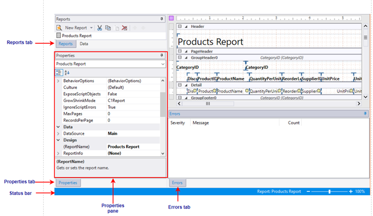
FlexReportDesigner provides different tabs such as Report tab, Data tab, Properties tab and Error tab. The designer also provides the statusbar, a horizontal bar at the bottom of the application window.
The following snapshot depicts the different tabs and statusbar in the report designer:

The bulleted list below takes you through the different tabs and statusbar, and their description in FlexReportDesigner:
- Reports/Data tabs: The tab lists all reports contained in the current report definition file. You can double-click a report name to preview or edit the report. You can also use the list to rename, copy, and delete reports.
- Data tab: The tab lists all the Data Sources and Parameters in the current report. The data sources and parameters can be added or edited from here.
- Properties tab: The tab allows you to edit properties for the objects that are selected in the Designer.
- Error tab: The tab displays list of errors, their severity and count, generated when importing or previewing a report.
- Status bar: The tab displays information about what the FlexReportDesigner application is working on. If a field is selected, status bar displays selected field's name, type, and if the field is data bound (calculated) or static. If a section is selected, status bar displays the name of the section, section type, and its visibility if the section is hidden. It also displays processes such as loading, saving, printing, rendering, importing, and so on. You can zoom in and out of a selected report by dragging the zoom slider at the right of the status bar.
Designer Grid
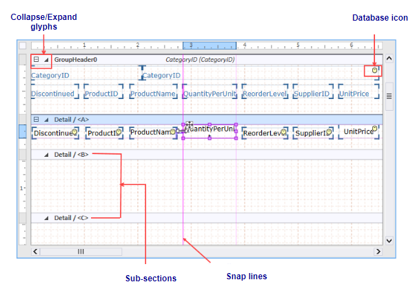
The designer grid in FlexReportDesigner lets you edit data-bound reports and provides a rich set of elements to manipulate report layouts that meet your requirements.
The following snapshot depicts the different tabs and statusbar in the report designer:

The following list presents a summary of the different elements in the designer grid and their usage in FlexReportDesigner:
- Collapse/Expand glyphs: Each section provides option to expand or collapse the sub-sections contained within them by clicking expand or collapse glyphs.
- Database icon: Indicates that a field is bound to a data source (i.e., a calculated field), if the data base icon appears on the top-right corner of the field. If the data base icon does not appear, it means the field is static.
- Snap lines: Help in the alignment of fields. When the size of a field is increased or decreased, vertical and horizontal snap lines appear, that help in positioning the fields relative to each other.
- Sub-sections: Sub-sections are sections within sections. Sub-sections, by default, appear at the bottom of a section and are automatically named as /<B>, / <C>..., and so on.


