
-
Getting Started
- Introduction
- QuickStart
- Licensing
- Referencing Wijmo from NPM
- Referencing Wijmo
- NPM Module Formats
- Sizing and Styling Controls
- Pseudo Classes
- Events
- Enumerations
- Globalization
- Glyphs
- Angular Components
- React Components
- React-Redux Support
- Vue Components
- WebComponents
- Intellisense
- SASS
- Wijmo Designer
- Accessibility
- Topics
- Tutorials
Accessibility
Currently, Wijmo's main controls (FlexGrid, Input, etc.) already comply with the WCAG 2.1 AA standards. When you use these controls without any special configurations, they can pass accessibility testing tools (Axe-DevTools, etc.) and provide richer, more accurate content for screen readers (NVDA, etc.).
This greatly enhances the experience of people with disabilities when using Wijmo, and can also make it easier for your application to meet certain international accessibility guidelines.
The main support for the accessibility of the controls includes the following points:
Comprehensive enhancement of WAI labels for DOM nodes, such as
role,aria-label,aria-labelledby,aria-describedby,aria-disabled, etc., and corrections to the correctness of the values corresponding to these labels.Visible labels have been added to input controls without affecting the UI design.
Adjusted the color contrast of the controls to meet the 4.5:1 ratio as much as possible.
Enhanced the UI performance of the controls in the system's high contrast mode.
Added supplementary keyboard behaviors, allowing the controls to be operated as much as possible without relying on a mouse.
In addition, some overly flexible user scenarios are not suitable for direct support within Wijmo controls, but we still provide some possible solutions to help you achieve the goals.
Scenario: Adding “autocomplete“ Attribute
The HTML autocomplete attribute lets web developers specify what if any permission the user agent has to provide automated assistance in filling out form field values, as well as guidance to the browser as to the type of information expected in the field.
For example, you want to add autocomplete=email in ComboBox control.
// 1. get the input element from ComboBox
const input = combobox.inputElement;
// 2. set “autocomplete” attribute
input.setAttribute("autocomplete", "email");
API Reference: ComboBox Class | Wijmo API
Scenario: Dynamic Status Messages
Status messages make you aware of important changes in content, it will be read by screen readers.
As this type of notification message is entirely dependent on the user scenario and customized by the user, a reference implementation is provided here.
For example, you want the screen reader to read “Current value: {SOMETHING}“ when ComboBox’s text changed.
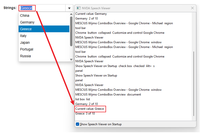
// 1. HTML part: prepare a announcer DOM element
<div id="valueAnnouncer" role="status" aria-live="polite" aria-atomic="true"></div>

// 2. CSS part: hide the announcer so that it will not effect layout
<style>
#valueAnnouncer { width: 0; height: 0; overflow: hidden; }
</style>

// 3. JS part: change announcer's textContent when combobox changed
const announcer = document.getElementById('valueAnnouncer');
combobox.textChanged.addHandler((sender, e) => {
    let text = sender.text; // display value
    announcer.textContent = `Current value: ${text}`;
});