
-
Spread Windows Forms Product Documentation
- Getting Started
-
Developer's Guide
- Understanding the Product
- Working with the Component
- Spreadsheet Objects
- Ribbon Control
- Sheets
- Rows and Columns
- Headers
- Cells
- Cell Types
- Data Binding
- Customizing the Sheet Appearance
- Customizing Interaction in Cells
- Tables
- Pivot Table
- Understanding the Underlying Models
- Customizing Row or Column Interaction
- Formulas in Cells
- Sparklines
- Keyboard Interaction
- Events from User Actions
- File Operations
- Storing Excel Summary and View
- Printing
- Chart Control
- Enhanced Chart
- Customizing Drawing
- Touch Support with the Component
- Spread Designer Guide
- Assembly Reference
- Import and Export Reference
- Version Comparison Reference
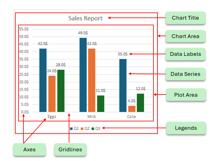
Chart Elements
Charts are powerful tools for data visualization. Each chart is made up of several chart elements, which can be formatted individually to generate charts with a customized layout. Configuring chart elements in a spreadsheet not only enables users to represent information in a meaningful way but also helps them put together a clear view of comparisons and trends for advanced data visualization and analysis.
A basic chart with the primary chart elements is shown in the image below.
The following topics explain the various chart elements and their formatting options:
Chart Elements | Descriptions |
|---|---|
Represents a the title of the chart. | |
Represents the entire chart control area. | |
Represents the graphics area used to draw the chart trends. | |
Represents the ruler used to draw the chart trends. | |
Represents the data trends for one group of data values. | |
Represents a straight or curved line that is added on the chart to show the trends. | |
Represents the error or uncertainty of data on charts. | |
Represents the High-Low and Drop lines on charts. | |
Represents up-down bars used in line charts. | |
Represents a grid that displays the source data of the chart | |
Represents the relevant information on the chart. | |
Represents the identifiers for each of the series of the data. |