- SpreadJS Overview
- Getting Started
- JavaScript Frameworks
- Best Practices
-
Features
- Workbook
- Worksheet
- Rows and Columns
- Headers
- Cells
- Data Binding
- TableSheet
- GanttSheet
- ReportSheet
- Data Charts
- JSON Schema with SpreadJS
- SpreadJS File Format
- Data Validation
- Conditional Formatting
- Sort
- Group
- Formulas
- Serialization
- Keyboard Actions
- Floating Objects
- Shapes
- Barcodes
- Charts
- Sparklines
- Tables
- Pivot Table
- Slicer
- Theme
- User Management
- Culture
- AI Assistant
- SpreadJS Designer
- SpreadJS Designer Component
- Tutorials
- SpreadJS Collaboration Server
- Touch Support
- Formula Reference
- Import and Export Reference
- Frequently Used Events
- API Documentation
- Release Notes
TableSheet Views
A tablesheet view is the centerpiece of a tablesheet and is formed by the fields of fetched data sources. It is used to enrich data columns and give them more capabilities.
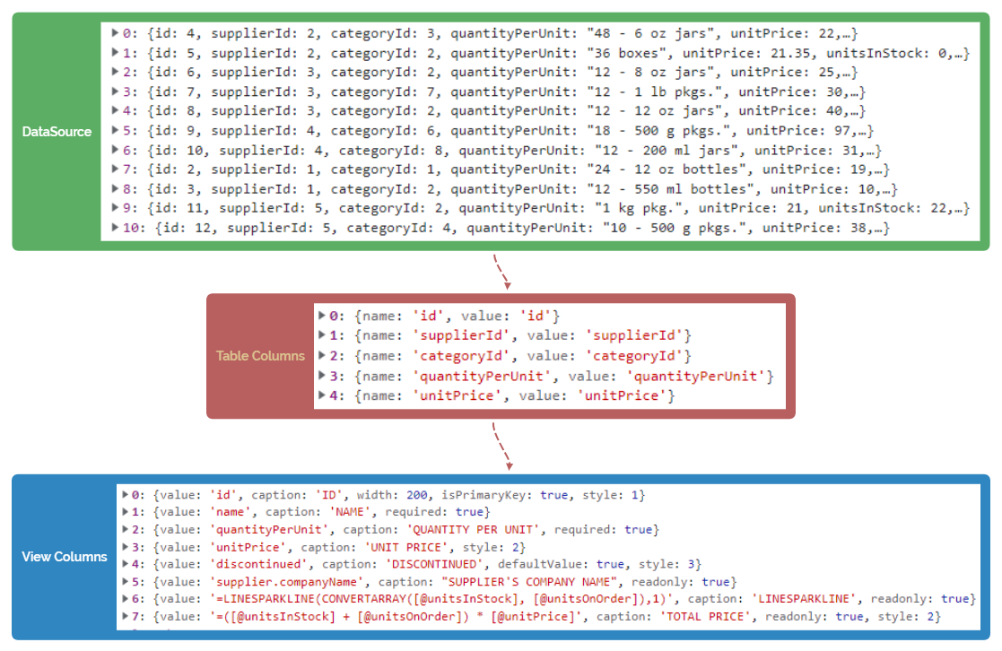
As displayed in the above flowchart image, a tablesheet view can be presented in the following ways:
Table columns: Default columns that are generated from fields directly, which means they only have a field name property and are used to display the default view.
View columns: Rich columns that you can customize with styles, formats, and more properties. They are rendered into TableSheet view by using many useful attributes such as caption, style, width, and headerStyle.
You can customize a tablesheet view by setting various IColumn attributes such as header style, header fit, conditional formatting, data validation, and column styles such as cell types and dropdowns.
Column Display Value
You can display a customized value in a tablesheet column in place of the existing column data using the formatter with the formula in the style variable of the column. The formula can display the properties from the full row using the '@' operator in the bracket which displays the entire row data.
There are two ways to display customized values in a column of tablesheet:
Formula in formatter
=[@contactTitle] & ":" & [@employee.FirstName] & " " & [@employee.LastName]
Template formula in formatter
{{[@contactTitle]}} : {{=[@employee.FirstName] & " " & [@employee.LastName]}}

The following code sample displays the formula in formatter to display customized column values:
//add relationship between sales table and customer table
dataManager.addRelationship(salesTable, "customerKey", "myCustomer", customerTable, "customerKey", "mySales");

//add custom view
customerTable.fetch().then(function () {

var myView = salesTable.addView("myView", [
       { value: "saleKey", width: 100, caption: "Sale Key" },
       { value: "salesPerson", width: 150, caption: "Sales Person" },
       { value: "myCustomer", width: 350, caption: "Customer Information", style: { formatter: '=[@myCustomer.primaryContact] & " " & [@myCustomer.postalCode]' } },
       { value: "address", width: 350, caption: "Address" },
       { value: "stockItem", width: 350, caption: "Stock Item" },
       { value: "quantity", width: 100, caption: "Quantity" }
          ]);
Column Header Style
You can customize a column header's style by defining HeaderStyleOptions in the view headerStyle attribute. The HeaderStyleOptions contain options such as background color, theme font, word wrap, and so on.
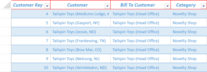
The following code sample shows how to set column header style in a tablesheet view.
// define a style for column headers and assign it while adding the view using addView() method
var headerStyle = {
    font: "italic bold 13pt Calibri",
    borderTop: {
        color: "red",
        style: "thick"
    },
    borderLeft: {
        color: "red",
        style: "thin"
    },
    borderRight: {
        color: "red",
        style: "thin"
    },
    borderBottom: {
        color: "red",
        style: "thin"
    }
};


//bind a view to the tablesheet
customerTable.fetch().then(function () {
    var view = customerTable.addView("myView", [
        { value: "customerKey", width: 130, headerStyle: headerStyle, caption: "Customer Key" },// set the style of column header using headerStyle property
        { value: "customer", width: 200, headerStyle: headerStyle, caption: "Customer" },
        { value: "billToCustomer", width: 200, headerStyle: headerStyle, caption: "Bill To Customer" },
        { value: "category", width: 120, headerStyle: headerStyle, caption: "Category" },
        { value: "buyingGroup", width: 180, headerStyle: headerStyle, caption: "Buying Group" },
        { value: "primaryContact", width: 170, headerStyle: headerStyle, caption: "Primary Contact" },
        { value: "postalCode", width: 120, headerStyle: headerStyle, caption: "Postal Code" },
        { value: "validFrom", width: 150, headerStyle: headerStyle, caption: "Valid From" },
        { value: "validTo", width: 180, headerStyle: headerStyle, caption: "Valid To" }

    ]);
    //the View has all default columns of the Table
    sheet.setDataView(view);
});
Column Header Fit Mode
You can set the column header fit mode for the specified column in a tablesheet view to change the header layout to display the header and viewport data suitably.
It is useful when the content length of column data is short but the length of column header caption is too long, or when some columns have relations.
The view option attribute headerFit can be used to set the three types of header fit mode as described below.
Normal: The column header text direction is horizontal and from left to right. It is the default header fit mode.
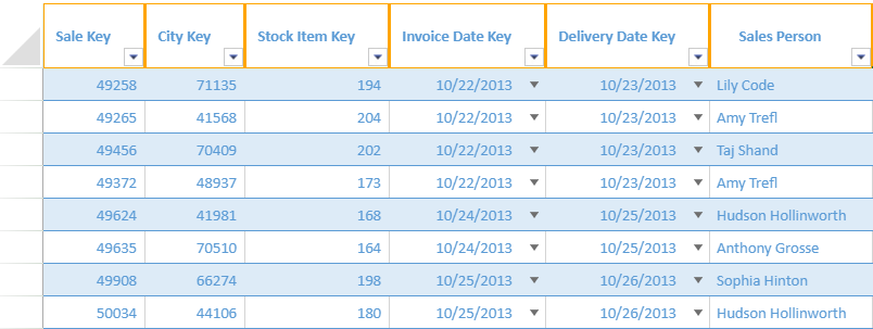
Vertical: The column header text direction is vertical and from top to bottom.
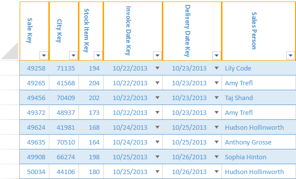
Stack: The column headers are stacked on top of each other when the column is not wide enough for the column header text.
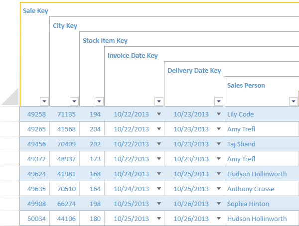
The stack header fit mode is displayed alongside the vertical mode in a cross-fit way when the columns are adjacent to each other.
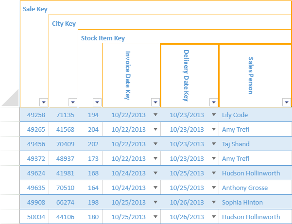
You can also set the stack row height in a tablesheet view by using the defaultStackRowHeight option. It calculates the average row height by default when the value is null (default). If a valid number is given as a value, it calculates the height from top to bottom.
The following code sample shows how to set the desired column header fit mode and adjust the row height in a tablesheet view.
//bind a view to the tablesheet
myTable.fetch().then(function () {
    var view = myTable.addView("myView", [
        { value: "saleKey", caption: "Sale Key", headerFit: "stack", headerStyle: headerStyle },// set headerFit to stack
        { value: "cityKey", caption: "City Key", headerFit: "stack", headerStyle: headerStyle },
        { value: "stockItemKey", width: 50, caption: "Stock Item Key", headerFit: "stack", headerStyle: headerStyle },
        { value: "invoiceDateKey", width: 120, caption: "Invoice Date Key", headerFit: "vertical", headerStyle: headerStyle },
        { value: "deliveryDateKey", width: 120, caption: "Delivery Date Key", headerFit: "vertical", headerStyle: headerStyle },
        { value: "salesPerson", width: 150, caption: "Sales Person", headerFit: "vertical", headerStyle: headerStyle },
        { value: "address", caption: "Address", width: 300, headerFit: "normal", headerStyle: headerStyle }

    ]);
    sheet.setDataView(view);
    sheet.options.defaultStackRowHeight = 30;
    sheet.setDefaultRowHeight(220, 1);
});
Note: If the row height is unable to display the entire caption, the specific column row stack will be cut off. The setDefaultRowHeight method can be used to adjust this.
Cell Types and Dropdowns
You can set different cell types and dropdowns in a tablesheet view to show how information is displayed and help in selecting the data easily and quickly.
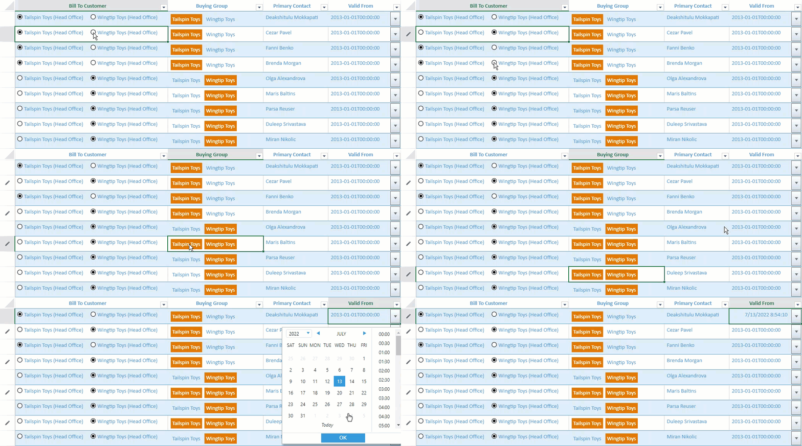
The following cell types and dropdowns are supported in the tablesheet:
Cell types - Checkbox, combobox, hyperlink, radio button list, checkbox list, range template
Dropdown - Color picker, date picker, time picker, month picker, list, slider, calculator, workflow list, multi-column
The following code sample shows how to add cell types and dropdowns in a tablesheet view.
// Code for RadioButtonList
var radioButtonListStyle = new GC.Spread.Sheets.Style();
var cellTypeRadioButtonList = new GC.Spread.Sheets.CellTypes.RadioButtonList();
cellTypeRadioButtonList.items([
    { text: "Tailspin Toys (Head Office)", value: "Tailspin Toys (Head Office)" },
    { text: "Wingtip Toys (Head Office)", value: "Wingtip Toys (Head Office)" },
]);
radioButtonListStyle.cellType = cellTypeRadioButtonList;

// Code for ButtonList
var buttonListStyle = new GC.Spread.Sheets.Style();
var buttonListCellType = new GC.Spread.Sheets.CellTypes.ButtonList();
buttonListCellType.items([
    { text: "Tailspin Toys", value: "Tailspin Toys" },
    { text: "Wingtip Toys", value: "Wingtip Toys" },
]);
buttonListStyle.cellType = buttonListCellType;

// Code for Date DropDown
var dateStyle = {};
dateStyle.cellButtons = [
    {
        imageType: "dropdown",
        command: "openDateTimePicker",
        useButtonStyle: true,
    }
];
dateStyle.dropDowns = [
    {
        type: "dateTimePicker",
        option: {
            showTime: true
        }
    }
];

//bind a view to the tablesheet
customerTable.fetch().then(function () {
    var view = customerTable.addView("myView", [
        { value: "customerKey", width: 120, caption: "Customer Key" },
        { value: "billToCustomer", width: 400, caption: "Bill To Customer", style: radioButtonListStyle },
        { value: "buyingGroup", width: 250, caption: "Buying Group", style: buttonListStyle },
        { value: "primaryContact", width: 170, caption: "Primary Contact" },
        { value: "validFrom", width: 190, caption: "Valid From", style: dateStyle }
    ]);
    //the View has all default columns of the Table
    sheet.setDataView(view);
});
Column Caption Multiple Headers
You can set a column caption in a tablesheet view where multiple columns can be grouped under a common header. It helps you represent the available information in an organized way by grouping the columns into a common category.
The "caption" property of the columnInfos parameter present in the addView method accepts a string array to set multiple rows of a column header in a tablesheet. The columns, with common values in the headers, are merged automatically in the row direction and column direction.
In the following example, customer information like Customer Key, Customer Name, Bill To Customer, and Primary Contact are presented under a common caption “Customer Information” that retains the existing headers for each column. Similarly, product validity dates can be displayed under one column header caption.

The following code sample shows how to set the same caption to the multiple columns in a tablesheet view.
//bind a view to the tablesheet
myTable.fetch().then(function () {
   var view = myTable.addView("myView", [
       { value: "customerKey", width: 130, caption: ["Customer Information", "Customer Key"] }, // Set string array to caption
       { value: "customer", width: 200, caption: ["Customer Information", "Customer"] },
       { value: "billToCustomer", width: 200, caption: ["Customer Information", "Bill To Customer"] },
       { value: "primaryContact", width: 170, caption: ["Customer Information", "Primary Contact"] },
       { value: "validFrom", width: 150, caption: ["Validity", "Valid From"], style: { formatter: "MM/dd/yyyy"} },
       { value: "validTo", width: 180, caption: ["Validity", "Valid To"], style: { formatter: "MM/dd/yyyy"} }
   ]);
   sheet.setDataView(view);
});
To know how to apply multiple header column captions using the SpreadJS Designer, refer to TableSheet Design Mode.
Free Header Area
You can add a header area to a tablesheet view where you can describe the tablesheet and present aggregated data using formulas and sparklines. The free header area is assigned above the main tablesheet view and can consist of a single row or multiple rows as shown in the image below.
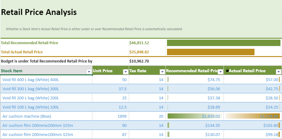
The applyFreeHeaderArea method is used to configure the free layout area for the column header. This method accepts a worksheet JSON which can be created using the toJSON method. Before generating the worksheet JSON, set the keepUnknownFormulas option to true if you want to keep formulas that contain sheet names.
The following code sample shows how to create a template worksheet and apply the free header area in a tablesheet view.
//bind a view to the tablesheet
myTable.fetch().then(function () {
   var view = myTable.addView("myView", [

       { value: "stockItem", width: 300, caption: "Stock Item", headerStyle: headerStyle },
       { value: "unitPrice", width: 120, caption: "Unit Price", headerStyle: headerStyle },
       { value: "taxRate", width: 120, caption: "Tax Rate", headerStyle: headerStyle },
       { value: "recommendedRetailPrice", width: 190, caption: "Recommended Retail Price", style: currencyFormatter, headerStyle: headerStyle, conditionalFormats: [dataBarRule1] },
       { value: "=([@unitPrice] * [@taxRate])/100 + [@unitPrice]", caption: "Actual Retail Price", style: currencyFormatter, width: 190, headerStyle: headerStyle, conditionalFormats: [dataBarRule2] }, // calculated column

   ]);

   // create template sheet for free header area json
   var templateSheet = new GC.Spread.Sheets.Worksheet();
   templateSheet.options.keepUnknownFormulas = true;
   var currencyFormatterStyle = new GC.Spread.Sheets.Style();
   currencyFormatterStyle.formatter = formatter;
   currencyFormatterStyle.hAlign = GC.Spread.Sheets.HorizontalAlign.left;
   templateSheet.setRowCount(6);
   var freeHeaderAreaStyle = new GC.Spread.Sheets.Style();
   freeHeaderAreaStyle.backColor = Colors.white;

   templateSheet.setValue(0, 0, "Retail Price Analysis");
   templateSheet.getCell(0, 0).hAlign(GC.Spread.Sheets.HorizontalAlign.left).font("bold 30px \"Calibri\"");
   templateSheet.addSpan(0, 0, 1, 5);
   var titleStyle = new GC.Spread.Sheets.Style();
   titleStyle.backColor = Colors.lightGreen;
   titleStyle.foreColor = Colors.black;
   templateSheet.setStyle(0, -1, titleStyle);
   templateSheet.setRowHeight(0, 80);

   templateSheet.getCell(1, 0)
       .value("Whether a Stock Item's Actual Retail Price is either under or over Recommended Retail Price is automatically calculated.")
       .font("italic 12px \"Calibri\"")
       .foreColor("rgb(120,120,120)")
       .textIndent(2);
   templateSheet.setStyle(1, -1, titleStyle);
   templateSheet.addSpan(1, 0, 1, 5);

   var headerDescriptionStyle = new GC.Spread.Sheets.Style();
   headerDescriptionStyle.backColor = Colors.lightGreen;
   headerDescriptionStyle.borderBottom = new GC.Spread.Sheets.LineBorder(Colors.middleGreen, GC.Spread.Sheets.LineStyle.thick);
   templateSheet.setStyle(2, -1, headerDescriptionStyle);
   templateSheet.addSpan(2, 0, 1, 5);
   templateSheet.setRowHeight(2, 16);

   templateSheet.setValue(3, 0, "Total Recommended Retail Price");
   templateSheet.getCell(3, 0).hAlign(GC.Spread.Sheets.HorizontalAlign.left).font("bold 14px \"Calibri\"").foreColor(Colors.darkGreen);
   templateSheet.addSpan(3, 0, 1, 2);
   templateSheet.setFormula(3, 2, '=SUM(TableSheet1[Recommended Retail Price])');
   templateSheet.getCell(3, 2).hAlign(GC.Spread.Sheets.HorizontalAlign.left).font("bold 14px \"Calibri\"").foreColor(Colors.darkGreen).formatter(formatter);
   templateSheet.setFormula(3, 3, '=HBARSPARKLINE(ROUND(C4/MAX(C4,C5),2),"' + Colors.darkGreen + '",false)');
   templateSheet.addSpan(3, 3, 1, 2);
   templateSheet.setStyle(3, -1, freeHeaderAreaStyle);

   templateSheet.setValue(4, 0, "Total Actual Retail Price");
   templateSheet.getCell(4, 0).hAlign(GC.Spread.Sheets.HorizontalAlign.left).font("bold 14px \"Calibri\"").foreColor(Colors.brown);
   templateSheet.addSpan(4, 0, 1, 2);
   templateSheet.setFormula(4, 2, '=SUM(TableSheet1[Actual Retail Price])');
   templateSheet.getCell(4, 2).hAlign(GC.Spread.Sheets.HorizontalAlign.left).font("bold 14px \"Calibri\"").foreColor(Colors.brown).formatter(formatter);
   var contentBorderStyle = new GC.Spread.Sheets.Style();
   contentBorderStyle.backColor = Colors.white;
   contentBorderStyle.borderBottom = new GC.Spread.Sheets.LineBorder(Colors.brown, GC.Spread.Sheets.LineStyle.thick);
   templateSheet.setStyle(4, -1, contentBorderStyle);
   templateSheet.setFormula(4, 3, '=HBARSPARKLINE(ROUND(C5/MAX(C4,C5),2),"' + Colors.brown + '",false)');
   templateSheet.addSpan(4, 3, 1, 2);

   templateSheet.setFormula(5, 0, '=IF(C4>C5,"Budget is under Total Recommended Retail Price by","Budget is over Total Recommended Retail Price")');
   templateSheet.getCell(5, 0).hAlign(GC.Spread.Sheets.HorizontalAlign.left).font("bold 14px \"Calibri\"").foreColor(Colors.black);
   templateSheet.addSpan(5, 0, 1, 2);
   templateSheet.setFormula(5, 2, '=C4-C5');
   templateSheet.getCell(5, 2).hAlign(GC.Spread.Sheets.HorizontalAlign.left).font("bold 14px \"Calibri\"").formatter(formatter).foreColor(Colors.black);
   templateSheet.setStyle(5, -1, freeHeaderAreaStyle);
   templateSheet.addSpan(5, 2, 1, 3);

   let template = templateSheet.toJSON();
   sheet.applyFreeHeaderArea(template);
   sheet.setDataView(view);
});
The free header supports the formula text box when editing or creating formulas in the cell. This enables you to perform selection operations on tablesheet columns, column ranges, multiple columns, and cross sheet columns.
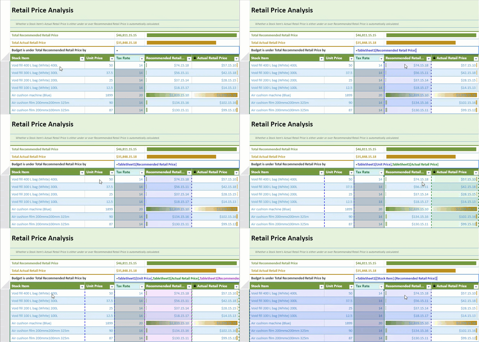
To know how to apply the free header area using the SpreadJS Designer, refer to TableSheet Design Mode.
Trigger Formula
You can store independent data in a column but still allows you to use a formula to calculate column data using the Trigger formula in a TableSheet. It is useful to recalculate your data based on selected conditions or clean data when a new value is entered or set an appropriate default value for a column.
SpreadJS provides a new interface GC.Data.ITriggerFormulaOptions which includes properties such as when, formula, and fields to configure the triggers.
Name | Description | Usage |
|---|---|---|
when (Required) | Indicates when to trigger. |
|
formula (Required) | Indicates the applied formula. | The evaluated result of the formula is set in the row data. |
fields (Required) | Indicates which fields could affect the formula to trigger. | “Any Field” indicates that all field “field1, field2, field3“ indicates the related fields which are separated by the comma. If the when is onNew, no need to specify the fields, otherwise it’s required. |
The following code sample implements the trigger formula.
schema: {
        type: "csv",
        columns: {
            SKU: {
                dataType: "string",
                trigger: {
                    when: "onNewAndUpdate",
                    formula: "=UPPER(TRIM([@SKU]))", // Format the input SKU text
                    fields: "SKU" // If the SKU field be inputted, trigger the formula to format the input text
                }
            },
            OrderDate: {
                dataType: "date",
                trigger: {
                    when: "onNew", // When an order added, records the order created date
                    formula: "=TODAY()"
               }
            },
            lastUpdatedTime: {
                dataType: "date",
                trigger: {
                    when: "onNewAndUpdate",
                    formula: "=NOW()",
                    fields: "*" // When any field be updated or the order be added, records the order updated time
                }
            },
            lastUpdateUser: {
                dataType: "string",
                trigger: {
                    when: "onNewAndUpdate",
                    formula: "=ACTIVEUSER()", // The user could determine how to getting the current updated user by them self
                    fields: "*" // When any field be updated or the order be added, records the updated user
                }
            },
            OrderPhone: {
                dataType: "string",
                trigger: {
                    when: "onNewAndUpdate",
                    formula: "=IF(ISBLANK([@OrderPhone]),[@customer.Phone],[@OrderPhone])",
                    fields: "CustomerId,OrderPhone"// Provide the customer phone when the order phone is blank
                }
            },
            Amount: {
                dataType: "number",
                trigger: {
                    when: "onNewAndUpdate",
                    formula: "=LET(amount, [@UnitPrice] * [@Quantity], IF([@Quantity] > 30, amount * 0.8, amount))",
                    fields: "UnitPrice,Quantity"  // When the UnitPrice or Quantity fields updated or the order be added, Amount field will get a calculated result automatically
                }
            },
            CustomerId: {
                lookup: {
                    name: 'customer', columns: [
                        { value: "Id", width: 60 },
                        { value: "CompanyName", width: 200 },
                        { value: "ContactName", width: 140 },
                        { value: "ContactTitle", width: 140 }
                    ]
                }
            },
            Quantity: { dataType: "number" },
            UnitPrice: { dataType: "number" },
        }
    }
});
Trigger formulas have certain policies, such as:
When new row data is added, the trigger with onNew and onNewAndUpdating is evaluated, similar to updating.
When multiple fields in a row's data are updated, the formula will be triggered to alter the values of watched fields. Otherwise, it’s not triggered.
If the trigger of the field watches the field itself, the trigger formula is evaluated with the new value, and the result is treated as the updated value of the field.
The evaluated value from the trigger formula is treated as the updated value of the field, and the updated value will be applied in the evaluation of the trigger formula which refers to the field directly.
If both a default value and a trigger formula are simultaneously applied to a column, the default value is given higher priority.


