


- SpreadJS Overview
- Getting Started
- JavaScript Frameworks
- Best Practices
-
Features
- Workbook
- Worksheet
- Rows and Columns
- Headers
- Cells
- Data Binding
- Data Manager
- TableSheet
- GanttSheet
- ReportSheet
- Data Charts
- JSON Schema with SpreadJS
- SpreadJS File Format
- Data Validation
- Conditional Formatting
- Sort
- Group
- Formulas
- What-If Analysis
- Serialization
- Keyboard Actions
- Shapes
- Floating Objects
- Barcodes
- Charts
- Sparklines
- Tables
- Pivot Table
- Slicer
- Theme
- User Management
- Culture
- AI Assistant
- SpreadJS Designer
- SpreadJS Designer VSCode Plugin
- Tutorials
- SpreadJS Designer Component
- SpreadJS Collaboration Server
- Touch Support
- Formula Reference
- Import and Export Reference
- Events
- API Documentation
- Release Notes
Chart Axis
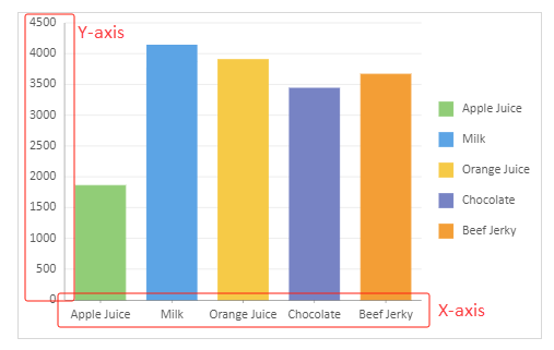
Axes refer to the lines on a chart that help you understand the scales and dimensions of the data being displayed. The horizontal (x-axis) and vertical (y-axis) axes are used to plot data like time, quantities, percentages, and so on. Use the IAxisOption interface to define the appearance and behavior of a axes in a Data Chart.
Axis Properties
The primary configurable properties of axes available in the IAxisOption interface are listed below.
Property | Description | Sample Preview |
|---|---|---|
type | Defines the axis type as either a "Category Axis" or a "Value Axis". Behavior can vary based on chart types and coordinate system (e.g., Cartesian or Polar). |
|
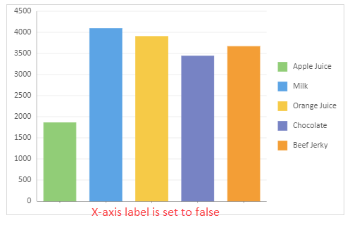
labels | Controls the visibility of axis labels. Default behavior may vary depending on chart types. Explicit settings are required to override defaults. |
|
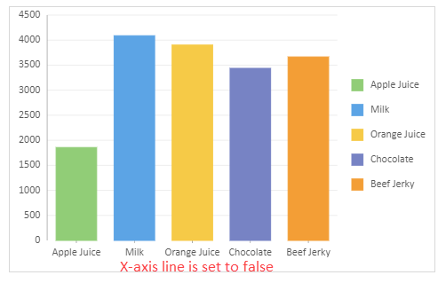
axisLine | Determines whether the axis line is displayed. Data Chart provides different default values for various chart types. Explicit settings are required to override defaults. |
|
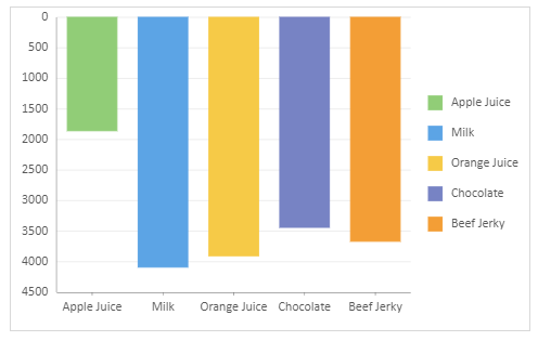
reversed | Reverses the direction of the axis. |
|
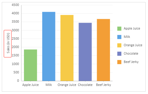
title | Specifies the axis title, including units or other descriptions. |
|
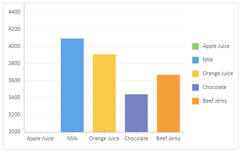
max & min | Sets the maximum and minimum values for the axis range. |
|
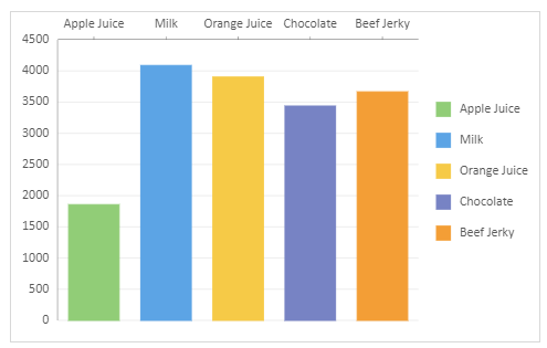
position | Determines the location of the axis on the Data Chart. |
|
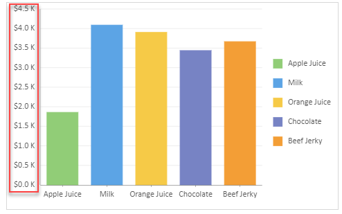
format | Sets the format information of axis, including the data units and format string. |
|
majorUnit & minorUnit | Sets the interval between scale markings.
|
|
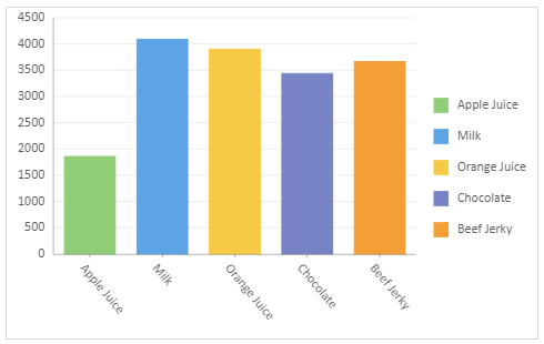
labelAngle | Sets the rotation angle of axis labels (range: -90 to 90 degrees). Note that, currently, this property only works on the first element of the array. |
|
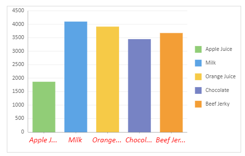
labelStyle | Defines the text style of axis labels. |
|
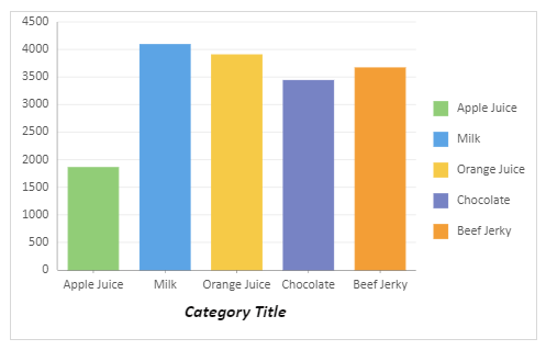
titleStyle | Specifies the style for axis titles. |
|
lineStyle | Configures the axis line appearance. |
|
majorTickSize & minorTickSize | Sets the length of the major and minor tick marks for the current axis. Major and minor tick marks help locate data points on the axis.
Supported values: none, inside, outside, and cross |
|
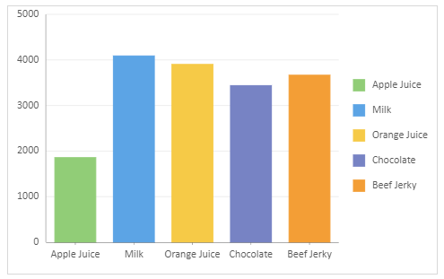
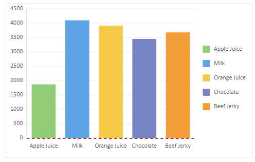
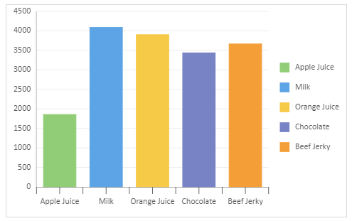
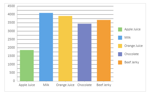
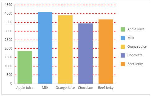
majorGrid & minorGrid | Sets to enhance data interpretation. They typically depict finer number intervals, allowing users to view data more precisely. Default values may vary depending on the chart types; for example, grid lines are not shown by default in a "pie" chart.
Major grid lines and tick marks are drawn for each major unit. Minor grid lines and tick marks are drawn for each minor unit. By default, each major unit is separated by one minor grid line and a tick mark. |
|
majorGridStyle & minorGridStyle | Configures the style information for major grid lines and minor grid lines. |
|
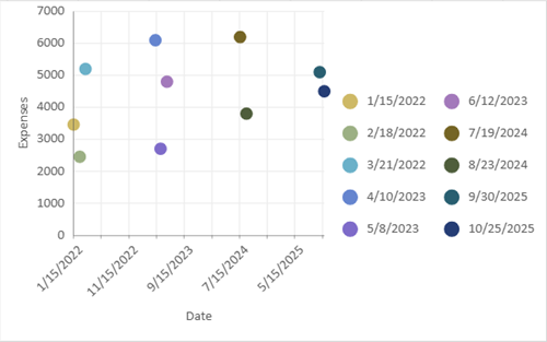
dateMode | Sets time spans of the axis in Data Charts like scatter and bubble charts. |
|
Date and Ordinal Scales
When a Date field is bound to Category, the category axis can be rendered as either an ordinal axis or a Date axis.
An ordinal axis treats each Date value or Date group as a category and spaces categories evenly. This is the default behavior for Date fields bound to Category.
A Date axis renders values on a continuous time scale. Use a Date scale when you want the spacing between data points to reflect actual time intervals.
config: {
  plotAreas: [{
    axes: [{
      type: GC.Spread.Sheets.DataCharts.AxisType.x,
      scale: {
        type: GC.Spread.Sheets.DataCharts.ValueScaleType.date
      }
    }]
  }]
}
Setting dateMode in Category encoding controls how Date values are grouped. Setting the axis scale controls how those grouped values are rendered.
If custom sorting is applied to a Category encoding, the category axis uses ordinal rendering so that the specified category order can be preserved.
When the axis uses a Date scale, the axis date interval is automatically aligned with the finest
dateModeused in the Category encoding. Advanced API configurations can set an axisdateModethat is coarser or finer than the CategorydateMode.
Date Axis Format
Date axis labels can be formatted independently from Date grouping and axis scale. A format string changes only how labels are displayed. It does not change the underlying Date values, category grouping, sorting, or axis behavior.
For example, if Date values are grouped by month, you can display the labels as month names:
config: {
  plotAreas: [{
    axes: [{
      type: GC.Spread.Sheets.DataCharts.AxisType.x,
      format: {
        value: "MMM"
      }
    }]
  }]
}
Date formatting also supports quarter tokens.
Token | Description | Example |
|---|---|---|
| Numeric quarter |
|
| Zero-padded quarter |
|
| Abbreviated quarter label |
|
| Full quarter label |
|
| Narrow quarter label |
|
Quarter labels are localized based on the chart locale.
Using Code
Refer to the following sample code to configure and customize axes on Data Chats.
Note that this sample uses the "salesTable" data mentioned on the Create Data Charts page. Therefore, make sure you have completed the primary steps outlined on that page to set up a data chart. Once done, you can use the following codes to configure the axes. Additionally, you also have the flexibility to customize the data source according to your specific needs.
// 1. Types of Axis
const sheet = spread.getSheet(0);
sheet.name("Axis Type");
sheet.setValue(4, 0, "Cartesian Coordinate System");
sheet.setValue(23, 0, "Polar coordinate system");
const dataChart = sheet.dataCharts.add('data-chart', 200, 10, 480, 300, GC.Spread.Sheets.DataCharts.DataChartType.column);
dataChart.setChartConfig({
tableName: 'Sales',
plots: [
{
type: GC.Spread.Sheets.DataCharts.DataChartType.column,
encodings: {
values: [{ field: 'Sales', aggregate: GC.Spread.Sheets.DataCharts.Aggregate.sum }],
category: { field: 'Product' },
color: { field: 'Product' }
},
}
],
config: {
plotAreas: [{
axes: [
{
type: GC.Spread.Sheets.DataCharts.AxisType.x, // GC.Spread.Sheets.DataCharts.AxisType
title: "X-Axis Title" // string
}, {
type: GC.Spread.Sheets.DataCharts.AxisType.y,
title: "Y-Axis Title"
}
]
}]
}
});
const dataChart2 = sheet.dataCharts.add('data-chart-2', 200, 320, 480, 300, GC.Spread.Sheets.DataCharts.DataChartType.column);
dataChart2.setChartConfig({
tableName: 'Sales',
plots: [
{
type: GC.Spread.Sheets.DataCharts.DataChartType.polarCoordinatesBar,
encodings: {
values: [{ field: 'Sales', aggregate: GC.Spread.Sheets.DataCharts.Aggregate.sum }],
category: { field: 'Product' },
color: { field: 'Product' },
},
}
]
});
// 2. Labels
let sheet2 = spread.getSheet(1);
sheet2.name("Labels");
sheet2.setValue(16, 0, "The X-Axis Labels are Hidden");
const dataChart3 = sheet2.dataCharts.add('data-chart-3', 10, 10, 480, 300, GC.Spread.Sheets.DataCharts.DataChartType.column);
dataChart3.setChartConfig({
tableName: 'Sales',
plots: [
{
type: GC.Spread.Sheets.DataCharts.DataChartType.column,
encodings: {
values: [{ field: 'Sales', aggregate: GC.Spread.Sheets.DataCharts.Aggregate.sum }],
category: { field: 'Product' },
color: { field: 'Product' }
},
}
],
config: {
plotAreas: [{
axes: [
{
type: GC.Spread.Sheets.DataCharts.AxisType.x,
// Hide the Labels on X - Axis
labels: false // boolean
},
]
}]
}
});
// 3. Axis Line
let sheet3 = spread.getSheet(2);
sheet3.name("Axis Line");
sheet3.setValue(16, 0, "AxisLine is hidden for X-Axis");
const dataChart4 = sheet3.dataCharts.add('data-chart-4', 10, 10, 480, 300, GC.Spread.Sheets.DataCharts.DataChartType.column);
dataChart4.setChartConfig({
tableName: 'Sales',
plots: [
{
type: GC.Spread.Sheets.DataCharts.DataChartType.column,
encodings: {
values: [{ field: 'Sales', aggregate: GC.Spread.Sheets.DataCharts.Aggregate.sum }],
category: { field: 'Product' },
color: { field: 'Product' }
},
}
],
config: {
plotAreas: [{
axes: [
{
type: GC.Spread.Sheets.DataCharts.AxisType.x,
// Hide the AxisLine for X-Axis
axisLine: false // Boolean
},
]
}]
}
});
//4. Axis Reversed
let sheet4 = spread.getSheet(3);
sheet4.name("Axis Reversed");
sheet4.setValue(16, 0, "The direction of the Y-Axis is Reversed");
const dataChart5 = sheet4.dataCharts.add('data-chart-5', 10, 10, 480, 300, GC.Spread.Sheets.DataCharts.DataChartType.column);
dataChart5.setChartConfig({
tableName: 'Sales',
plots: [
{
type: GC.Spread.Sheets.DataCharts.DataChartType.column,
encodings: {
values: [{ field: 'Sales', aggregate: GC.Spread.Sheets.DataCharts.Aggregate.sum }],
category: { field: 'Product' },
color: { field: 'Product' }
},
}
],
config: {
plotAreas: [{
axes: [
{
type: GC.Spread.Sheets.DataCharts.AxisType.y,
// The direction of the Y-Axis is Reversed
reversed: true // Boolean
},
]
}]
}
});
//5. Axis Title
let sheet5 = spread.getSheet(4);
sheet5.name("Axis Title");
sheet5.setValue(16, 0, "The title 'Sales (in USD)' is set for the Y-Axis.");
const dataChart6 = sheet5.dataCharts.add('data-chart-6', 10, 10, 480, 300, GC.Spread.Sheets.DataCharts.DataChartType.column);
dataChart6.setChartConfig({
tableName: 'Sales',
plots: [
{
type: GC.Spread.Sheets.DataCharts.DataChartType.column,
encodings: {
values: [{ field: 'Sales', aggregate: GC.Spread.Sheets.DataCharts.Aggregate.sum }],
category: { field: 'Product' },
color: { field: 'Product' }
},
}
],
config: {
plotAreas: [{
axes: [
{
type: GC.Spread.Sheets.DataCharts.AxisType.y,
// Set the Title for the Y-Axis
title: "Sales (in USD)" // string
},
]
}]
}
});
//6. Max and Min
let sheet6 = spread.getSheet(5);
sheet6.name("Max and Min");
sheet6.setValue(16, 0, "No Max and Min");
sheet6.setValue(16, 10, "Y-Axis Max Value: 4500");
sheet6.setValue(17, 10, "Y-Axis Min Value: 3000");
const dataChart7 = sheet6.dataCharts.add('data-chart-7', 10, 10, 480, 300, GC.Spread.Sheets.DataCharts.DataChartType.column);
dataChart7.setChartConfig({
tableName: 'Sales',
plots: [
{
type: GC.Spread.Sheets.DataCharts.DataChartType.column,
encodings: {
values: [{ field: 'Sales', aggregate: GC.Spread.Sheets.DataCharts.Aggregate.sum }],
category: { field: 'Product' },
color: { field: 'Product' }
},
}
],
});
const dataChart8 = sheet6.dataCharts.add('data-chart-8', 610, 10, 480, 300, GC.Spread.Sheets.DataCharts.DataChartType.column);
dataChart8.setChartConfig({
tableName: 'Sales',
plots: [
{
type: GC.Spread.Sheets.DataCharts.DataChartType.column,
encodings: {
values: [{ field: 'Sales', aggregate: GC.Spread.Sheets.DataCharts.Aggregate.sum }],
category: { field: 'Product' },
color: { field: 'Product' }
},
}
],
config: {
plotAreas: [{
axes: [{
type: GC.Spread.Sheets.DataCharts.AxisType.y,
max: { // Set the Maximum Value for Y-Axis
type: GC.Spread.Sheets.DataCharts.ValueOptionType.number, // ValueOptionType
value: 4500 // number
},
min: { // Set the Minimum Value for X-Axis
type: GC.Spread.Sheets.DataCharts.ValueOptionType.number,
value: 3000
}
}]
}]
}
});
//7. Position
let sheet7 = spread.getSheet(6);
sheet7.name("Position");
sheet7.setValue(16, 0, "Axis Position of the X-Axis is set to 'Far'")
const dataChart9 = sheet7.dataCharts.add('data-chart-9', 10, 10, 480, 300, GC.Spread.Sheets.DataCharts.DataChartType.column);
dataChart9.setChartConfig({
tableName: 'Sales',
plots: [
{
type: GC.Spread.Sheets.DataCharts.DataChartType.column,
encodings: {
values: [{ field: 'Sales', aggregate: GC.Spread.Sheets.DataCharts.Aggregate.sum }],
category: { field: 'Product' },
color: { field: 'Product' }
},
}
],
config: {
plotAreas: [{
axes: [{
type: GC.Spread.Sheets.DataCharts.AxisType.x,
position: GC.Spread.Sheets.DataCharts.AxisPosition.far
}]
}]
}
});
//8. Origin
let sheet8 = spread.getSheet(7);
sheet8.name("Origin");
sheet8.setValue(17, 0, "The Origin of the X-Axis is set to 2000");
sheet8.setValue(17, 10, "The Origin of the Y-Axis is set to 2.3");
const dataChart10 = sheet8.dataCharts.add('data-chart-10', 10, 10, 480, 300, GC.Spread.Sheets.DataCharts.DataChartType.column);
dataChart10.setChartConfig({
tableName: 'Sales',
plots: [
{
type: GC.Spread.Sheets.DataCharts.DataChartType.column,
encodings: {
values: [{ field: 'Sales', aggregate: GC.Spread.Sheets.DataCharts.Aggregate.sum }],
category: { field: 'Product' },
color: { field: 'Product' }
},
}
],
config: {
plotAreas: [{
axes: [{
type: GC.Spread.Sheets.DataCharts.AxisType.x,
// When the Position of the X-Axis is set, the data set corresponds to the scale of the Y-Axis
origin: 2000, // Number
}]
}]
}
});
const dataChart11 = sheet8.dataCharts.add('data-chart-11', 610, 10, 480, 300, GC.Spread.Sheets.DataCharts.DataChartType.column);
dataChart11.setChartConfig({
tableName: 'Sales',
plots: [
{
type: GC.Spread.Sheets.DataCharts.DataChartType.column,
encodings: {
values: [{ field: 'Sales', aggregate: GC.Spread.Sheets.DataCharts.Aggregate.sum }],
category: { field: 'Product' },
color: { field: 'Product' }
},
}
],
config: {
plotAreas: [{
axes: [{
type: GC.Spread.Sheets.DataCharts.AxisType.y,
// When positioning the "y" axis, the dataset aligns with the "x" axis scale.
// However, since the "x" axis often represents non-numeric categories, it is evenly divided based on the number of categories.
// The scale is then set such that the starting item's position is 1, with a spacing of 1 unit between each item.
origin: 2.3, // Sets the Origin of the Y-Axis
}]
}]
}
});
// 9. Format
let sheet9 = spread.getSheet(8);
sheet9.name("Format");
sheet9.setValue(17, 0, "The format of the Y-Axis is $0.0 K");
const dataChart12 = sheet9.dataCharts.add('data-chart-12', 10, 10, 480, 300, GC.Spread.Sheets.DataCharts.DataChartType.column);
dataChart12.setChartConfig({
tableName: 'Sales',
plots: [
{
type: GC.Spread.Sheets.DataCharts.DataChartType.column,
encodings: {
values: [{ field: 'Sales', aggregate: GC.Spread.Sheets.DataCharts.Aggregate.sum }],
category: { field: 'Product' },
color: { field: 'Product' }
},
}
],
config: {
plotAreas: [{
axes: [{
type: GC.Spread.Sheets.DataCharts.AxisType.y,
format: {
type: GC.Spread.Sheets.DataCharts.FormatType.thousands,
value: "$0.0 K"
}
}]
}]
}
});
// 10. Major and Minor Unit
let sheet10 = spread.getSheet(9);
sheet10.name("Major and Minor Unit");
sheet10.setValue(17, 0, "Y-Axis Major Unit: 1000");
sheet10.setValue(18, 0, "X-Axis Major Unit: 2");
const dataChart13 = sheet10.dataCharts.add('data-chart-13', 10, 10, 480, 300, GC.Spread.Sheets.DataCharts.DataChartType.column);
dataChart13.setChartConfig({
tableName: 'Sales',
plots: [
{
type: GC.Spread.Sheets.DataCharts.DataChartType.column,
encodings: {
values: [{ field: 'Sales', aggregate: GC.Spread.Sheets.DataCharts.Aggregate.sum }],
category: { field: 'Product' },
color: { field: 'Product' }
},
}
],
config: {
plotAreas: [{
axes: [
{
type: GC.Spread.Sheets.DataCharts.AxisType.y,
// If the current scale is of type "Number," set the value directly.
majorUnit: {
value: 1000
},
},
{
type: GC.Spread.Sheets.DataCharts.AxisType.x,
// If the scale is not of type "Number" or "Date" set the value directly as well,
// with the rule that each category value is spaced by 1 unit.
majorUnit: {
value: 2
},
}]
}]
}
});
// 11. Label Angle And Label Style
let sheet11 = spread.getSheet(10);
sheet11.name("Label Angle And Label Style");
sheet11.setValue(17, 0, "For X-Axis, the Label Angle is 50");
const dataChart14 = sheet11.dataCharts.add('data-chart-14', 10, 10, 480, 300, GC.Spread.Sheets.DataCharts.DataChartType.column);
dataChart14.setChartConfig({
tableName: 'Sales',
plots: [
{
type: GC.Spread.Sheets.DataCharts.DataChartType.column,
encodings: {
values: [{ field: 'Sales', aggregate: GC.Spread.Sheets.DataCharts.Aggregate.sum }],
category: { field: 'Product' },
color: { field: 'Product' }
},
}
],
config: {
plotAreas: [{
axes: [{
type: GC.Spread.Sheets.DataCharts.AxisType.x,
labelAngle: [50], // Rotation Angle, Value Range is -90~90
labelStyle: { // ILabelStyleOption
color: "red",
fontSize: 16,
fontStyle: GC.Spread.Sheets.DataCharts.FontStyle.italic,
overflow: GC.Spread.Sheets.DataCharts.TextOverflow.ellipsis
},
}]
}]
}
});
// 12. Title Style
let sheet12 = spread.getSheet(11);
sheet12.name("Title Style");
sheet12.setValue(17, 0, "Title Style Has Been Applied");
const dataChart15 = sheet12.dataCharts.add('data-chart-15', 10, 10, 480, 300, GC.Spread.Sheets.DataCharts.DataChartType.column);
dataChart15.setChartConfig({
tableName: 'Sales',
plots: [
{
type: GC.Spread.Sheets.DataCharts.DataChartType.column,
encodings: {
values: [{ field: 'Sales', aggregate: GC.Spread.Sheets.DataCharts.Aggregate.sum }],
category: { field: 'Product' },
color: { field: 'Product' }
},
}
],
config: {
plotAreas: [{
axes: [{
type: GC.Spread.Sheets.DataCharts.AxisType.x,
title: "Category Title", // string
// Apply Title Style To X-Axis
titleStyle: { // ILabelStyleOption
color: "red",
fontSize: 16,
fontStyle: GC.Spread.Sheets.DataCharts.FontStyle.italic,
fontWeight: "Bold",
}
}]
}]
}
});
// 13. Line Style
let sheet13 = spread.getSheet(12);
sheet13.name("Line Style");
sheet13.setValue(17, 0, "Line Style Has Been Applied To X-Axis");
const dataChart16 = sheet13.dataCharts.add('data-chart-16', 10, 10, 480, 300, GC.Spread.Sheets.DataCharts.DataChartType.column);
dataChart16.setChartConfig({
tableName: 'Sales',
plots: [
{
type: GC.Spread.Sheets.DataCharts.DataChartType.column,
encodings: {
values: [{ field: 'Sales', aggregate: GC.Spread.Sheets.DataCharts.Aggregate.sum }],
category: { field: 'Product' },
color: { field: 'Product' }
},
}
],
config: {
plotAreas: [{
axes: [{
type: GC.Spread.Sheets.DataCharts.AxisType.x,
// Apply Line Style to X-Axis
lineStyle: {
stroke: { type: "CssColor", color: "#9f3434" },
strokeWidth: 2,
strokeDasharray: "5,5",
}
}]
}]
}
});
// 14. MajorTickSize and MinorTickSize
let sheet14 = spread.getSheet(13);
sheet14.setColumnCount(30);
sheet14.name("MajorTickSize and MinorTickSize");
sheet14.setValue(17, 0, "For X-Axis: ");
sheet14.setValue(18, 0, "MinorTickSize: 10");
sheet14.setValue(19, 0, "MinorTick: Inside");
sheet14.setValue(20, 0, "Major Tick: None");
sheet14.setValue(17, 10, "For X-Axis: ");
sheet14.setValue(18, 10, "MinorTickSize: 10");
sheet14.setValue(19, 10, "MinorTick: Outside");
sheet14.setValue(20, 10, "Major Tick: None");
sheet14.setValue(17, 19, "For X-Axis: ");
sheet14.setValue(18, 19, "MinorTickSize: 10");
sheet14.setValue(19, 19, "MinorTick: Cross");
sheet14.setValue(20, 19, "Major Tick: None");
const dataChart17 = sheet14.dataCharts.add('data-chart-17', 10, 10, 480, 300, GC.Spread.Sheets.DataCharts.DataChartType.column);
dataChart17.setChartConfig({
tableName: 'Sales',
plots: [
{
type: GC.Spread.Sheets.DataCharts.DataChartType.column,
encodings: {
values: [{ field: 'Sales', aggregate: GC.Spread.Sheets.DataCharts.Aggregate.sum }],
category: { field: 'Product' },
color: { field: 'Product' }
},
}
],
config: {
plotAreas: [{
axes: [{
type: GC.Spread.Sheets.DataCharts.AxisType.x,
minorTickSize: 10,
minorTicks: GC.Spread.Sheets.DataCharts.TickMark.inside,
majorTicks: GC.Spread.Sheets.DataCharts.TickMark.none
}]
}]
}
});
const dataChart18 = sheet14.dataCharts.add('data-chart-18', 600, 10, 480, 300, GC.Spread.Sheets.DataCharts.DataChartType.column);
dataChart18.setChartConfig({
tableName: 'Sales',
plots: [
{
type: GC.Spread.Sheets.DataCharts.DataChartType.column,
encodings: {
values: [{ field: 'Sales', aggregate: GC.Spread.Sheets.DataCharts.Aggregate.sum }],
category: { field: 'Product' },
color: { field: 'Product' }
},
}
],
config: {
plotAreas: [{
axes: [{
type: GC.Spread.Sheets.DataCharts.AxisType.x,
minorTickSize: 10,
minorTicks: GC.Spread.Sheets.DataCharts.TickMark.outside,
majorTicks: GC.Spread.Sheets.DataCharts.TickMark.none
}]
}]
}
});
const dataChart19 = sheet14.dataCharts.add('data-chart-19', 1150, 10, 480, 300, GC.Spread.Sheets.DataCharts.DataChartType.column);
dataChart19.setChartConfig({
tableName: 'Sales',
plots: [
{
type: GC.Spread.Sheets.DataCharts.DataChartType.column,
encodings: {
values: [{ field: 'Sales', aggregate: GC.Spread.Sheets.DataCharts.Aggregate.sum }],
category: { field: 'Product' },
color: { field: 'Product' }
},
}
],
config: {
plotAreas: [{
axes: [{
type: GC.Spread.Sheets.DataCharts.AxisType.x,
minorTickSize: 10,
minorTicks: GC.Spread.Sheets.DataCharts.TickMark.cross,
majorTicks: GC.Spread.Sheets.DataCharts.TickMark.none
}]
}]
}
});
// 15. Major Grid and Minor Grid
let sheet15 = spread.getSheet(14);
sheet15.setColumnCount(30);
sheet15.name("Major Grid Line and Minor Grid Line");
sheet15.setValue(17, 0, "For Y-Axis: ");
sheet15.setValue(18, 0, "MajorGridLine: False");
sheet15.setValue(19, 0, "MinorGridLine: true");
const dataChart20 = sheet15.dataCharts.add('data-chart-20', 10, 10, 480, 300, GC.Spread.Sheets.DataCharts.DataChartType.column);
dataChart20.setChartConfig({
tableName: 'Sales',
plots: [
{
type: GC.Spread.Sheets.DataCharts.DataChartType.column,
encodings: {
values: [{ field: 'Sales', aggregate: GC.Spread.Sheets.DataCharts.Aggregate.sum }],
category: { field: 'Product' },
color: { field: 'Product' }
},
}
],
config: {
plotAreas: [{
axes: [{
type: GC.Spread.Sheets.DataCharts.AxisType.y,
// Set the Major Grid Line and Minor Grid Line
majorGrid: false, // boolean
minorGrid: true, // boolean
}]
}]
}
});
// 16. MajorGridStyle and MinorGridStyle
let sheet16 = spread.getSheet(15);
sheet16.setColumnCount(30);
sheet16.name("MajorGridStyle and MinorGridStyle");
sheet16.setValue(17, 0, "Major Grid Style has been applied");
const dataChart21 = sheet16.dataCharts.add('data-chart-21', 10, 10, 480, 300, GC.Spread.Sheets.DataCharts.DataChartType.column);
dataChart21.setChartConfig({
tableName: 'Sales',
plots: [
{
type: GC.Spread.Sheets.DataCharts.DataChartType.column,
encodings: {
values: [{ field: 'Sales', aggregate: GC.Spread.Sheets.DataCharts.Aggregate.sum }],
category: { field: 'Product' },
color: { field: 'Product' }
},
}
],
config: {
plotAreas: [{
axes: [{
type: GC.Spread.Sheets.DataCharts.AxisType.y,
majorGridStyle: {
stroke: { type: "CssColor", color: "red" },
strokeWidth: 2,
strokeDasharray: "5,5",
}
}]
}]
}
});
// 17. Date Mode
// Add A Table to The Data Manager
const sales2Table = createSales2Table(dataManager);
await sales2Table.fetch();
let sheet17 = spread.getSheet(16);
sheet17.setColumnCount(30);
sheet17.name("Date Mode");
sheet17.setValue(17, 0, "Major Unit Value: 2");
sheet17.setValue(18, 0, "Date Type: Year");
sheet17.setValue(17, 10, "Major Unit Value: 5");
sheet17.setValue(18, 10, "Date Type: Month");
const dataChart22 = sheet17.dataCharts.add('data-chart-22', 10, 10, 480, 300, GC.Spread.Sheets.DataCharts.DataChartType.column);
dataChart22.setChartConfig({
tableName: 'Sales2',
plots: [
{
type: GC.Spread.Sheets.DataCharts.DataChartType.scatter,
config: {
palette: ['#CEB966', '#9CB084', '#6BB1C9', '#6585CF', '#7E6BC9', '#A379BB'],
},
encodings: {
values: [{ field: "Date" }, { field: 'Expenses' }],
category: { field: 'Date' },
color: { field: 'Date' }
},
}
],
config: {
plotAreas: [{
axes: [
{
type: GC.Spread.Sheets.DataCharts.AxisType.x,
majorUnit: {
value: 2,
dateMode: GC.Spread.Sheets.DataCharts.DateMode.year
},
title: "Date"
}, {
type: GC.Spread.Sheets.DataCharts.AxisType.y,
title: "Expenses"
}
]
}]
}
});
const dataChart23 = sheet17.dataCharts.add('data-chart-23', 610, 10, 480, 300, GC.Spread.Sheets.DataCharts.DataChartType.column);
dataChart23.setChartConfig({
tableName: 'Sales2',
plots: [
{
type: GC.Spread.Sheets.DataCharts.DataChartType.scatter,
config: {
palette: ['#CEB966', '#9CB084', '#6BB1C9', '#6585CF', '#7E6BC9', '#A379BB'],
},
encodings: {
values: [{ field: "Date" }, { field: 'Expenses' },],
color: { field: 'Date' }
},
}
],
config: {
plotAreas: [{
axes: [
{
type: GC.Spread.Sheets.DataCharts.AxisType.x,
majorUnit: {
value: 5,
dateMode: GC.Spread.Sheets.DataCharts.DateMode.month
},
title: "Date"
}, {
type: GC.Spread.Sheets.DataCharts.AxisType.y,
title: "Expenses"
}
]
}]
}
});
function createSales2Table(dataManager) {
const records = [
{
"Country": "US1",
"Company": "Amazon",
"Date": new Date("2022-01-15T03:10:25.000Z"),
"Downloads": 6230,
"Sales": 1,
"Expenses": 3456.45,
"NewCustomer": true,
"Salesman": "Alice"
},
{
"Country": "US2",
"Company": "Google",
"Date": new Date("2022-02-18T06:30:50.000Z"),
"Downloads": 4020,
"Sales": 2,
"Expenses": 2450.75,
"NewCustomer": false,
"Salesman": "Bob"
},
{
"Country": "CHINA",
"Company": "Tencent",
"Date": new Date("2022-03-21T10:15:30.000Z"),
"Downloads": 15470,
"Sales": 3,
"Expenses": 5200.60,
"NewCustomer": true,
"Salesman": "Chen"
},
{
"Country": "UK",
"Company": "BP",
"Date": new Date("2023-04-10T14:45:10.000Z"),
"Downloads": 12470,
"Sales": 4,
"Expenses": 6100.95,
"NewCustomer": false,
"Salesman": "Emily"
},
{
"Country": "GERMANY",
"Company": "Siemens",
"Date": new Date("2023-05-08T08:20:00.000Z"),
"Downloads": 3320,
"Sales": 5,
"Expenses": 2700.30,
"NewCustomer": false,
"Salesman": "Max"
},
{
"Country": "JAPAN",
"Company": "Toyota",
"Date": new Date("2023-06-12T12:35:25.000Z"),
"Downloads": 27500,
"Sales": 6,
"Expenses": 4800.75,
"NewCustomer": true,
"Salesman": "Yuki"
},
{
"Country": "INDIA",
"Company": "TCS",
"Date": new Date("2024-07-19T09:25:15.000Z"),
"Downloads": 18250,
"Sales": 7,
"Expenses": 6200.40,
"NewCustomer": true,
"Salesman": "Ravi"
},
{
"Country": "CANADA",
"Company": "Shopify",
"Date": new Date("2024-08-23T07:15:45.000Z"),
"Downloads": 9500,
"Sales": 8,
"Expenses": 3800.20,
"NewCustomer": false,
"Salesman": "Sophia"
},
{
"Country": "AUSTRALIA",
"Company": "Atlassian",
"Date": new Date("2025-09-30T05:40:35.000Z"),
"Downloads": 14600,
"Sales": 9,
"Expenses": 5100.55,
"NewCustomer": true,
"Salesman": "James"
},
{
"Country": "FRANCE",
"Company": "L'Oreal",
"Date": new Date("2025-10-25T16:50:45.000Z"),
"Downloads": 13750,
"Sales": 10,
"Expenses": 4500.70,
"NewCustomer": false,
"Salesman": "Marie"
}
];
return dataManager.addTable('Sales2', {
data: records
});
}