- SpreadJS Overview
- Getting Started
- JavaScript Frameworks
- Best Practices
-
Features
- Workbook
- Worksheet
- Rows and Columns
- Headers
- Cells
- Data Binding
- Data Manager
- TableSheet
- GanttSheet
- ReportSheet
- Data Charts
- JSON Schema with SpreadJS
- SpreadJS File Format
- Data Validation
- Conditional Formatting
- Sort
- Group
- Formulas
- What-If Analysis
- Serialization
- Keyboard Actions
- Shapes
- Floating Objects
- Barcodes
- Charts
- Sparklines
- Tables
- Pivot Table
- Slicer
- Theme
- User Management
- Culture
- AI Assistant
- SpreadJS Designer
- SpreadJS Designer VSCode Plugin
- Tutorials
- SpreadJS Designer Component
- SpreadJS Collaboration Server
- Touch Support
- Formula Reference
- Import and Export Reference
- Events
- API Documentation
- Release Notes
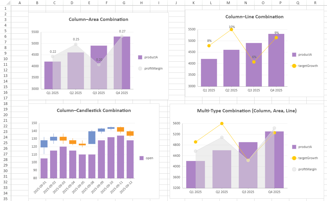
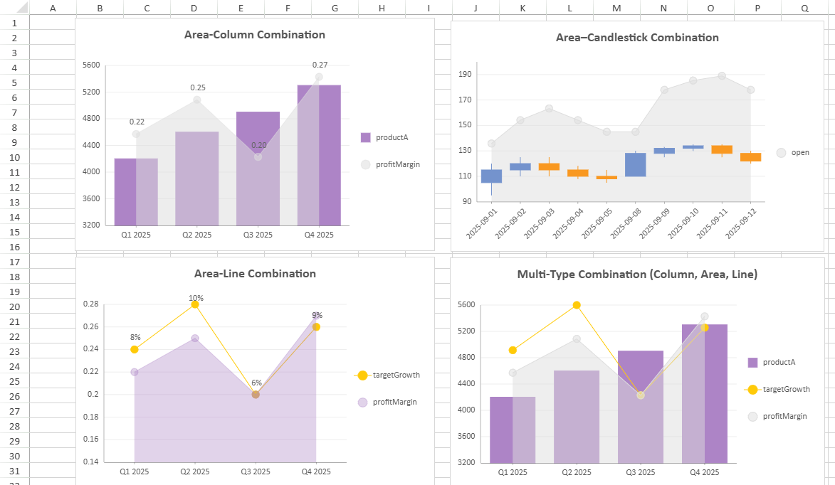
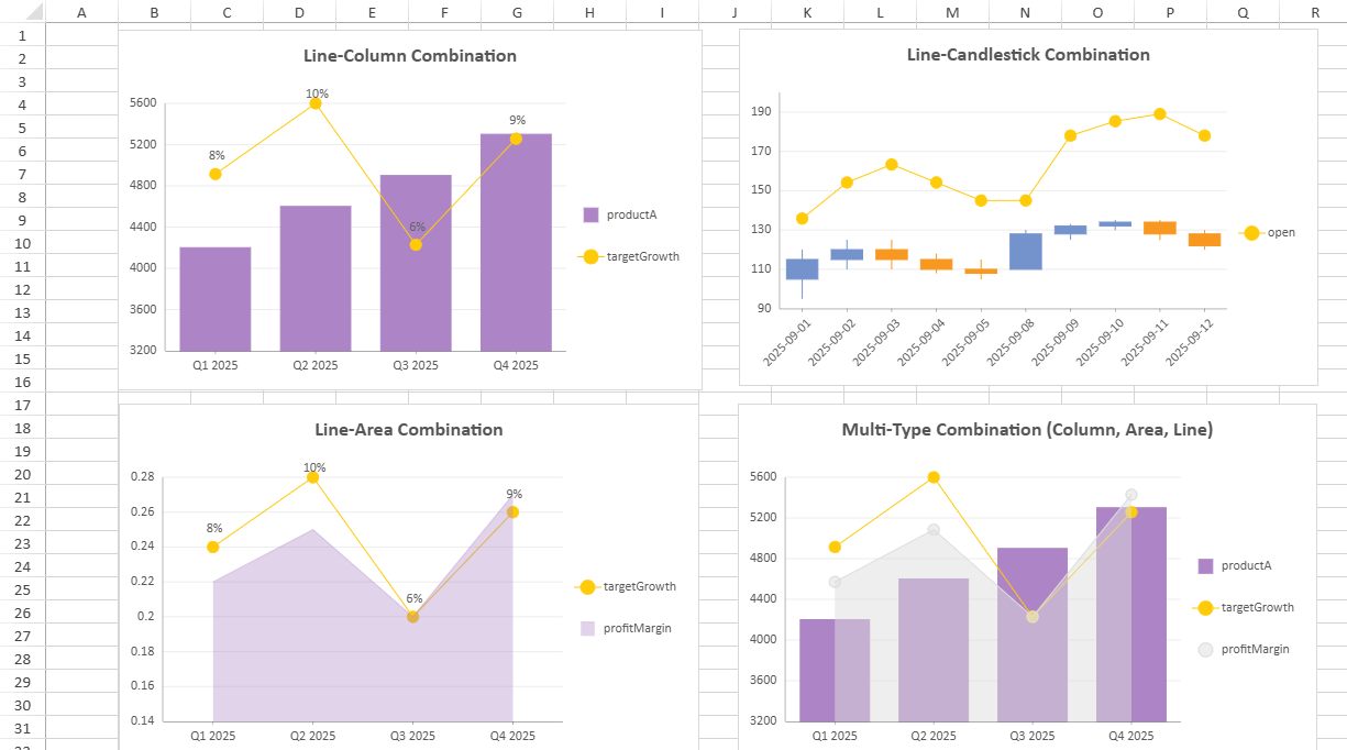
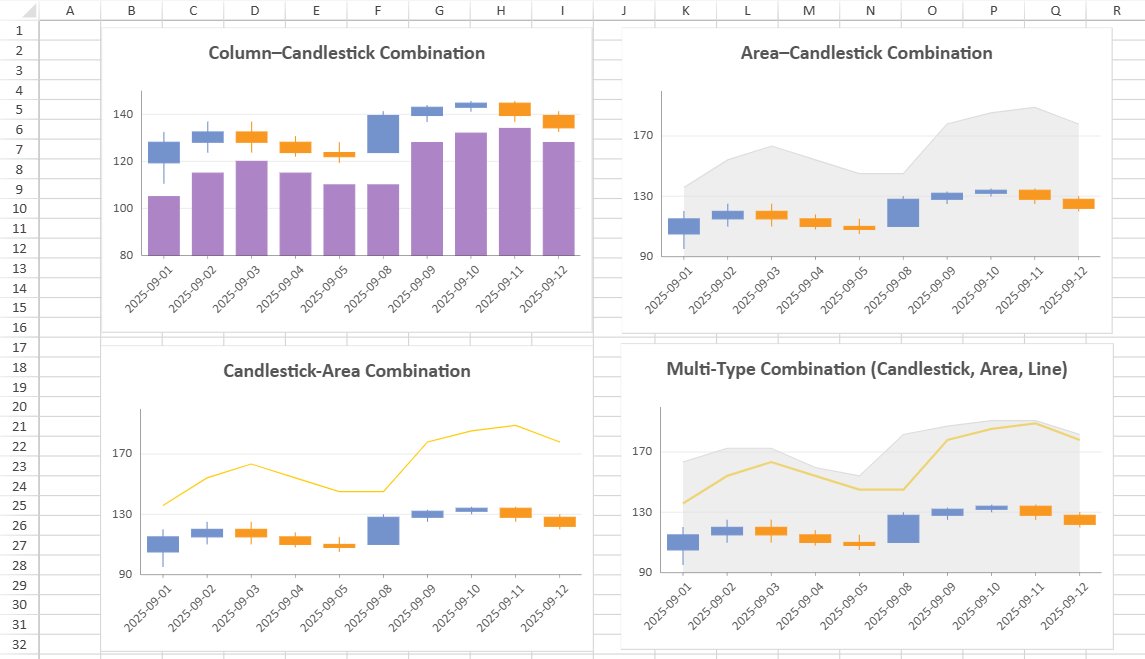
Combo Charts
The Combo Chart provides a flexible visualization tool that combines multiple chart types (e.g., column, line, area) into a single, unified chart. This allows users to represent and compare different types of data—such as quantities, trends, or percentages—within one graphical display.
Supported Chart Combinations
The following table lists which chart types can be combined in a single Combo Chart.
Primary Chart Type | Can Be Combined With | Example Combination(s) |
|---|---|---|
Column | Column, Area, Line, Candlestick, OHLC |
|
Bar | Bar | - |
Area | Column, Area, Line, Candlestick, OHLC |
|
Line | Column, Area, Line, Candlestick, OHLC |
|
Pie | - | - |
Radar | Radar | - |
Scatter | Scatter | - |
Treemap | - | - |
Funnel | - | - |
Waterfall | - | - |
Candlestick, OHLC | Column, Area, Line, Candlestick, OHLC |
|
Notes:
A Combo Chart supports a maximum of 4 subplots.
Some chart variations (for example, Range Column, Stacked Column and Percent Stacked Column) share the same combination rules.
Examples combining the same chart type are not listed here. For displaying multiple series of the same type, it’s generally better to use a chart with multiple value fields rather than a combo chart configuration.
Combo Chart Configuration
The table below summarizes property scope and synchronization behavior of Combo Chart.
Some settings are synchronized across all plots (marked as Common), while others can be customized independently per plot (marked as Independent).
Property | Scope | Notes |
|---|---|---|
Chart Name | Independent | Sets the unique chart name of the current plot. |
Chart Type | Independent | - |
Category | Common | All plots in a Combo Chart share the same category encoding field. |
Value | Independent | At least one is needed. |
Chart Style | Independent | - |
Data Labels | Independent | - |
Tool Tip | Independent | - |
Animation | Independent | - |
Legend | Independent | - |
Appearance | Common | Affects the overall Combo Chart background and border appearance. |
Title | Common | Shared chart title synchronized across all plots. |
Layout | Common | Controls the Combo Chart’s position, width, and height within the sheet. |
Category Axis | Common |
|
Value Axis | Independent/Common |
|
Notes:
Only one dataset can be used in a single Combo Chart.
All plots share the same category axis; category changes affect every plot.
Global appearance changes (appearance, title, layout, category axis) synchronize across plots.
Tips:
Overlapping visual layers may cause plotted lines or points to obscure columns. Adjust transparency or order as needed.
Use separate value axes when plots represent metrics with different scales to improve readability.
About Legend in Combo Chart
You can customize the legend for each plot individually, and the display order of legends follows the order in which the plots are created.
Note:
Only plots with valid legend bindings will produce visible legends.
// Example: plot1 and plot2 use independent legned settings.
{
  plotAreas: [{
    legends: [
      { type: "Color", position: "Bottom" }, // plot1
      { type: "Color", position: "Top" }     // plot2
    ]
  }]
}
About Value Axes in Combo Chart
A combo chart supports multiple value axes so that data series with different value ranges can be displayed within the same chart.
Axis Binding Rules
Each plot must be linked to at least one value axis.
Up to four axes (Y1–Y4) are available.
By default, all value fields share a common axis (Y1).
The binding order cannot be manually specified. Axes are automatically assigned in the sequence Y1 to Y4, which does not affect the chart output.
Unused axes remain hidden from the chart.
Axis Customization
Each axis can be configured independently.
The following examples illustrate how to configure shared and independent value axes in a combo chart.
// Example 1: plot1 and plot2 share the same value axis
{
axes: [{
plots: ["plot1", "plot2"],
type: "Y"
}]
}
// Example 2: plot1 and plot2 use independent value axes
{
axes: [{
plots: ["plot1"],
type: "Y"
}, {
plots: ["plot2"],
type: "Y"
}]
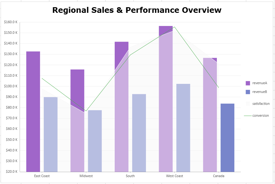
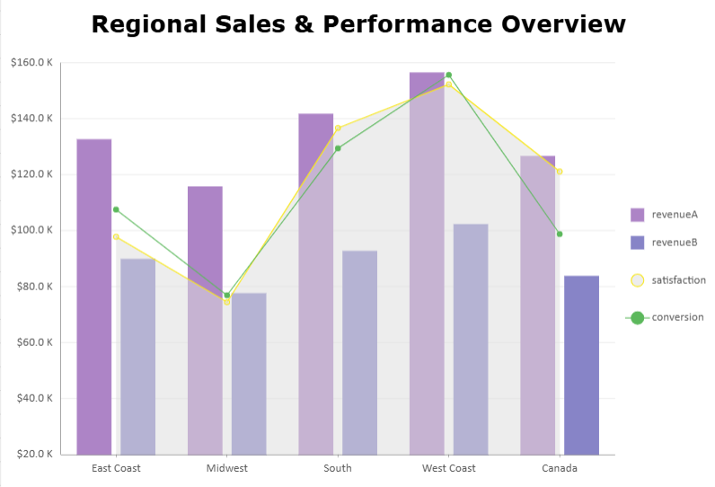
}Example: Three‑Plot Combo Chart
This combo chart combines a column plot with an area plot for customer satisfaction and a line plot for conversion rate.
It demonstrates how up to three plots can be visualized together, balancing both value‑based and percentage‑based metrics across regions.
const sheet = spread.getActiveSheet();
sheet.name("Combo Chart");
const dataManager = spread.dataManager();

function createSalesTable(dataManager) {
    return dataManager.addTable("Sales", {
        data: [
            {
                region: "East Coast",
                revenueA: 132489,
                revenueB: 89732,
                satisfaction: 0.84,
                conversion: 0.056
            },
            {
                region: "Midwest",
                revenueA: 115621,
                revenueB: 77484,
                satisfaction: 0.81,
                conversion: 0.049
            },
            {
                region: "South",
                revenueA: 141570,
                revenueB: 92596,
                satisfaction: 0.89,
                conversion: 0.061
            },
            {
                region: "West Coast",
                revenueA: 156343,
                revenueB: 102152,
                satisfaction: 0.91,
                conversion: 0.067
            },
            {
                region: "Canada",
                revenueA: 126481,
                revenueB: 83646,
                satisfaction: 0.87,
                conversion: 0.054
            }
        ],
    });
}

const SalesTable = createSalesTable(dataManager);
await SalesTable.fetch();

// Create combo data charts
const dataChart = sheet.dataCharts.add('data-chart', 10, 10, 600, 400);

dataChart.setChartConfig({
                tableName: 'Sales',
                plots: [{
                    name: "Product A & B Revenue",
                    type:  GC.Spread.Sheets.DataCharts.DataChartType.column,
                    encodings: {
                        values: [
                            {field: "revenueA"},
                            {field: "revenueB"}
                        ],
                        category: {
                            field: "region"
                        }
                    },
                    config: {
                        palette: ['#A066C9', '#7885CB']
                    }
                }, {
                    name: "Customer Satisfaction",
                    type: GC.Spread.Sheets.DataCharts.DataChartType.area,
                    encodings: {
                        values: [{
                            field: "satisfaction"
                        }]
                    },
                    config: {
                        palette: ['#F7F7F7']
                    }
                }, {
                    name: "Conversion Rate",
                    type: GC.Spread.Sheets.DataCharts.DataChartType.line,
                    encodings: {
                        values: [{
                            field: "conversion"
                        }]
                    },
                    config: {
                        palette: ['#4CAF50']          //#E5C103
                    }
                }],
                config: {
                    header: {
                        title: "Regional Sales & Performance Overview",
                        padding: {
                        left: 10,
                        right: 10,
                        top: 10,
                        bottom: 10,
                        },
                        textStyle: {
                            color: 'black',
                            fontSize: 24,
                            fontFamily: 'Verdana',
                            fontWeight: 'Bold'
                        }
                    },
                    plotAreas: [{
                        axes: [{
                            plots: ["Product A & B Revenue"],
                            type: GC.Spread.Sheets.DataCharts.AxisType.y,
                            format: {
                                type: GC.Spread.Sheets.DataCharts.FormatType.thousands,
                                value: "$0.0 K"
                            }
                    }, {
                            plots: ["Customer Satisfaction"],
                            type: GC.Spread.Sheets.DataCharts.AxisType.y,
                            position: GC.Spread.Sheets.DataCharts.AxisPosition.none
                    }, {
                            plots: ["Conversion Rate"],
                            type: GC.Spread.Sheets.DataCharts.AxisType.y,
                            position: GC.Spread.Sheets.DataCharts.AxisPosition.none
                    }]
                }]
                }
        });