Reflector Content
The C1Reflector control can hold text content, Silverlight controls, and DataTemplates as its content. The C1Reflector control will cast a reflection of the content.
Text Content
If you just wanted to reflect a short phrase, you would just set the Content property to a string. It would look similar to this:

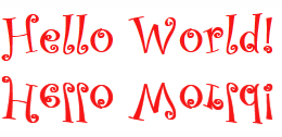
The example above is a little plain, but you can spruce up the text by setting just a few properties. You can change the font to a built-in Silverlight font (or add your own font to the project), change the font color, and customize the font size from the Properties panel in Blend. The image below uses a 36 point Curlz MT font in red.

For task-based help about how to add text content, see Adding Simple Text Content to the Reflector.
Control Content
Adding control content is just as simple. You can add controls to the C1Reflector control in Blend by selecting a control icon and then using a drag-and-drop operation to add it to the C1Reflector control 's container. If you prefer to use XAML, you just wrap the <c1ext:C1Reflector> tags around the control so that your markup looks as follows:
<c1ext:C1Reflector Width="400">
<c1datetime:C1TimeEditor Width="400"/>
</c1ext:C1Reflector>
The above XAML markup creates the following:

For task-based help about how to use controls with the C1Reflector control, see Adding a Control to the Reflector.
Adding Multiple Controls
Content property can only accept one control at a time. However, you can get around this limitation by adding a panel-based control as the C1Reflector control's child element. Panel-based controls, such as a StackPanel control, are able to hold multiple elements. The panel-based control meets the one control limitation of the C1Reflector control, but its ability to hold multiple elements will allow you to show several controls in the content area at the same time.


