
Decorator
The Gauge controls support visual elements called decorators, which are rendered relative to the gauge face. Decorators help visualize ranges, intervals, labels, and the current gauge value.
The following decorator types are supported:
GaugeRangeGaugeMarkGaugeLabelGaugePointer
All decorators are positioned relative to the gauge face and share common layout properties such as Location, Thickness, and Alignment.
Common Decorator Properties
All gauge decorators provide common properties for controlling positioning and layout.
Property | Description |
|---|---|
| Specifies the relative position of the decorator between the inner and outer edges of the gauge face. |
| Defines the relative size or width of the decorator. |
| Specifies whether the decorator is rendered inside, outside, or centered on the gauge scale. |
These properties allow you to precisely control decorator placement within the gauge.
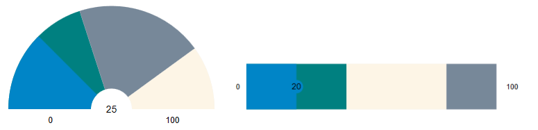
GaugeRange
You can add multiple ranges to a single gauge. Each range denotes a region or state, helping users quickly identify where the gauge's current value falls. The GaugeRange decorator represents a continuous value range on the gauge scale.
In a linear gauge, the range is rendered as a rectangle.
In a radial gauge, the range is rendered as a donut-shaped segment.
A range is defined using the following properties:
Property | Description |
|---|---|
| Specifies the starting value of the range. |
| Specifies the ending value of the range. |
If From equals the gauge Minimum value and To equals the Maximum value, the range spans the entire gauge face. If the Origin value is greater than Minimum, the range is rendered from Origin to Maximum.
Appearance
ShowRanges Property
The ShowRanges property determines whether gauge ranges are displayed.
Property Value | Behavior |
|---|---|
| Displays all defined ranges. The pointer color is derived from the active range color. |
| Hides all defined ranges. The range-pointer brush is taken from the underlying range. |
ShowRangePointer Property
The ShowRangePointer property controls the visibility of the default built-in range pointer. This pointer automatically tracks the gauge value and derives its color from the active range underneath it when ShowRanges is enabled.
Property Value | Behavior |
|---|---|
| Displays the default range pointer. Its color is derived from the active range. |
| Hides the default range pointer. |
Range Appearance Properties
Property | Description |
|---|---|
| Specifies the fill brush used to render the range. |
| Specifies the brush used to render the range border. |
| Specifies the thickness of the range border. |
Example
   <c1:C1LinearGauge x:Name="gaugeTrue"
                     Value="10"
                     ShowRanges="True"
                     Height="80">
       <c1:C1LinearGauge.Ranges>
           <c1:GaugeRange From="0" To="40" Brush="purple"/>
           <c1:GaugeRange From="40" To="80" Brush="Orange"/>
           <c1:GaugeRange From="80" To="100" Brush="Red"/>
       </c1:C1LinearGauge.Ranges>
   </c1:C1LinearGauge>
For detailed information about GaugeRange configuration and appearance settings, see Range.
GaugeMark
The GaugeMark decorator renders tick marks along the gauge scale.
Marks are displayed at intervals specified by the Interval property relative to the Origin property. By default, marks are rendered as lines.
Key Properties
Range and Interval
Property | Description |
|---|---|
| Specifies the starting value for rendering marks. If not set, the gauge minimum value is used. |
| Specifies the ending value for rendering marks. If not set, the gauge maximum value is used. |
| Specifies the spacing between marks on the gauge scale. |
Positioning
Property | Description |
|---|---|
| Specifies the position of marks relative to the gauge face. |
| Specifies an absolute position for marks instead of using |
| Specifies whether marks are rendered inside, outside, or centered on the gauge axis. |
Appearance
Property | Description |
|---|---|
| Specifies the relative length of the marks. |
| Specifies the mark thickness independently of the gauge thickness. |
| Specifies the brush used to render the marks. |
| Specifies the brush used to render the mark border. |
| Specifies the thickness of the mark border. |
| Specifies the width of the mark line. |
| Specifies the transparency level of the marks. |
SVG Customization
You can use SVG files to render custom mark shapes such as dots, lines, or icons.
Property | Description |
|---|---|
| Specifies the URI of the SVG file used to render custom marks. |
| Specifies the starting point in SVG coordinate space. |
| Specifies the ending point in SVG coordinate space. |
Example
<c1:GaugeMark From="0" To="100" Interval="10" Thickness="0.05"/><c1:GaugeMark Interval="10" StrokeThickness="2.5" Thickness=".12" />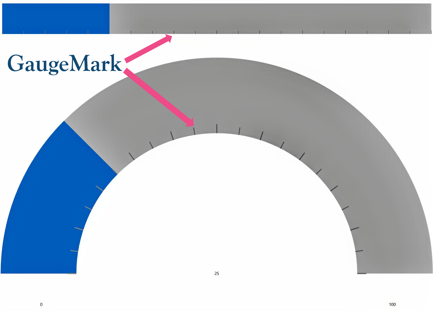
GaugeLabel
The GaugeLabel decorator displays text labels along the gauge scale. Labels are rendered at intervals specified by the Interval property.
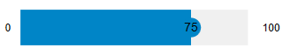
Values can also be displayed as text labels in the gauge using the GaugeTextVisibility enum on the parent gauge control, which supports the following values:
Values | Snapshot |
|---|---|
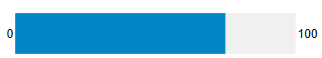
All: Show the gauge's value, min, and max as text labels. |
|
MinMax: Show the gauge's min and max values as text labels. |
|
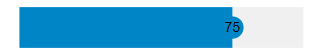
Value: Show the gauge's value as text label. |
|
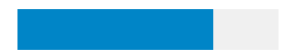
None: Do not show any text label in the gauge. |
|
Key Properties
Range and Interval
Property | Description |
|---|---|
| Specifies the starting value for rendering labels. If not set, the gauge minimum value is used. |
| Specifies the ending value for rendering labels. If not set, the gauge maximum value is used. |
| Specifies the spacing between labels on the gauge scale. |
Positioning
Property | Description |
|---|---|
| Specifies the position of labels relative to the gauge face. |
| Specifies an absolute position for labels instead of using |
| Specifies whether labels are rendered inside, outside, or centered on the gauge axis. |
Appearance
Property | Description |
|---|---|
| Specifies the space allocated for rendering labels. |
| Specifies the label thickness independently of the gauge thickness. |
| Specifies the brush used to render label text. |
Text Formatting
Property | Description |
|---|---|
| Applies a format string to label values. |
| Converts numeric values into custom display text. |
Behavior
Property | Description |
|---|---|
| Specifies whether labels scale to fit the available space. |
| Specifies whether labels rotate according to the gauge angle |
Font Properties
The following properties control the appearance of label text.
Note: When
<span data-loadable-vc-wrapper="true" data-ssr-placeholder-replace="Hm6N8:EfLS5:z8NN7:qz-Pe:OP-5u-0">IsScaled</span>is<span data-loadable-vc-wrapper="true" data-ssr-placeholder-replace="Hm6N8:EfLS5:z8NN7:qz-Pe:OP-5u-0">true</span>,<span data-loadable-vc-wrapper="true" data-ssr-placeholder-replace="Hm6N8:EfLS5:z8NN7:qz-Pe:OP-5u-0">FontSize</span>won't have any apparent effect as the label size is determined by the available space.
Property | Description |
|---|---|
| Specifies the font size of the label text. |
| Specifies the font family used for the label text. |
| Specifies the font style, such as |
| Specifies the font weight, such as |
Example
<c1:GaugeLabel Interval="20" FontSize="16" FontFamily="Times New Roman" FontStyle="Italic" FontWeight="Normal" />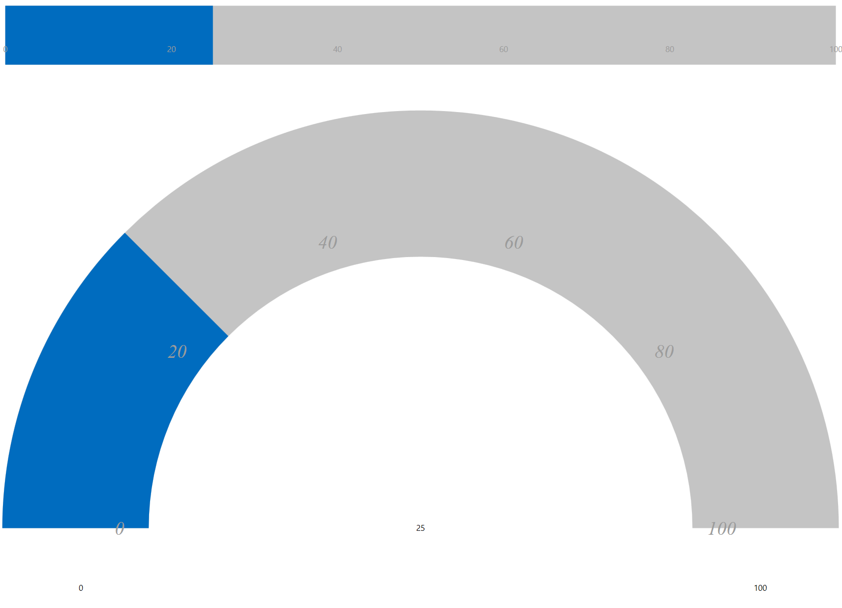
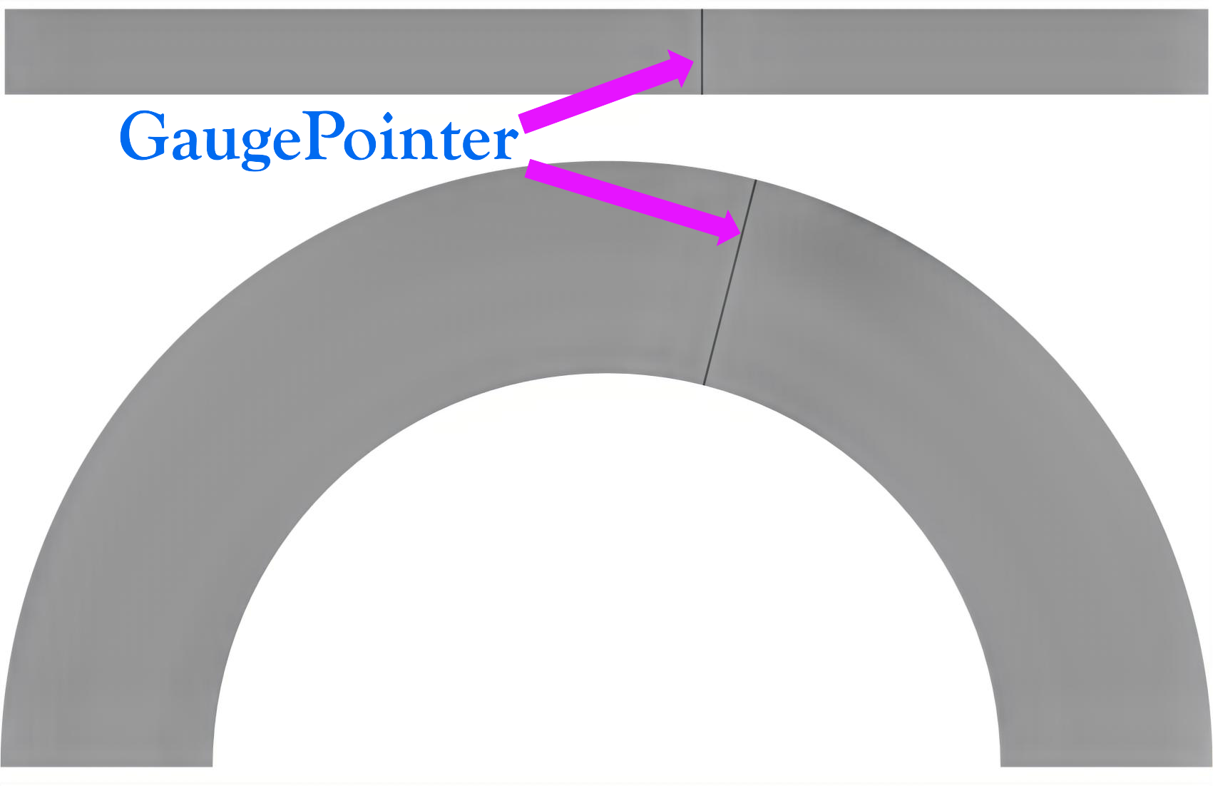
GaugePointer
The GaugePointer decorator is an indicator that represents the gauge's current value. The pointer points to a value along the linear or radial scale, and updates dynamically as the gauge value changes, making it useful for real-time data visualization.
The pointer position is determined by the Value property of the parent gauge. By default, the pointer is rendered as a line.
Key Properties
Value and Behavior
Property | Description |
|---|---|
| Specifies the current gauge value and determines the pointer position. This property is defined on the parent gauge. |
Appearance
Property | Description |
|---|---|
| Specifies the width of the pointer. |
| Specifies the brush used to render the pointer. |
| Specifies the brush used to render the pointer border. |
| Specifies the thickness of the pointer border. |
SVG Customization
Property | Description |
|---|---|
| Specifies the SVG file used to render a custom pointer. |
| Specifies the starting point in SVG coordinate space. |
| Specifies the ending point in SVG coordinate space. |
Example
<c1:C1RadialGauge Value="50">
    <c1:GaugePointer Thickness="0.6"/>
</c1:C1RadialGauge><c1:C1RadialGauge Thickness="0.6"/>