


- TrueDBGrid For WinForms
- True DBGrid Versus FlexGrid
- Key Features
- QuickStart
- Working with Objects and Collection
- Design Time
- Data Binding
- Columns
- Rows
- Cells
- Scrollbar
- Selection
- Split Presentation
- Sort
- Filter
- Merge
- Group
- Translate
- Incremental Search
- Views
- Export
- End User Interaction
- Customization
- RTL Support
- Appearance and Styling
- Best Practices
Built-In Named Styles
When a grid is first created, it has a collection of built-in named styles that control various aspects of its display. For example, the Heading style determines the attributes used to display column headers. At design time, change the appearance of the grid as a whole by modifying the built-in named styles in the C1TrueDBGrid Styles Editor. At run time, the GridStyleCollection provides access to the same set of named styles. Initially, all grids contain ten built-in styles, which control the display of the following grid elements:
Element | Description |
|---|---|
Caption | Grid and split caption bars. |
Editor | Cell editor within grid. |
EvenRow | Data cells in even numbered rows. |
Filter Bar | Data in the filter bar columns. |
Footer | Column footers. |
Group | Group columns in grid grouping area. |
Heading | Column headers. |
HighlightRow | Data cells in highlighted rows. |
Inactive | Column headings when another column has focus. |
Normal | Data cells in unselected, unhighlighted rows. |
OddRow | Data cells in odd numbered rows. |
Record Selector | Data in the record selector column. |
Selected | Data cells in selected rows. |
A selected row is one whose bookmark has been added to the SelectedRowCollection, either in code or through user interaction. The term highlighted row refers to the current row when the MarqueeStyle property is set to MarqueeEnum.HighlightRow or MarqueeEnum.HighlightRowRaiseCell.
The EvenRow and OddRow styles are used only when the AlternatingRows property is set to True.
Named Style Defaults
As in Microsoft Word, a Style object in True DBGrid can inherit its characteristics from another style, referred to as the parent style. For a newly created grid, the Normal style is the parent (or grandparent) of all named styles. Its default properties are as follows:
Property | Setting |
|---|---|
255 | |
System.Drawing.Color.White | |
System.Drawing.Color.White | |
None | |
BackgroundPictureDrawModeEnum.Stretch | |
Microsoft Sans Serif, 8.25pt | |
System.Drawing.Color.Black | |
None | |
ForegroundPicturePositionEnum.LeftOfText | |
False | |
None | |
AlignHorzEnum.General | |
False | |
0, 0, 0, 0 | |
Character | |
AlignVertEnum.Top | |
WrapText | False |
The Heading and Footing styles are defined similarly. Each inherits from the Normal style, and each overrides the following properties:
Property | Setting |
|---|---|
System.Drawing.SystemColors.Control | |
System.Drawing.Color.Black | |
AlignVertEnum.Center |
The Heading style overrides one additional property that the Footing style does not:
Property | Setting |
|---|---|
WrapText | True |
The Selected style also inherits from Normal and overrides two color properties:
Property | Setting |
|---|---|
System.Drawing.SystemColors.Highlight | |
System.Drawing.SystemColors.HighlightText |
The same is True of the HighlightRow style, which uses the inverse of the color settings for the default Normal style:
Property | Setting |
|---|---|
System.Drawing.SystemColors.Text | |
System.Drawing.SystemColors.HighlightText |
The EvenRow, OddRow, and FilterBar styles inherit from Normal, but only the EvenRow style overrides any properties:
Property | Setting |
|---|---|
System.Drawing.Color.Aqua |
The only styles that do not inherit directly from Normal are the Caption and RecordSelector styles, which inherit from the Heading style. The reason that grid and split captions are centered by default is that the Caption style specifies the following property:
Property | Setting |
|---|---|
AlignHorzEnum.Center |
Named Style Inheritance
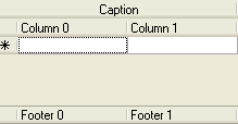
To see how named style inheritance works, place a grid on a form and set the Caption property of the grid and its default columns. Set the FooterText property of the default columns and set the ColumnFooters property of the grid to True. The grid should look something like this.
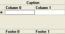
In the C1TrueDBGrid Style Editor, select Normal from the left pane and expand the Font node. Set the Bold property to True. Note that the column headers, column footers, and grid caption are all bold, since all built-in styles inherit from the Normal style or one of its children.
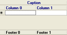
Next, select Heading from the left pane, and in the right pane select the ForeColor property. Click the Web tab, and then select Navy. Note that the text color of both the column headers and the grid's caption bar is now white, since the Caption style inherits its color properties from the Heading style. The column footers remain the same because the Footer style inherits from the Normal style, not the Heading style.
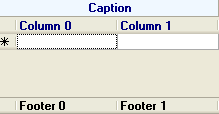
Finally, select Caption from the left pane and in the right pane select its BackColor property. Click the Web tab, and then select AliceBlue. Note that the background color of the column headers is not changed, and that the Caption style continues to inherit its text color from its parent style, Heading.
Modified Named Styles
Change the appearance of the overall grid at design time by using .NET’s collection editors to modify the GridStyleCollection. For example, to force all column headers to center their caption text, change the HorizontalAlignment property of the built-in Heading style to AlignHorzEnum.Center.
However, it is not necessary to use the C1TrueDBGrid Style Editor or manipulate named members of the GridStyleCollection in code, as the grid and its component objects expose several properties that return Style objects. As the next section describes, the appearance of the grid can be fine-tuned by manipulating these objects directly. For more information see Using the C1TrueDBGrid Style Editor.