NavBar Button Styles
The C1NavBar consists of vertically stacked pre-set buttons or custom buttons. The preset buttons include the following: Custom, Mail, Calendar, Contacts, Tasks, Notes, Folder, Shortcut, and Journal. Each preset button has an image and text. By default the image appears to the left of the text. You can display images of buttons horizontally in the button strip at the bottom of the C1NavBar. If you plan to display many buttons on the button strip it’s a good idea to increase the height of it. You can use the StripHeight property to increase the height of the button strip. The default height for the button strip is 30 pixels.
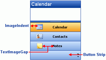
C1NavBar provides several appearance properties to customize the style of the buttons. The following image illustrates the ImageIndent and TextImageGap properties

Button Text and Image Layout
You can configure the layout of the text and image for each button to get the desired appearance through the ImageIndent and TextImageGap properties. If you would like to increase the indent of the image you can use the ImageIndent property. If you would like more space between the image and the text then you can use the TextImageGap property to increase the pixel width. By default, the ImageIndent property is 6 pixels and the TextImageGap is 3 pixels.


