


- List for WinForms Overview
- Key Features
- Design-Time Support
- Quick Start
- Data Binding
- List Items
- Data Views
- Data Presentation
- Format
- Split Presentation
- Search
- Sort
- Navigation
- Scroll Bar
- Selection
- Virtualization
- Display Images
- ToolTips
- Bookmarks
- Export, Import, and Print
- Customization
- Styling and Appearance
- Integration with C1Combo
Using the C1List Designer
C1List Designer provides various options which can be used to configure the list's behavior and appearance. Besides, it also lets you preview the appearance of the list.
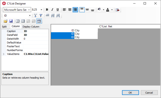
There are three ways in which you can access the C1List Designer at design time as described below.
Using Smart Tag: Click the smart tag icon(
 ) in the upper right corner of the list and select Designer... from the C1List Tasks smart tag panel.
Using Properties Window: Select the list, go to the Properties window and click the ellipsis button (…) next to the Columns property.
Using Context Menu: Right-click the list and select Design.. from the context menu.
List Designer Elements
C1List Designer allows list fields to be set up easily at design time instead of having to write the code. In the C1List Designer, the right pane displays the list fields and the left pane displays three tabs, namely, Split, Column, and Display Column. The Split tab provides various properties for changing the settings of each split. The Column tab allows you to set various column-specific properties and provides access to Value Collection Editor. The Display Column tab enables you to configure columns in a split. Besides these, the designer also provides toolbars which are discussed in the following sections.
Tabs
The C1List Designer contains three tabs namely, Split, Column, and Display Column which provides various options to customize splits, columns, and display columns, respectively.
Split Tab
The Split tab provides access to most of properties specific to a Split. In List, splits can be created to present data in multiple horizontal or vertical panes.
The following SplitCollection object properties are available in the C1List Designer's Split tab:
Property | Description |
|---|---|
Gets or sets a value indicating the ability to move columns. | |
Gets or sets a value indicating the ability to select columns. | |
Gets or sets a value indicating whether the split can receive focus. | |
Gets or sets a value indicating whether a user is allowed to resize horizontal splits. | |
Gets or sets how interactive row resizing is performed. | |
Gets or sets a value indicating whether a user is allowed to resize vertical splits. | |
Gets or sets a value indicating whether the split uses the OddRowStyle for odd-numbered rows and EvenRowStyle for even-numbered rows. | |
Gets or sets the caption. | |
Gets or sets the height of the caption. | |
Gets or sets the height of the column captions. | |
Gets or sets the height of column footers. | |
Gets a collection of C1DisplayColumn objects. | |
Gets or sets the Style object that controls the appearance of an even-numbered row when using AlternatingRows. | |
Gets or sets a value that determines how the last column will extend to fill the dead area of the split. | |
Gets or sets a value indicating whether the FetchRowStyle event will be raised. | |
Gets or sets the Style object that controls the appearance of column footers. | |
Gets a collection of C1DisplayColumn objects. | |
Gets or sets the Style object that controls the appearance of the list's column headers. | |
Gets or sets the Style object that controls the current row/cell when the MarqueeStyle is set to Highlight Row/Cell. | |
Gets or sets the group which synchronizes horizontal scrolling between splits. | |
Gets the HBar object that controls the appearance of the horizontal scrollbar. | |
Gets or sets the name of a split. | |
Gets or sets the Style object that controls the appearance of an odd-numbered row when using AlternatingRows. | |
Gets or sets the Style object that controls the appearance of the RecordSelectors. | |
Gets or sets the Style object that controls the appearance of selected rows and columns. | |
Gets or sets the size of a split. | |
Gets or sets a value indicating how the SplitSize property is used to determine the actual size of a split. | |
Gets or sets the root Style object for the Split. | |
Gets or sets the group which synchronizes vertical scrolling between splits. | |
Gets the VBar object that controls the appearance of the vertical scrollbar. |
Column Tab
The following column-specific properties are available in the C1List Designer of the Column tab:
Property | Description |
|---|---|
Gets or sets the text in the column header. | |
Gets or sets the database field name for a column. | |
Gets or sets the maximum number of characters which may be entered for cells in this column. | |
Gets or sets the default value for a column when a new row is added by the list. | |
Gets or sets the text displayed in the column footer. | |
Gets or sets the formatting string for a column. | |
Gets the ValueItems object for this column. |
Display Column Tab
The following display column properties are available in the C1List Designer in the Display Column tab:
Property | Description |
|---|---|
Gets or sets a value indicating whether column resizing is allowed. | |
Gets or sets a value indicating whether a column footer will act like a button. | |
Gets or sets a value indicating whether a column header will act like a button. | |
Gets or sets the style of the border drawn between columns. | |
Gets or sets a value indicating whether the FetchCellStyle event will be raised for a column. | |
Gets or sets a value indicating whether to display the column divider in the footer area. | |
Gets or sets the Style object that controls the appearance of column footers. | |
Gets or sets a value indicating whether to display the column divider in the header area. | |
Gets or sets the Style that controls the appearance of the column headers. | |
Gets or sets the height of the column. | |
Gets or sets the minimum width a column can be resized to when in SpringMode. | |
Gets the caption of the associated C1DataColumn objects. | |
Gets or sets a value indicating whether cells in this column are drawn by the user in the OwnerDrawCell event. | |
Gets or sets the root Style for this column. | |
Gets or sets a value indicating the visibility of a column. | |
Gets or sets the width of a column. |
Toolbars
The C1List Designer provides three toolbars that can be used to customize the list's content and appearance as discussed in the following sections.
Formatting Toolbar
The Formatting toolbar allows you to quickly customize the appearance of the column content, including text, alignment, and color.

The following table provides a brief description of the options provided by the Formatting toolbar:
Command Button Name | Command Button | Description |
|---|---|---|
Font |
| The drop-down allows youto choose the font. |
Font Size |
| Sets the font size. |
Bold |
| Select the Bold button to bold the text in the chosen column. |
Italic |
| Select the Italic button to italicize the text in the chosen column. |
Underline |
| Underlines the text in the chosen column. |
Align Left |
| Horizontally aligns the chosen column to the left of the cell. |
Horizontally Center |
| Horizontally aligns the content of the chosen column to the center of the cell. |
Align Right |
| Horizontally aligns the content of the chosen column to the right of the cell. |
Align Top |
| Vertically aligns the content of the chosen column to the top of the cell. |
Vertically Center |
| Vertically aligns the content of the chosen column to the center of the cell. |
Align Bottom |
| Vertically aligns the content of the chosen column to the bottom of the cell. |
Set Background Color |
| Sets the background color of the cells in the chosen column. |
Set Foreground Color |
| Sets the foreground color of the cells in the chosen column. |
Apply to Header when Checked |
| Applies formatting changes to the header, and not the body cells, of the chosen column. |



Layout Toolbar
The Layout toolbar allows you to quickly customize the list's layout by showing splits, column headers, and much more. Besides these, it also allows you to load and save layouts.

The Layout toolbar consists of the following commands:
Command Button Name | Command Button | Description |
|---|---|---|
Load Layout |
| Loads a previously saved list layout. |
Save Layout |
| Saves the current list layout to a file. |
Insert Horizontal Split |
| Inserts a horizontal split at the current selected place in the list. |
Insert Vertical Split |
| Inserts a vertical split at the current selected place in the list. |
Delete Horizontal |
| Deletes the selected horizontal split. |
Delete Vertical |
| Deletes the selected Vertical split. |
Column Headers |
| Shows column headers in the list. By, default this is selected. |


Columns Toolbar
The Columns toolbar allows you to quickly add and delete columns, and change column width.

The Columns toolbar consists of the following commands:
Command Button Name | Command Button | Description |
|---|---|---|
Column |
| This drop-down list allows you to select the column you wish to view or modify. |
Insert Column |
| Inserts a new column at the current location. |
Remove Column |
| Deletes the currently selected column. |
Make all columns the same width |
| Makes all columns of the same width. |
Increase column width |
| Increases the width of the selected column. |
Decrease column width |
| Decreases the width of the selected column. |



Note: WinForms .NET Edition does not include rich design-time support yet. We will enhance it in future releases.