- List for WinForms Overview
- Key Features
- Design-Time Support
- Quick Start
- Data Binding
- List Items
- Data Views
- Data Presentation
- Format
- Split Presentation
- Search
- Sort
- Navigation
- Scroll Bar
- Selection
- Virtualization
- Display Images
- ToolTips
- Bookmarks
- Export, Import, and Print
- Customization
- Styling and Appearance
- Integration with C1Combo
Collection Editors
Apart from the tasks smart tag panels, List also provides various editors that can help you set a number of properties related to list, its fields and their styles.
Let us now discuss about the various collection editors provided by the List control.
Split Collection Editor
The Split Collection Editor provides access to most of the grid's display properties and properties specific to a Split. It can be accessed by clicking on the ellipsis button (...) next to the Splits property in the Properties window.
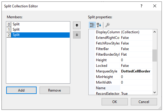
In the Split Collection Editor window, the right pane displays properties like AllowRowSizing, Caption, Name, etc for each split. The left pane displays a list of splits along with Add and Remove buttons which can be used to add and remove splits, respectively.
type=note
Note: In .NET Framework Edition, the Split Collection Editor does not contain buttons to add and delete Splits. So, you can add or remove splits by using the C1List Designer. For more information, see C1List Designer.
ValueItem Collection Editor
The ValueItem Collection is a collection of values and display values which enables data translation within a column.
To access the ValueItem Collection Editor through the Properties window, follow the given steps:
- In the Properties window, navigate to the Columns property and click the ellipsis button (...) next to it to open the C1DataColumn Collection Editor (in .NET Edition) or the C1List Designer (in .NET Framework Edition).
- Expand the ValueItems node to expose the ValueItems Collection items.
- Navigate to the Values property and click the ellipsis button (...) next to it to open the ValueItem Collection Editor.
The ValueItem Collection Editor appears as follows:
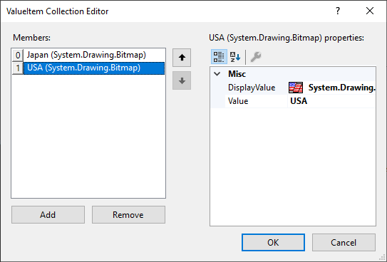
In the ValueItem Collection Editor window, the right pane displays properties like DisplayValue and Value for each member of the Value Collection. The left pane displays the list of values along with Add and Remove buttons which can be used to add and remove values, respectively.
C1DisplayColumn Collection Editor
The C1DisplayColumnCollection is a collection of the column properties which can be used to set color, font, heading style and so on.
To access the C1DisplayColumnCollection Editor, follow these steps:
- In the Properties window, navigate to the Splits property and click the ellipsis button (...) next to it to open the Split Collection Editor.
- In the Split Collection Editor, navigate to the DisplayColumns property and click the ellipsis button (...) next to it to open the C1DisplayColumn Collection Editor.
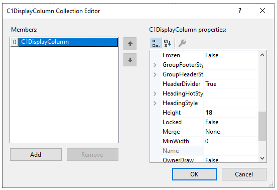
In the C1DisplayColumn Collection Editor window, the right pane displays properties like AllowSizing, HeadingStyle, FooterStyle, etc for each display column. The left pane displays the list of columns along with Add and Remove buttons, which can be used to add and remove display columns, respectively.
type=note
Note: In the .NET Framework Edition, the C1DisplayColumnCollection Editor does not contain buttons to add and delete columns. So, you can add or remove columns by using the C1List Designer. For more information, see C1List Designer.
C1DataColumn Collection Editor
The DataColumnCollection represents collection of columns that defines the data source. The DataColumn Collection Editor can be accessed by clicking on the ellipsis button next to the Columns property in the Properties window.
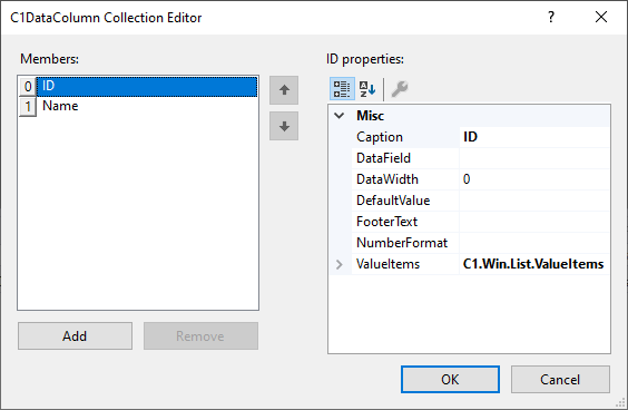
In the C1DataColumn Collection Editor window, the right pane displays properties like Caption, DataField, and FooterText, FooterStyle, etc for each column. The left pane displays the list of columns along with Add, and Remove buttons, which can be used to add and remove columns, respectively.
type=note
Note: In .NET Framework Edition, the DataColumn properties can be accessed via the C1List Designer, as the C1DataColumn Collection Editor is not available. For more information, see C1List Designer.
Style Collection Editor
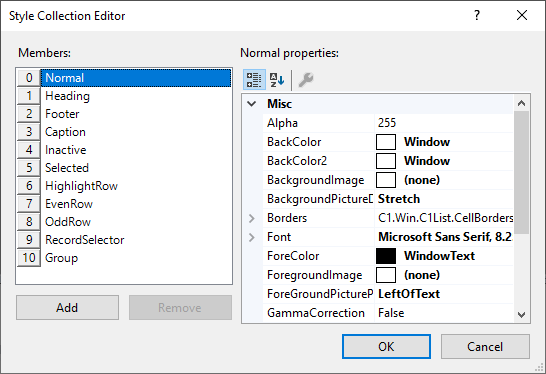
The Style Collection Editor lets you style the list at design time by customizing the built-in styles. It offers a list of styles for specific types of cell on left side and a property window on right side to customize these styles. Towards the bottom, there are Add and Remove buttons to add and delete the custom styles.
To access the Style Collection Editor, select the list, go to the Properties window and click the ellipsis button (…) next to the Styles property. The Style Collection Editor appears as the follows:
Caption Style Editor
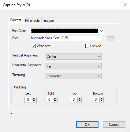
The Caption Style editor allows you to set styling related properties of the column header cell and its text. The editor comprises of three tabs, Content, Fill Effects, and Images for customizing various aspects of the header cells. The Content tab provides various options to customize the font styles. The Fill Effects tab lets you set the border and background color and the Images tab lets you display an image.
To access the Caption Style editor, click the smart tag icon of the List control, and select Column Tasks from the C1List Tasks smart tag panel, and then, select Caption Style... option.
Column Style Edior
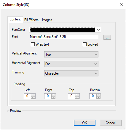
Similar to Caption Style editor, List provides another editor, the Column Style editor for styling the column text. The Column Style editor has the same options as that of Caption Style editor. The only difference is that Caption Style editor customizes the column header text while the Column Style editor works on the general text in the column cells.
To access the Column Style editor, click smart tag icon of the List control and select Column Tasks from the C1List Tasks smart tag panel, and then, select Column Style... option.
type=note
Note: WinForms .NET Edition does not include rich design-time support yet. We will enhance it in future releases.


