InputGridPanel Layout
The InputPanel control provides an InputGridPanel which allows you to arrange the child controls in a grid containing rows and columns. Similar to the InputFlowPanel, InputGridPanel is a layout manager which arranges the child components automatically so that they are not overlapped or misaligned while resizing. The grid containing rows and columns appears like cells which can contain any form items, can have different sizes and can even be merged together.
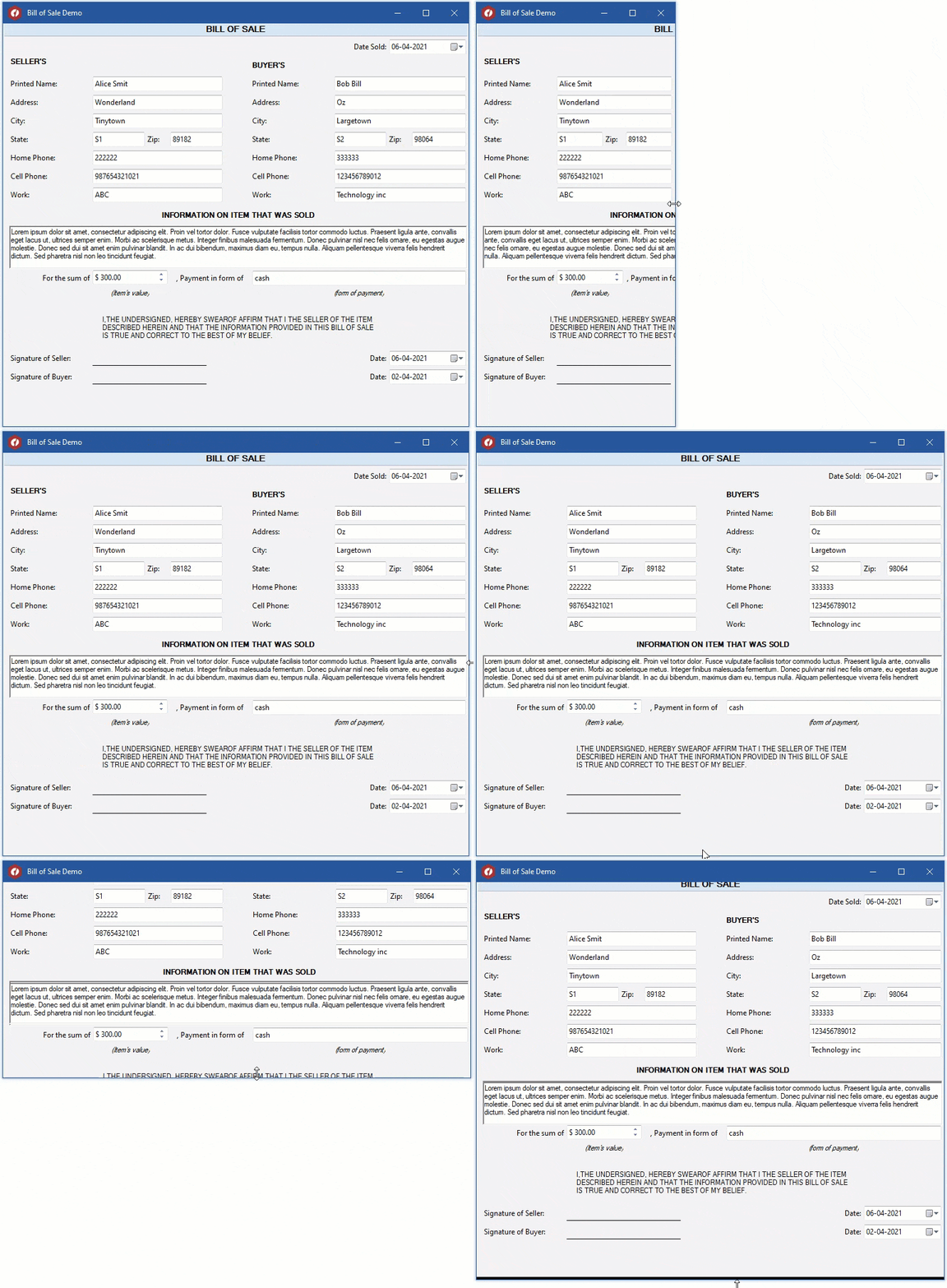
The below gif shows a sales bill created by using an InputGridPanel inside an InputPanel control. The form items like labels and textbox are added in the grid and as can be seen, the resize action does not distorts the form layout.
Add InputGridPanel Layout
The following section describes how to add InputGridPanel to a Windows form in .NET 4.5.2 and .NET 5 applications.
.NET Framework
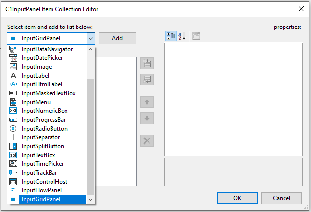
You can add the InputGridPanel layout to a Windows form by using the collection editor of C1InputPanel. The C1InputPanel Item Collection Editor can be launched by selecting the C1InputPanel on the Form and then clicking the ellipsis next to Items in the Properties window.
type=note
Note: Alternatively, you can also add InputGridPanel layout using the glyph feature in InputPanel designer, which when clicked opens a toolbox of components to be added to the panel.
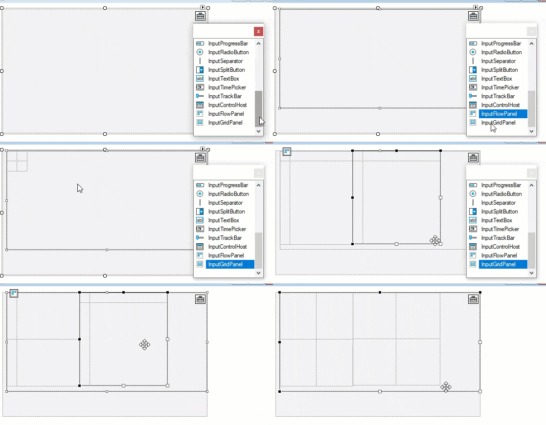
So, you can add components to the InputPanel at design time using the glyph feature. You can drag and drop grid panel within the flow panel, and vice-versa. Learn more about this feature in the Design-Time support.
.NET
You can add the InputGridPanel layout to a Windows form by using the collection editor of C1InputPanel. The InputComponent Collection Editor can be launched by selecting the C1InputPanel on the Form and then clicking the ellipsis next to Items in the Properties window.
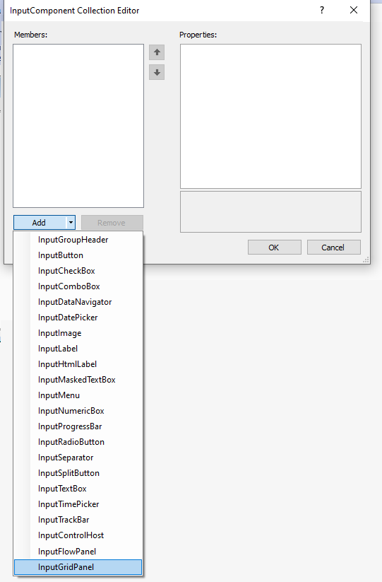
Add Items to InputGridPanel Layout
The following section describes how to add items to InputGridPanel layout in .NET 4.5.2 and .NET 5 applications.
.NET Framework
You can add, remove or edit items in the InputGridPanel layout by using the collection editor at design-time. The InputGridPanel Item Collection Editor can be launched by selecting the InputGridPanel layout on the Form and then clicking the ellipsis next to Items in the Properties window.
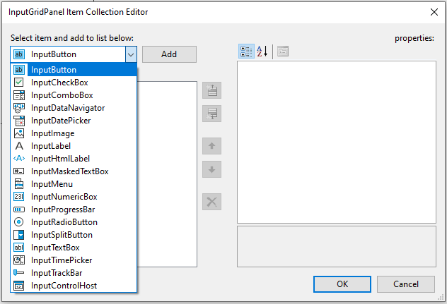
.NET
You can add, remove or edit items in the InputGridPanel layout by using the collection editor at design-time. The InputComponent Collection Editor can be launched by selecting the InputGridPanel layout on the Form and then clicking the ellipsis next to Items in the Properties window.
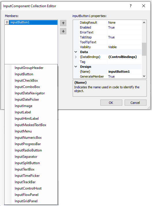
Now, that you have added different components to the GridPanel, you can also data-bind each component with the required data. This can be done via data-source at design time or programmatically. To learn more about binding InputPanel with data, refer the DataBinding topic.
Row and Column Indices
The Row Index indicates the current row an item has occupied within the grid. Likewise, the column Index indicates the current column an item has occupied within the same grid. The GridPanel provides a grid like UI to add and arrange child controls within it.
For example, let's say you want to arrange the datepicker component on the GridPanel. You can use the row index as well as column index properties of the component and change their values to see how the datepicker moves from one cell to the other.
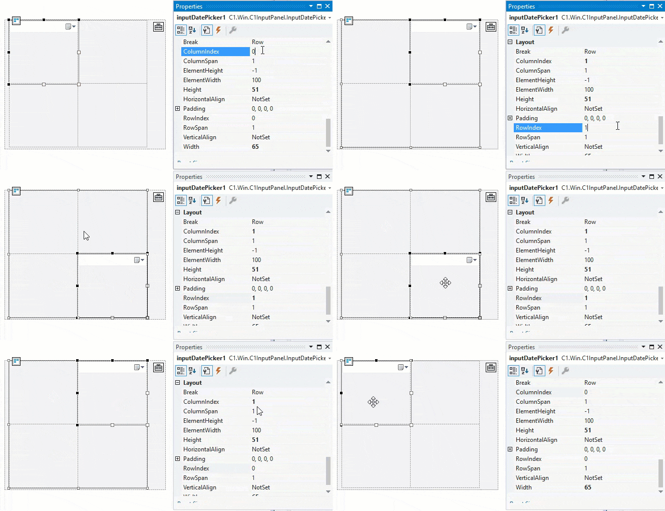
You can set these properties via the Properties window at design-time, or configure them via code.
// set row and column indices
inputDatePicker1.RowIndex = 1;
inputDatePicker1.ColumnIndex = 0;
RowSpan and ColumnSpan
Row span is the feature used in the cells of grid panel to merge rows, that is to combine two or more rows. Column span is the attribute used in grid cells within the panel to merge columns.
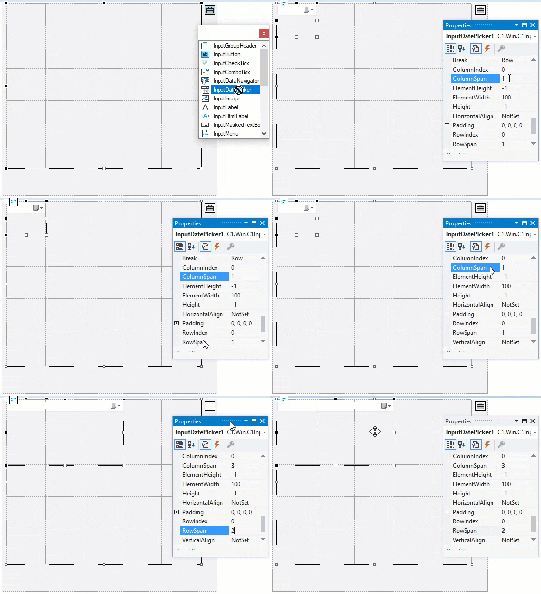
The number of rows spanned by the child component in the grid panel is specified by the numerical value ascribed to the RowSpan property. Let's say if your child component in the grid panel spans two rows, it means it will take up the space of two rows in that panel. RowSpan lets the child component to span the height of more than one row. Likewise, the number of columns spanned by the child component in the grid panel is specified by the numerical value ascribed to ColumnSpan property. It lets the child component in the grid panel to span the width of more than one column.
Both RowSpan and ColumnSpan properties can be configured via the Properties window at design time or programmatically:
// set row and column indices
inputDatePicker1.RowSpan = 2;
inputDatePicker1.ColumnSpan = 2;
Column and Row Definitions
Grid Panel provides Columns and Row Definitions to display the list of columns and rows. The ColumnDefinitions and RowDefinitions class define the column-specific and row-specific properties that apply to the InputGridPanel items.
You can configure column definitions using the ColumnDefinitions property at design time or via code.
The ColumnDefinition Collection Editor opens when you click the ellipsis in the Properties window for ColumnDefinition.
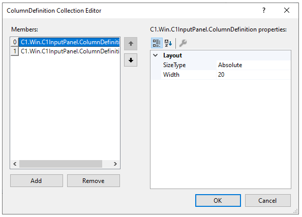
It lets you add or remove columns and define their layouts using the SizeType and Width properties. Here, the Width property sets the width of the column, and the SizeType property provides three options for specifying the sizing of rows or columns:
- Absolute: Sizing the row or column to an exact number of pixels.
- AutoSize: Sizing the row or column automatically to share space with its peers.
- Percent: Sizing the row or column as a percentage of the parent container.
You can similarly configure row definitions using the RowDefinitions property at design time or via code.
The RowDefinition Collection Editor opens when you click the ellipsis in the Properties window for RowDefinition.
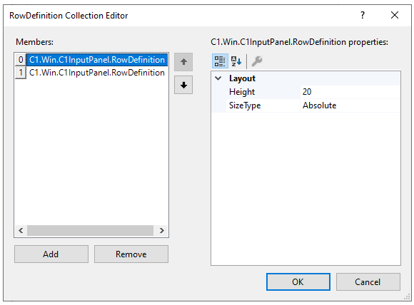
It lets you add or remove rows and define their layouts using the SizeType and Width properties. Here the Height property sets the width of the row, and the SizeType property provides three options for sizing just as in the case of ColumnDefinitions.
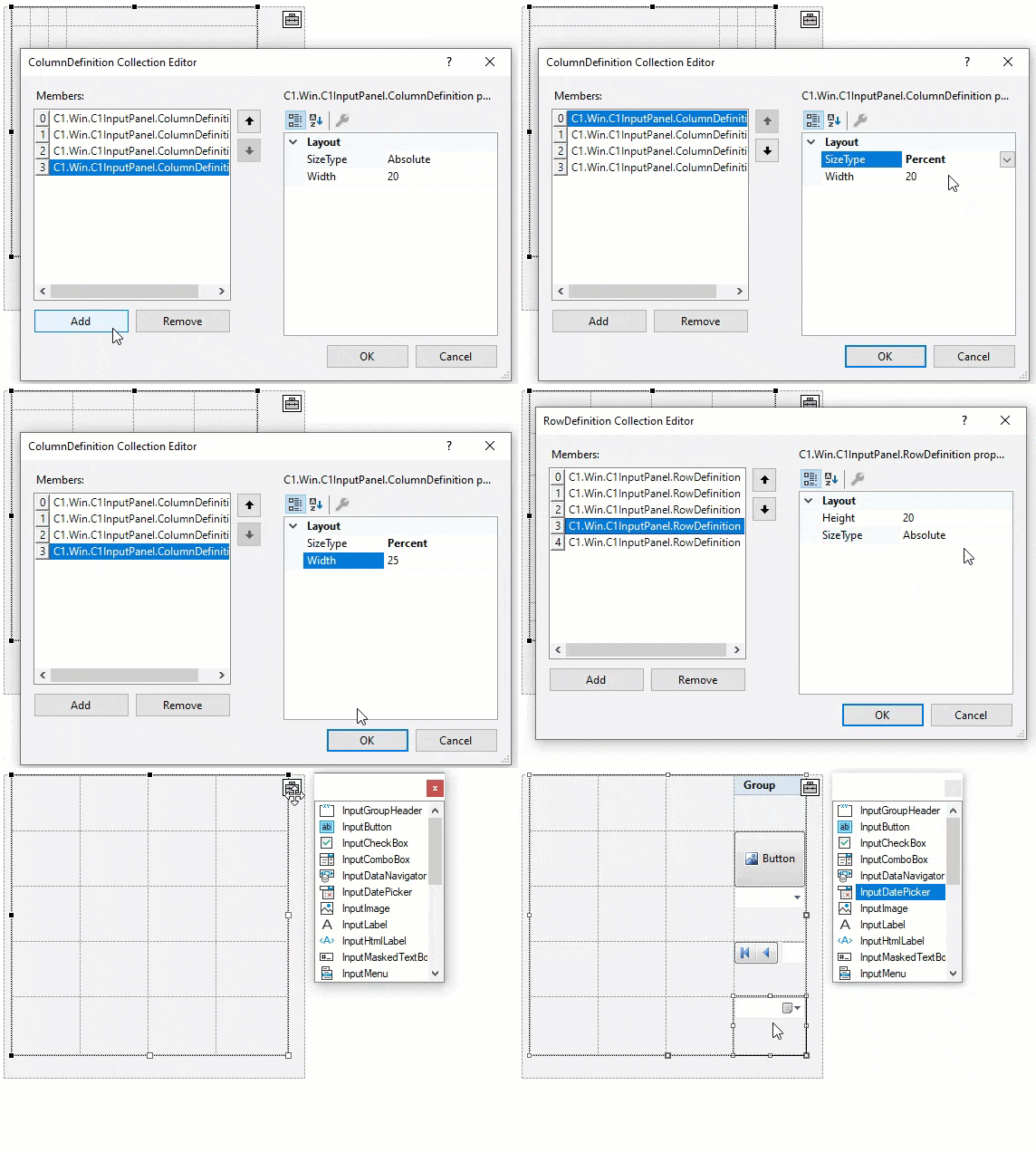
The GIF image below shows how to set both RowDefinitions and ColumnDefinitions at design time for a grid panel with four columns and five rows.
