
Cursor Styles
You can customize how the cursor appears when the pointer moves over the control by specifying a value for the Cursor property. You can also customize how the cursor appears when the mouse is over the buttons on the applicable input controls using the ButtonCursor property. The cursor styles are applicable to all C1Input controls. The button cursor styles are applicable to the C1DropDownControl, C1DbNavigator, C1DateEdit, and C1NumericEdit. The cursor and button cursor styles appear like the following:
| Button Cursor Style | Preview |
|---|---|
| AppStarting | 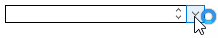 |
| Arrow | 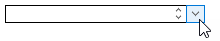 |
| Cross | 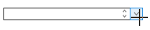 |
| Default | 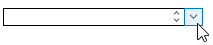 |
| IBeam | 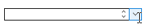 |
| No | 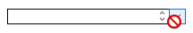 |
| SizeAll | 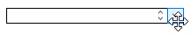 |
| SizeNESW | 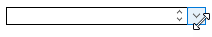 |
| SizeNS | 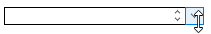 |
| SizeNWSE | 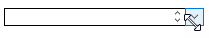 |
| SizeWE | 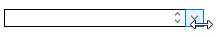 |
| UpArrow | 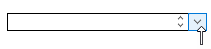 |
| WaitCursor | 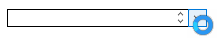 |
| Help | 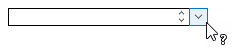 |
| HSplit | 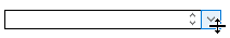 |
| VSplit | 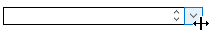 |
| NoMove2D | 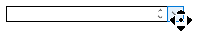 |
| NoMoveHoriz | 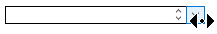 |
| NoMoveVert | 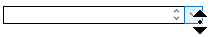 |
| PanEast | 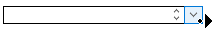 |
| PanNE | 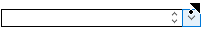 |
| PanNorth | 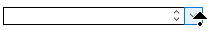 |
| PanNW | 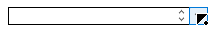 |
| PanSE | 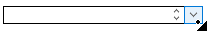 |
| PanSouth | 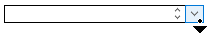 |
| PanSW | 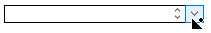 |
| PanWest | 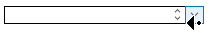 |
| Hand | 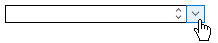 |