


Custom Data Labels
FlexChart ssupports custom data labels through the Content property. Assign a template string to this property to define the content displayed for each data point.
Template strings can contain the following predefined parameters:
Parameter | Description |
|---|---|
x | Represents the X value of the data point. |
y | Represents the Y value of the data point. |
value | Represents the Y value of the data point. |
name | Represents the name or X value of the data point. |
seriesName | Represents the name of the series. |
pointIndex | Represents the index of the data point. |
P | Represents the percentage of the parent slice in a Sunburst chart. |
p | Represents the percentage of the entire Sunburst chart. |
FlexChart also supports value formatting within data-label templates. Numeric values can include currency symbols, group separators, or decimal precision. Date and time values can use standard short or long date formats.
The following chart shows custom labels that display the series name and temperature value for each data point:
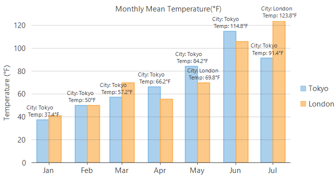
//Set template string to create custom content for data labels
this.flexChart1.DataLabel.Content = "Country: {seriesName} \n Temp: {y}°F";
'Set template string to create custom content for data labels
Me.flexChart1.DataLabel.Content = "Country: {seriesName} " & vbLf & " Temp: {y}°F"Customize Pie Chart Data Label Positioning
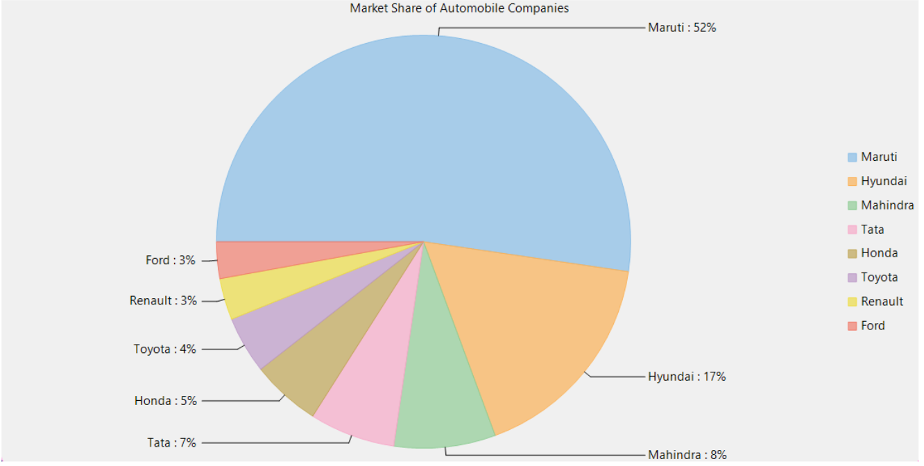
FlexPie supports the Sides option of the PieLabelPosition enumeration. This option places labels around the sides of the chart at an equal distance from the chart center and connects them to the corresponding slices.
The following image shows labels positioned around the sides of a FlexPie chart:
Packages Required
C1.Chart - 8.0.20252.34
C1.Win.FlexChart - 8.0.20252.715
To create customized data label, use the following code:
flexPie1.DataLabel.Position = PieLabelPosition.Sides; Sample Usage
using C1.Chart;
using C1.Win.Chart;

namespace FlexPie_LabelPositionSides
{
    public partial class Form1 : Form
    {
        public Form1()
        {
            InitializeComponent();
        }

        private void Form1_Load(object sender, EventArgs e)
        {

            FlexPie flexPie1 = new FlexPie();
            //Binding FlexPie's AxisX to 'Value' so values appear in Horizontal axis
            flexPie1.Binding = "Value";

            flexPie1.BindingName = "Name";

            //Specify what and how to show data values
            flexPie1.DataLabel.Content = "{name} : {p:0}%";

            //Dock the FlexPie to fill the application window
            flexPie1.Dock = DockStyle.Fill;

            //Setting FlexPie's Header
            flexPie1.Header.Content = "Market Share of Automobile Companies";

            //Specify where to position the data labels relative to pie slices
            //!!! This is the new option for data label positioning
            flexPie1.DataLabel.Position = PieLabelPosition.Sides;

            //Passing data in FlexPie
            flexPie1.DataSource = GetCarSales();

            //Adding FlexPie to the Form
            this.Controls.Add(flexPie1);
        }

        //Method to create data for FlexPie
        public static List<CategoricalPoint> GetCarSales()
        {
            var data = new List<CategoricalPoint>()
        {
            new CategoricalPoint{Name="Maruti", Value=1643467},
            new CategoricalPoint{Name="Hyundai", Value=536241},
            new CategoricalPoint{Name="Mahindra", Value=248859},
            new CategoricalPoint{Name="Tata", Value=210200},
            new CategoricalPoint{Name="Honda", Value=170026},
            new CategoricalPoint{Name="Toyota", Value=140645},
            new CategoricalPoint{Name="Renault", Value=102222},
            new CategoricalPoint{Name="Ford", Value=90061},
        };
            return data;
        }


        //Data model class to hold data for FlexPie
        public class CategoricalPoint
        {
            public string Name { get; set; }
            public int Value { get; set; }
        }

    }
}
Position Data Labels
Use the Position property to place data labels relative to their data points.
For FlexChart, the property accepts values from the C1.Chart.LabelPosition enumeration. Labels can appear above, below, at the center, or to the left or right of a data point.
For pie and sunburst charts, use PieDataLabel.Position, which accepts values from the PieLabelPosition enumeration. Labels can appear inside, outside, or at the center of the chart and can use circular, radial, or side positioning.
The default value, Auto, positions labels according to the available chart space. Set the position to None to hide the labels.
//Set chart's DataLabels position
this.flexChart1.DataLabel.Position = LabelPosition.Top;
'Set chart's DataLabels position
Me.flexChart1.DataLabel.Position = LabelPosition.TopRotate Data Labels
Use the Angle property of the DataLabel class to rotate data labels and reduce overlap.
The property accepts values from 0 through 90 degrees.
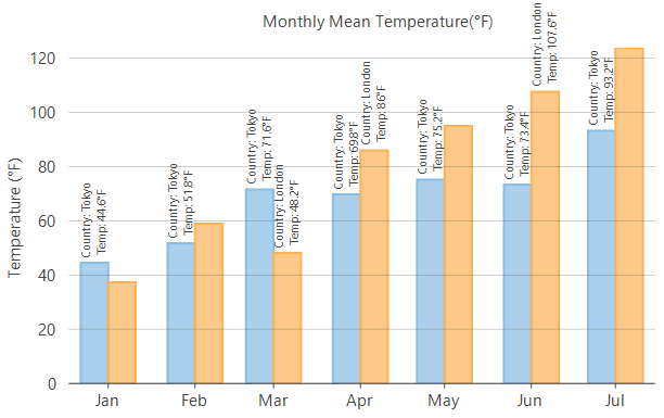
//Rotate the data labels by 90 degrees
    this.flexChart1.DataLabel.Angle= 90;
' Rotate the data labels by 90 degrees
Me.flexChart1.DataLabel.Angle= 90 Trim Or Wrap Data Labels Text
FlexChart supports trimming and wrapping data-label text to prevent overlap.
Set the ContentOptions property to specify whether the label text is trimmed or wrapped.
Use the following properties to control the available label space:
MaxWidth specifies the maximum label width before trimming or wrapping occurs.
MaxLines specifies the maximum number of lines when wrapping is enabled.
When the text exceeds the configured limits, FlexChart displays an ellipsis at the end of the label.
The following images compare trimmed and wrapped data labels:
ContentOptions.None | ContentOptions.Trim |
|---|---|
|
|
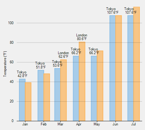
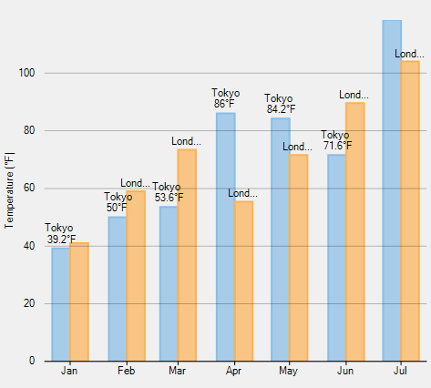
// Trim the data labels if they exceed the maximum width     this.flexChart1.DataLabel.ContentOptions = ContentOptions.Trim;
this.flexChart1.DataLabel.MaxWidth = 40;
' Trim the data labels if they exceed the maximum width Me.flexChart1.DataLabel.ContentOptions = ContentOptions.Trim
Me.flexChart1.DataLabel.MaxWidth = 40 Style Data Labels
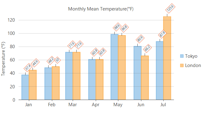
FlexChart provides properties for configuring data-label appearance and placement:
Set ConnectingLine to
trueto display a line between a label and its data point.Use Offset to specify the distance between a label and its data point.
Set Border to
trueto display a border around a label.Use BorderStyle to configure the border and background appearance.
Use Angle to rotate the labels and reduce overlap.
Use Style to configure the font and text appearance.
The following image shows styled data labels with borders, connecting lines, and rotated text:
//Set how far data labels appears to data point
this.flexChart1.DataLabel.Offset = 10;
//Connect data labels with data point with a connecting line
flexChart1.DataLabel.ConnectingLine = true;
//Set to show data labels borders
flexChart1.DataLabel.Border = true;
//Style data labels
flexChart1.DataLabel.Style.Font = new Font(this.flexChart1.Font.FontFamily, 8, FontStyle.Italic);
flexChart1.DataLabel.BorderStyle.StrokeColor = Color.OrangeRed;
flexChart1.DataLabel.BorderStyle.FillColor = Color.AliceBlue;
//Set the data label angle
flexChart1.DataLabel.Angle = 45;
'Sett how far data labels appears to data point
Me.flexChart1.DataLabel.Offset = 10
'Connect data labels with data point with a connecting line
flexChart1.DataLabel.ConnectingLine = True
'Set to show data labels borders
flexChart1.DataLabel.Border = True
'Style data labels
flexChart1.DataLabel.Style.Font = New Font(Me.flexChart1.Font.FontFamily, 8, FontStyle.Italic)
flexChart1.DataLabel.BorderStyle.StrokeColor = Color.OrangeRed
flexChart1.DataLabel.BorderStyle.FillColor = Color.AliceBlue
'Set the data label angle
flexChart1.DataLabel.Angle = 45