Tablix
A Tablix report item is a data region similar to Excel Pivot Tables. The tablix condenses bound data records into groups and arranges unique values of these groups, known as Group Instances, in horizontal(Column Groups) and vertical(Row Groups) directions. The intersection of a Row and Column Group displays one or more summary values. For example, in the report output from the Get Started With Summary Reports walkthrough, Row Groups display store names, Column Groups display years and their intersections show the Net Sales for each store in each year.

In addition, the Tablix can sort and filter the data based on pre-defined conditions or user input.
Adding a Tablix
You can add a Tablix into a report by either double-click the corresponding item in the toolbox or drag-and-drop it to a report page area.
Expand to watch adding the Tablix in action
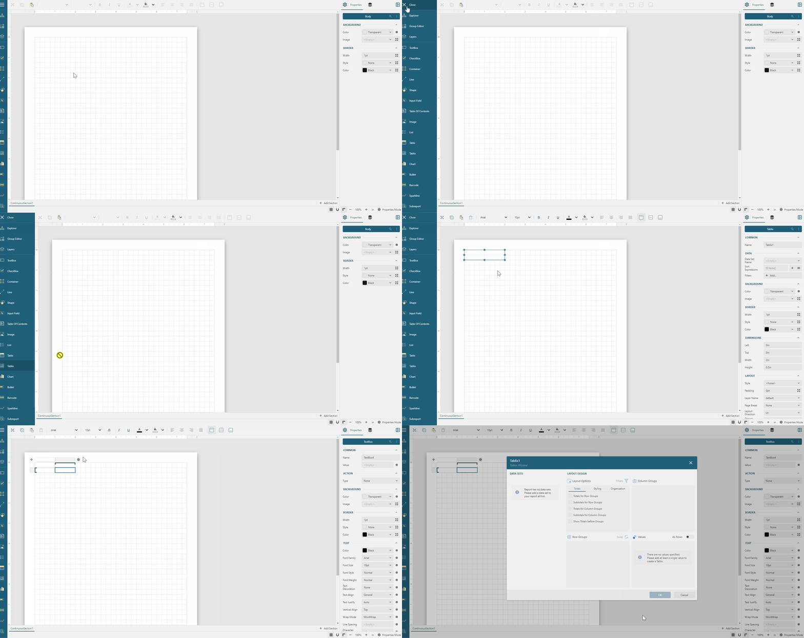
If you set up the Data Binding, which we recommend beginning any report creation with, then after adding a new tablix, it displays the dialog, known as Tablix Wizard that allows you to instantly configure Row Groups, Column Groups, Summary Values, and various layout options.
Tablix Wizard
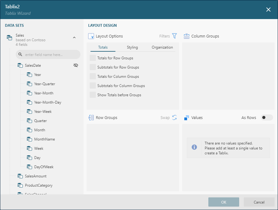
The wizard dialog displays available data sets on its left side. You can drag-and-drop fields from one of these data sets into the Row Groups, Column Groups, and Values areas.
The Filters button located on the right side of the Layout Options area allows you to add conditions under which the tablix will filter the displayed data.
Unique values of Rows and Columns fields generate row and column Group Instances, respectively. You can filter and sort group instances and apply formatting to their values using the corresponding drop-down buttons on a field name's right side. The Swap button exchanges row groups for column groups.
You can add more than one field into Row and Column groups creating hierarchical structures. For instance, the Drill-down Tablix has the following configuration.
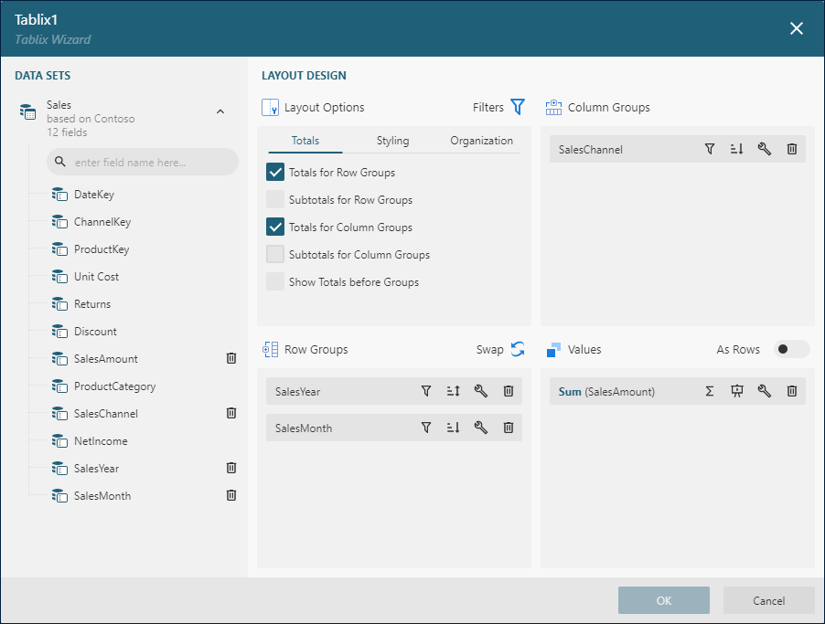
Consequently, the report output displays the Year rows expandable into the Month sub rows.
The fields in the Values area determine the summary values displayed in row and column group instances intersections. You can specify the aggregate function, such as Sum, Count, or Average, and the formatting of a summary value using buttons on the right side of its name. In addition, the Display As drop-down allows you to specify an advanced formula of the summary value. Supported values are:
% Grand Total- displays a value as a percentage of its grand total.% of Row Group Total- displays a value as a percentage of its row group total.% of Parent Row Group Total- displays a value as a percentage of its parent row group total.% of Column Group Total- displays a value as a percentage of its column group total.% of Parent Row Group Total- displays a value as a percentage of its parent column group total.
Multiple summary values can arrange horizontally, the default option, or vertically, which can be achieved by turning on the As Rows switch.
For instance, the Tablix with Multiple Values has two summary values to display sales channels' contribution to the sales of product categories using the absolute value and the percentage share. To achieve that, we added the SalesAmount in the Values area twice, set the Sum aggregate function for both of them, set the Currency formatting for the second value, and then selected the % of Column Group Total in the first value's Display As drop-down.
The Totals tab in the Layout Options section lets you quickly set up the appearance of Grand Totals and Subtotals for column and row groups:
The
Totals For Row Groupscheckbox inserts the additionalRowat the beginning or the end all theRow Group Instancesthat shows theGrand Totalfor each instance of the innermostColumn Group.The
Subtotal For Row Groupscheckbox inserts the additionalRowat the beginning or the end each instance of the outermostRow Groupthat shows theSubTotalfor each instance of the innermostColumn Group. This option is only applicable in the case of row group hierarchy.The
Totals For Column Groupscheckbox inserts the additionalColumnat the beginning or the end all theColumn Group Instancesthat shows theGrand Totalfor each instance of the innermostRow Group.The
Subtotal For Column Groupscheckbox inserts the additionalColumnat the beginning or the end each instance of the outermostColumn Groupthat shows theSubTotalfor each instance of the innermostRow Group. This option is only applicable in the case of column group hierarchy.The
Show Totals Before Groupscheckbox determine the placement ofGrand TotalsandSubtotalsfor those above options.
The Organization tab in the Layout Options section lets you configure the interactive features of a tablix.
The
Expand/Collapse Groupscheckbox enables the drill-down functionality of hierarchical row and column groups. For example, the Drill-Down Tablix uses this option to create drill-down grouping by Year and Month.The
Collpased Groupscheckbox determines whether a drill-down row or column group should initially hide inner group instances.The
Stepped Row Groupscheckbox determines the layout of row groups hierarchy. By default, each row group prints in a separate column. The stepped layout prints all row groups in a single column applying padding to nested group instances. The Drill-Down Tablix uses this option.
In most cases, after you finished the initial configuration of a tablix and closed the Wizard Dialog, you can re-open it later to adjust the settings. However, for advanced scenarios the Wizard can't handle the tablix structure and displays the corresponding warning.

Tablix Designer
Once you closed the Wizard Dialog, the tablix configuration can be set up using the designer. The following diagram depicts the default structure of the Tablix Designer that appears if you click anywhere inside its bounding box.
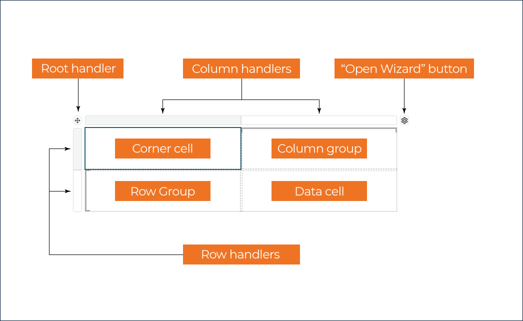
General Tablix Configuration
You can use one of two methods to load the general tablix configuration into the Properties panel
Select the
Tablixitem in the report explorer.Click the
Root handlerin the tablix designer.
The general configuration includes Base Report Item properties, Common Style Properties, Data Region properties, Visibility, Page Break, and the following specific properties.
The
Layout Directionproperty determines the direction of column groups:Ltr: Columns groups start at the left and progress to the right.Rtl: Columns groups start at the right and progress to the left.
The
Groups Before Row Headersnumber indicates how many columns should be printed before row groups appear. Try setting this property to2for the Tablix With Multiple Values to see its effect.Column groups of a tablix could span multiple pages horizontally. If that's the case, the
Repeat Row Headersflag indicates whether aTablixshould print row groups on each page.Row groups of a tablix could span multiple pages vertically. If that's the case, the
Repeat Column Headersflag indicates whether aTablixshould print column groups on each page.The
New Sectionflag indicates whether aTablixhas its page numbering. Check the Global References documentation for more information.The
Keep togetherflag determines whether aTablixalways appears on a single page if it fits.The
Frozen RowsandFrozen Columnsnumeric properties indicate how many rows and columns should remain visible when a report reader scrolls a tablix that does not fit into a visible area of the Report Viewer component.
Tablix Corner
A Tablix Corner is located in the upper-left corner, or upper-right corner if a tablix has the Layout Direction is set to Rtl.
The layout direction applies at preview-time only, though.
This area is automatically expanded horizontally or vertically when you add new column or row groups. You can merge cells inside the tablix corner and insert a data visualizer such as a TextBox or Image.
To merge cells, select them holding the Ctrl button on Windows or Cmd on Mac OS, then right-click the selection and choose the Cells > Merge Cells item in the context menu.
Tablix Rows
A Row is a horizontal group of Cells within a Tablix. If you left-click a row handler, it automatically selects all the report items in the row's cells and the Properties panel shows two tabs. The Row tab exposes the Height in Length units that determines the initial height of tablix cells within a row. However, cells can grow or shrink in height at preview-time. Check the CanGrow and CanShrink properties of a TextBox report item for more information.
The additional tab lets you modify the properties of all the row's report items simultaneously. In the most common scenario, the extra tab is called TEXTBOX and changes all the row's textboxes' properties.
Tablix Columns
A Column is a vertical group of Cells within a Tablix. If you left-click a column handler, it automatically selects all the report items in the column's cells and the Properties panel shows two tabs. The Column tab exposes the Width in Length units that determines the width of tablix cells within a column.
The additional tab lets you modify the properties of all the column's report items simultaneously. In the most common scenario, the extra tab is called TEXTBOX and changes all the column's textboxes' properties.
Tablix Groups
The tablix designer marks row and column groups with square brackets. If you click the cell on the right side or underneath a square bracket, the properties panel loads the configuration of the corresponding row or column group in the Tablix Member tab.
Group Configuration
The
Enabledflag is on by default for row and column groups. You can switch it off to make a column or row group print only once per tablix. It could be useful for layouts similar to the Tablix with Static ColumnsThe
Nameis the groupIddisplayed in the Group Editor.The
Group Expressionsis the collection of bound field references or more advanced expressions. Unique values of group expressions generateGroup Instances.The
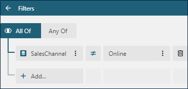
Labelexpression determines the text of a group instance link in the Report Map.The Filters Editor of a group allows you to filter out certain group instances. For example, if we want to exclude the
Onlinesales channel from the Tablix with Multiple Value output, we can add the following filter for theSalesChannelgroup.
Group Layout Configuration
The
Keep togetherflag ensures that the group instance always appears on a single page if it fits.The
Page Breakproperty determines the location of page breaks generated by group instances.None- no page breaks are generated.Start- each group instance inserts the page break before printing its content.End- each group instance inserts the page break after printing its content.StartAndEnd- the combination of theStartandEndoptions.Between- each group instance starts on the new page.
The
Page Break Disabledexpression allows you to conditionally prevent page breaks from being inserted by the aforementioned property.The Visibility property determines static or dynamic visibility of group instances. The Drill-Down Tablix sets the dynamic visibility of the
SalesMonthgroup to implement the drill-down interactivity.The
New Sectionflag determines whether each group instance has its page numbering. Check the Global References documentation for more information.
Sorting Group Instances
The Sort Expressions property of a row or column group is the collection of items that allows you to sort group instances. Each item consists of the expression and the sort direction. For instance, the Group_SalesYear row group in the Advanced Tablix, group has the {SalesYear} sort expression and ascending order. Consequently, years appear chronologically at preview time.
Group Layout
Initially, a tablix group consists of the single cell on the intersection of a row and column. You can add new columns and rows inside or outside a group. In the former scenario, newly added cells repeat once per group instance. In the latter, they repeat once per group.
For example, to add column headers into the Tablix with Multiple Values we could take the following steps.
Right-click the
{ProductCategory}cell enclosed with the square bracket on the top.Select the
Row -> Insert Row Inside a Group - Belowitem in the context menu.Set the padding, border, and text alignment for the newly added cell.
Right-click the newly added cell and select the
Cells->Split Cellsitem in the context menu.Set the
%%%and$$$text for the textboxes of newly created cells.
As a result, the output looks like this:

Insert adjacent, child or parent groups
Row and Columns groups can be arranged hierarchically. For example, in the Tablix with Static Columns, the Group_SalesChannel row group has the child Group_ProductCategory group.
Also, groups can be adjacent as the Group_SalesYear and Group_SalesChannel row groups in the Advanced Tablix.
To insert a child, parent, or adjacent group right click the cell on the right side or underneath a square bracket in the tablix designer and select the corresponding item in the Row Group or Column Group menu.
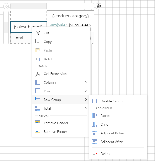
The same menu allows you to delete or disable a group.
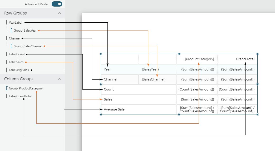
Alternatively, you can use the Group Editor to insert remove, disable groups or load their configuration into the properties panel. The group editor displays the hierarchy of items known as tablix members. Row and Column groups are marked with square brackets. Other items in the hierarchy marked with vertical lines are static tablix members and they point to cells that contain a static text or total values.
For example, here is the tablix members structure of the Advanced Tablix
Static Tablix Members Properties
In most cases, static tablix members are TextBoxes that you can modify by left-clicking inside the containing tablix cell. The Properties panel displays the TextBox and Tablix Members tabs. You can use the latter to modify the following properties.
The
Enabledflag is off for static members and on for dynamic members.The
Repeat on New Pageflags determines whether a static member prints on each page taken by the tablix content.The
Keep togetherflag ensures that the static member always appears on a single page if it fits.The Visibility property determines static or dynamic visibility of the static member.
Displaying Totals
A tablix could display two types of totals.
The
Grand Totalappears at the beginning or at the end all the group instances. For example, the Advanced Tablix displays the grand total of columns in the last three rows.The
Subtotalappears at the beginning or at the end of each group instance. For example, the Tablix with Static Columns prints the subtotal for eachSalesChannel.
To insert a total row or column in both scenarios, right click the cell on the right side or underneath a square bracket in the tablix designer and select the Total->Add Total Before or Total->Add Total After menu item. If a group does not have the parent, then the grand total will be inserted. Otherwise, the subtotal for the parent group will be created.
To insert additional totals, you can add rows and columns as described in the group layout section and set summary expressions for the newly added cells.
Feedback
Submit and View Feedback For


