- Getting Started
-
Topics
- Wijmo
-
Chart
- Basic
-
Advanced
- Animation
- Annotations
- Conditional Formatting
- Data Labels
- Export
- Grouping and Drilldown
- Hit-Testing
- Interpolating Nulls
- Legend and Titles
- Line Markers
- Plot Areas
- Range Selectors
- Selection
- Sorting & Filtering
- Styling Series
- Toggle Series Visibility
- Tooltips
- Zooming
- SpecialCharts
- Axes
- Financial
- Analytics
- Map
- Cloud
- Gauge
- Grid
- OLAP
- Input
- Nav
- Viewer
- Tutorials
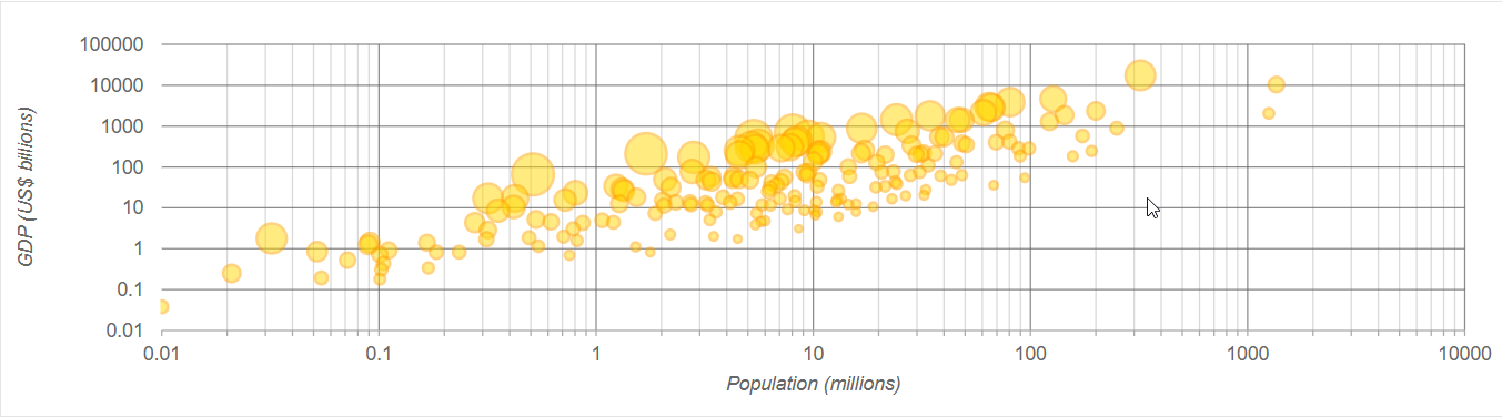
Axis Scaling in FlexChart
Use logarithmic axes to spread clustered data and improve the clarity of your charts without sacrificing accuracy. Use scaling formats to display axis labels in a clear and concise way.
Use the axis logBase property to spread data that is clustered around the origin. This is common in several financial and economic data sets. If the base is not specified the axis uses a linear scale.
Use the axis format property to automatically scale the labels and show thousands or millions instead of very large raw values.
import * as chart from '@mescius/wijmo.chart';

// create the chart
var myChart = new chart.FlexChart('#myChart');
myChart.axisX.logBase = 10;
myChart.axisX.format = 'g4,,';
myChart.axisY.logBase = 10;
myChart.axisY.format = 'g4,';
The bubble chart below shows the population (x), GDP (y), and per-capita income (bubble size) for about 200 countries. Notice how the use of log-axes spreads out the data and makes the chart easy to read.
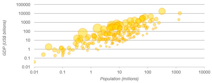
Use the logBase, minorGrid, and minorTickMarks properties to configure the minor tick marks and minor grid lines on the logarithmic axis. The minorUnit property dynamically calculates the minor ticks and ensures that the position of the minor grid lines and tick marks decreases exponentially across ranges ensuring precise division of spaces.
import * as chart from '@mescius/wijmo.chart';

// create the chart
var myChart = new chart.FlexChart('#myChart');
myChart.axisX.logBase = 10;
myChart.axisX.format = 'g4,,';
myChart.majorGrid = true;
myChart.minorUnit = 1;
myChart.minorGrid = true;
myChart.minorTickMarks: 'Outside';
myChart.axisY.logBase = 10;
myChart.axisY.format = 'g4,';
The bubble chart below shows the minorGrid lines and minorTickMarks towards outside the X-axis.