
- SpreadJS Overview
- Getting Started
- JavaScript Frameworks
- Best Practices
- Features
- SpreadJS Designer
- Tutorials
-
SpreadJS Designer Component
- Getting Started
- Quick Start
- Theme
- Designer Interface
- JavaScript Frameworks
- Customizations
-
Work in Designer Component
- AutoSum Functions
- Set Range Template Cell
- Name Box
- Select Cells Using Go To
- Find and Replace
- Edit Font Size
- Edit Font Family
- Manage Conditional Formatting Rules
- Shape Selection Pane
- Automatic Outline
- Format Painter
- Table Slicer
- TableSheet
- GanttSheet Designer
- ReportSheet Designer
- Data Chart Designer
- Text to Columns
- Remove Duplicates
- Pivot Table
- Dockable Side Panel
- Command Palette
- Transform Cells with LAMBDA Formula
- Toolbar Ribbon
- API Documentation
- SpreadJS Collaboration Server
- Touch Support
- Formula Reference
- Import and Export Reference
- Frequently Used Events
- API Documentation
- Release Notes
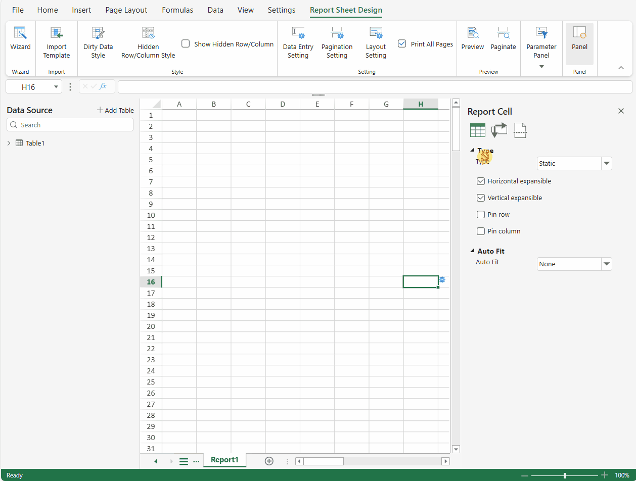
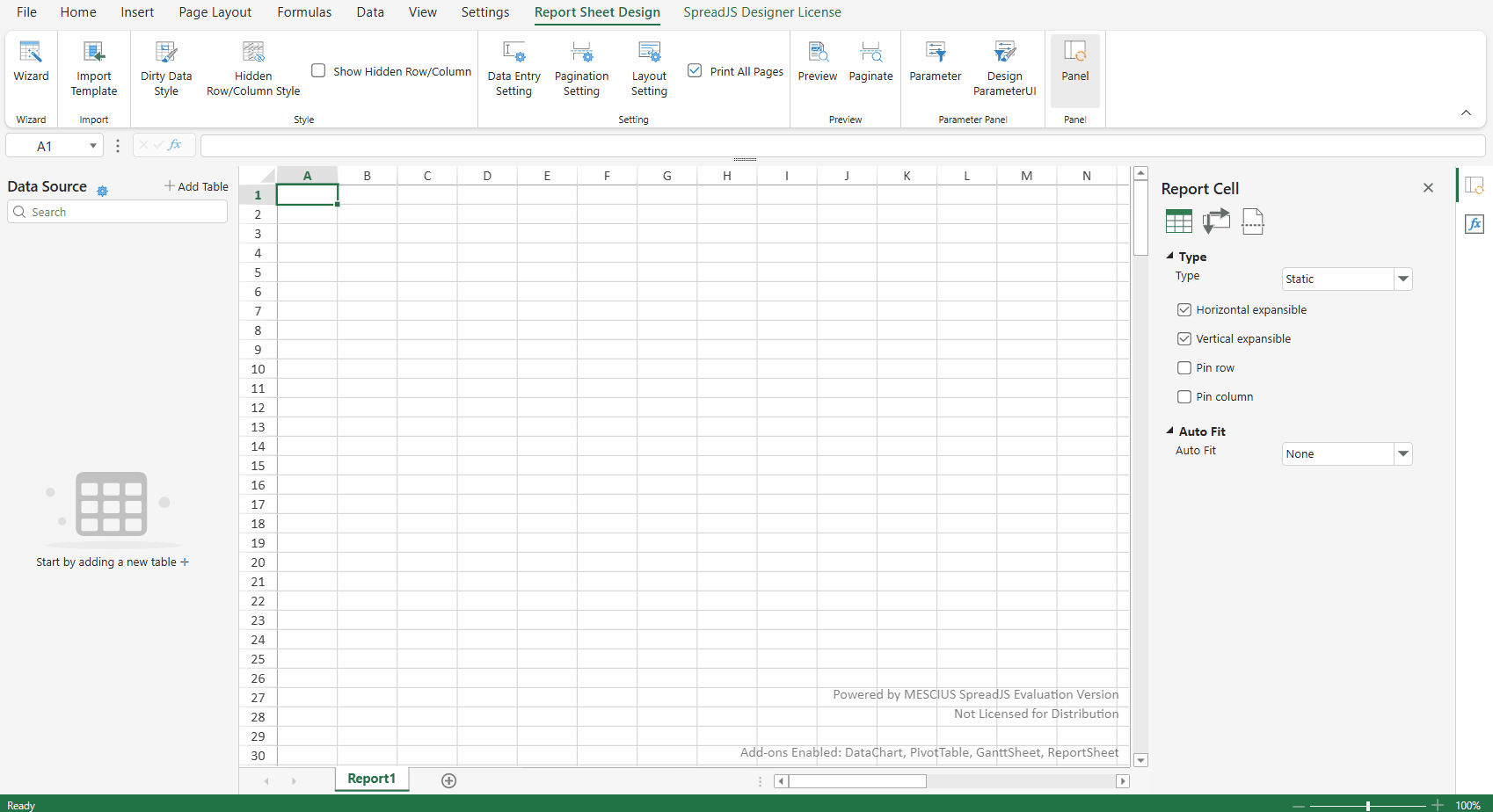
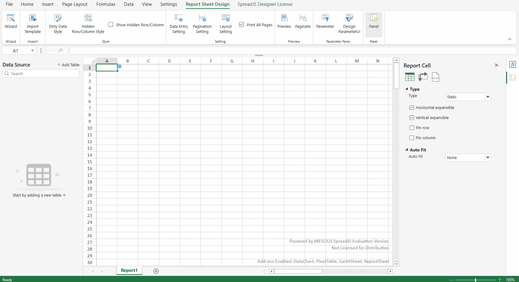
Dockable Side Panel
The SpreadJS Designer's dockable side panel enhances user experience and efficiency. It allows users to flexibly adjust the panel position based on personal preferences or workflow needs, optimizing screen space while keeping the design viewport unobstructed. Additionally, it provides quick access to frequently used functions.
Side Panel Drag and Drop
When you click and drag the title bar of a side panel, the panel enters drag mode. A position indicator appears in the center of the side panel, and a preview overlay shows possible docking locations.
There are two ways to place the panel:
Using the indicator: Drag the panel over the position indicator and drop it to dock at the specified location.
Using the overlay: Drag the panel near the desired spot, and when the preview overlay shows the target position, release to dock it there.
Both methods achieve the same docking function. You can choose whichever works best for your workflow.
Note:
Only the side panel supports drag-and-drop functionality. It can only be dragged to the left or right sides of the workbook—not to the top, bottom, or any other positions.
Side Panel Tabs
When multiple Side Panels are displayed simultaneously, they can be organized using tabs
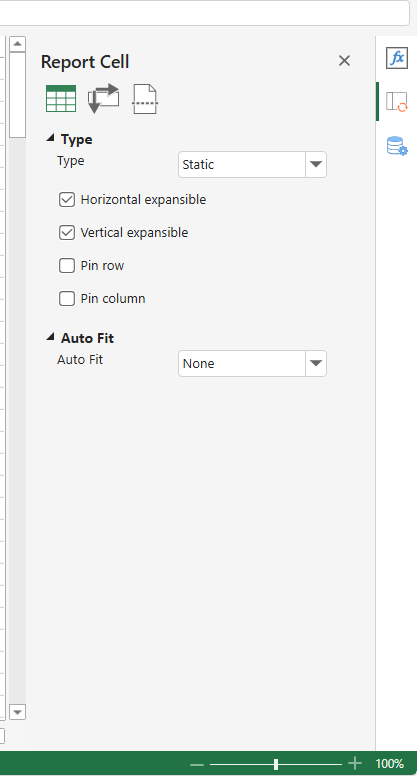
Default Tab Behavior
When multiple side panels are displayed on the same side, they will automatically appear as tabs by default.
Side-by-Side Display Option
Users can configure panels to display side-by-side (instead of in tabs) through settings in the configuration file.
Tab Grouping via Drag-and-Drop
To group panels into tabs:
Drag a panel over another panel's docking hint buttons
Release when the target panel's tab zone is highlighted
This will add the dragged panel to the target panel's tab group.
Interface
export interface ISidePanel {
    /* ... */
    canStack?: boolean;     // default true
}
When canStack is set to false:
The side panel will display in a side-by-side layout with other panels
Tab grouping functionality will be disabled
This setting preserves backward compatibility with legacy implementations
Example
const config = GC.Spread.Sheets.Designer.DefaultConfig;
config.sidePanels.forEach(panel => {
  panel.canStack = false;
});
const designer = new GC.Spread.Sheets.Designer.Designer('gc-designer-container', config);
Custom Side Panel support Dock Layout
To enable drag-and-drop functionality for a custom side panel in SpreadJS Designer, ensure your panel template includes the PanelTitle component. The PanelTitle acts as the drag handle, allowing users to move the panel by dragging its title area.
Interface
interface IPanelTitleOption extends GC.Spread.Sheets.Designer.ITextBlockOption {
  type: "PanelTitle"
}
Note:
This draggable behavior is only available when the panel’s position is set to either
leftorright.
Example
const config = GC.Spread.Sheets.Designer.DefaultConfig;
const customPanel = {
  command: "customPanel",
  position: "right",
  uiTemplate: "customPanelTemplate",
  width: "300px"
};

const customPanelCommand = {
  commandName: "customPanel",
  execute: () => {},
  getState: () => {}
};

const customPanelTemplate = {
  templateName: "customPanelTemplate",
  content: [
    {
      type: "Column",
      children: [
        {
          type: "PanelTitle",                 // use PanelTitle component
          text: "Custom Panel",
          margin: "10px"
        },
        {
          type: "TextBlock",
          text: "This is a custom side panel.",
          margin: "10px"
        }
      ]
    }
  ]
}

GC.Spread.Sheets.Designer.registerTemplate("customPanelTemplate", customPanelTemplate);
config.sidePanels.push(customPanel);
config.commandMap = {
  customPanel: customPanelCommand
};

designer.setConfig(config);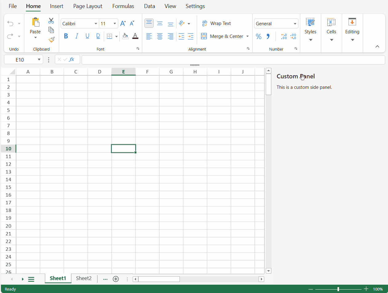
You can further customize the panel’s interaction with the spreadsheet by defining your own command logic, enabling the side panel to respond dynamically to user actions and business scenarios.