
Appearance
Although Xamarin controls match the native controls on all three platforms by default and are designed to work with both, light and dark, themes available on all platforms. But, there are several properties specific to the FlexViewer control which can be used to customize the appearance of the loaded document and the area around it. The FlexViewer class provides the following set of properties that can be used to change the overall look and feel of the document:
- PageBackgroundColor: Allows you to change the color for filling the page content.
- BackgroudColor: Allows you to change the background color of FlexViewer.
- PageBorderColor: Provides a brush used for drawing page borders.
- Padding: Sets the amount of padding between pages and the preview window edges.
- PageSpacing: Sets the amount of padding between pages in the preview.
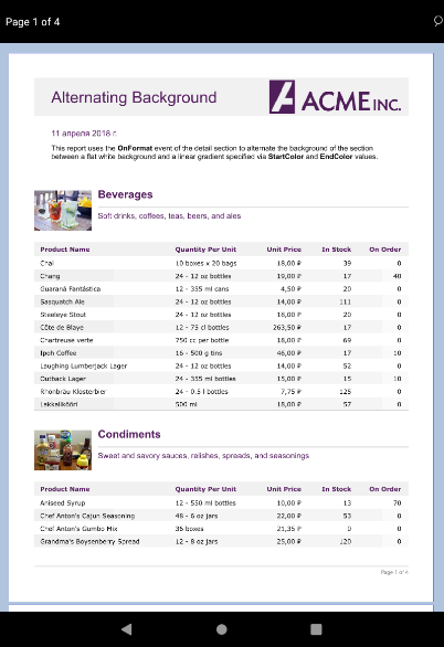
The following image shows FlexViewer with the customized appearance.
To change the appearance of the loaded PDF document, use the following code. This example uses the sample code created in Quick Start section.
flexViewer.PageBackgroundColor= Android.Graphics.Color.White;
flexViewer.BackgroundColor = Android.Graphics.Color.LightSteelBlue;
flexViewer.PageBorderColor = Android.Graphics.Color.Blue;
flexViewer.Padding = new C1Thickness(20, 20, 20, 20);
flexViewer.PageSpacing = 5;