Data Validation
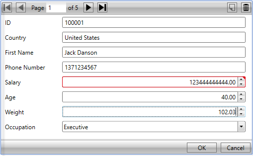
InputPanel comes with data validation support to provide users the ability to check invalid user input. The control supports built-in validation, which is performed when invalid or contradictory data is entered in an input field and is committed. For every invalid/inaccurate input, the InputPanel control displays a red frame around the input field as a visual alert.
The image given below illustrates an example where entering an invalid input in one of the input fields shows a visual alert.

The built-in validation provides very basic input checking functionality to users. However, to apply validation in complex scenarios, the control supports property level validation through standard and custom attribute markup. You can apply the markup in code to validate data in diverse scenarios, such as checking for unnecessary spaces, null values, or special characters in text, or putting limits on the age being entered in a numeric. In addition, InputPanel provides an event to apply validation rules.
Here is how you can use validate user input in InputPanel.
Learn how to implement property level validation in code.
Learn how to apply different transformations in code.


