
- FlexGrid for WPF Overview
- Feature Comparison
- Quick Start
- Object Model Summary
- Data Binding
-
Features
- Columns
- Row
- Scrolling Modes
- Selection
- Sorting
- Cell Merging
- Custom Editors
- Custom Icon
- Transpose Data in Grid
- Data Grouping
- Data Filtering
- Data Aggregation
- Custom Cells
- Multiple Cell Factory
- Virtualization
- Paging
- TreeGrid
- Print Support
- Row Details Template
- Layout and Appearance: ClearStyle Technology
- Freezing and Pinning
- Import Data from Excel
- Export to Excel
- Clipboard Operations
- Validation
- FlexGrid Samples
Selection
Most grid controls allow users to select parts of the data using the mouse and the keyboard. FlexGrid supports selection through the SelectionMode property. This property determines how the cell or rows are selected in grid.
.NET
You can set the selection mode for grid by using SelectionMode property of the C1GridControl class. The SelectionMode property sets the selection behavior through GridSelectionMode enumeration. This enumeration specifies the following values to define the selection behavior:
| Selection Mode | Description |
|---|---|
| Cell | To select a single cell. |
| CellRange | To select a cell range (block of adjacent cells). |
| Column | To select a single column. |
| ColumnRange | To select a set of contiguous columns. |
| ListBox | To select an arbitrary set of rows (not necessarily contiguous). |
| MultiColumns | To select non-contiguous columns by ctrl+clicking. |
| MultiRange | To select collection of ranges. |
| None | To disable the selection. |
| Row | To select a entire row. |
| RowRange | To select a set of contiguous rows. |
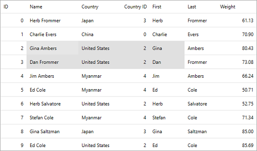
The following image shows selection of a range of cells in FlexGrid.
The following code illustrates how to set SelectionMode to CellRange.
grid.SelectionMode=C1.WPF.Grid.GridSelectionMode.CellRange;
.NET Framework
You can set the selection mode for grid by using SelectionMode property of the C1FlexGrid class. The SelectionMode property sets the selection behavior through SelectionMode enumeration. This enumeration specifies the following values to define the selection behavior:
| Selection Mode | Description |
|---|---|
| Cell | To select a single cell. |
| CellRange | To select a cell range (block of adjacent cells). |
| Column | To select a single column. |
| ColumnRange | To select a set of contiguous columns. |
| ListBox | To select an arbitrary set of rows (not necessarily contiguous). |
| Row | To select a entire row. |
| RowRange | To select a set of contiguous rows. |
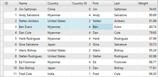
The following image shows selection of a range of cells in FlexGrid.
The following code illustrates how to set SelectionMode to CellRange.
grid.SelectionMode= C1.WPF.FlexGrid.SelectionMode.CellRange;
Data Item Selection
FlexGrid provides a series of properties as a part of Selection API that work with data items. These properties are:
- SelectedIndex: Allows to set or get the index of the selected row.
- SelectedItem: Allows to set or get a reference to the currently selected data item. The type of the selected item can vary depending on the context and the items contained in the selection control. It can be a string, an object, or any other relevant data type.
- SelectedItems: Allows to get a collection of the selected data items. This property is used when working with multi-selection, which allows selecting multiple items simultaneously.
All these properties provide more flexibility in manipulating the selected items at runtime and further customize your application behavior.
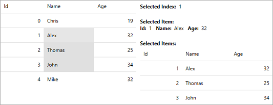
The following image shows how Selected Index displays the index of the selected row while the SelectedItem and SelectedItems option display the data items and the collection of data items for the selected row(s), respectively.
To understand how to use these properties, use the following code. In this example, we have used a class named Persons to get the data for FlexGrid.
<c1:FlexGrid x:Name="grid" ItemsSource="{Binding Persons}"
             SelectedItem="{Binding SelectedPerson, Mode=TwoWay,UpdateSourceTrigger=PropertyChanged}"
             SelectedIndex="{Binding SelectedPersonId,Mode=TwoWay, UpdateSourceTrigger=PropertyChanged}"
             SelectionChanged="FlexGridSelectionChanged"
             SelectionMode="CellRange" />
<StackPanel Grid.Column="1">
    <StackPanel Orientation="Horizontal" Margin="0,10,0,0">
        <TextBlock Text="Selected Index:  " FontWeight="Bold"/>
        <TextBlock Text="{Binding SelectedPersonId}"/>
    </StackPanel>
    <TextBlock Text="Selected Item:" FontWeight="Bold" Margin="0,20,0,0"/>
    <StackPanel Orientation="Horizontal">
        <TextBlock Text="Id:  " FontWeight="Bold"/>
        <TextBlock Text="{Binding SelectedPerson.Id, UpdateSourceTrigger=Default}"/>
        <TextBlock Text="Name:  " FontWeight="Bold" Margin="10,0,0,0"/>
        <TextBlock Text="{Binding SelectedPerson.Name, UpdateSourceTrigger=PropertyChanged}"/>
        <TextBlock Text="Age:  " FontWeight="Bold" Margin="10,0,0,0"/>
        <TextBlock Text="{Binding SelectedPerson.Age, UpdateSourceTrigger=PropertyChanged}"/>
    </StackPanel>
    <TextBlock Text="Selected Items:" FontWeight="Bold" Margin="0,20,0,0"/>
    <c1:FlexGrid ItemsSource="{Binding SelectedPersons, UpdateSourceTrigger=PropertyChanged}"/>
</StackPanel>