
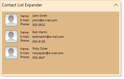
Expander Overview
Expander for WPF, as the name suggests, allows you to create an expandable and collapsible information panel that can include text, images, and controls. The Expander control appears as a header and a blank content panel whose behaviors, such as the expandability, state and the direction, can be modified based on your requirements.
Documentation | Blogs |
|---|---|