Appearance and Styling
Accordion provides various options to style the appearance, so that you can generate Accordion as per your requirement and change the look and feel of the application you are creating.
Styling
Accordion provides options to style the UI of the Accordion control, which is covered in the following section.
Header Style
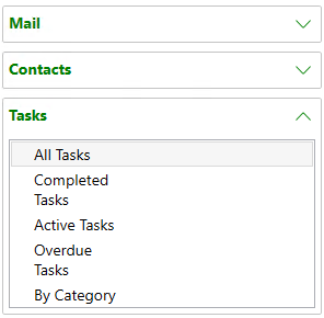
You can apply style to each pane in the Accordion control using the HeaderStyle property. If the Item added is an Expander then the style is applied only if the Item doesn't have a style already applied.

See how we can set this property in the XAML code:
<c1:C1Accordion x:Name="accordion" >
            <c1:C1Accordion.HeaderStyle>
                <Style TargetType="ContentControl">
                    <Setter Property="Foreground" Value="Green"></Setter>
                    <Setter Property="FontWeight" Value="Bold"></Setter>
                    <Setter Property="FontFamily" Value="segoe ui"></Setter>
                </Style>
            </c1:C1Accordion.HeaderStyle>
</C1:C1Accordion>
Expand Icon Style
You can apply style to the expand icon of the Accordion control by using the ExpandIconStyle property.
![]()
See how we can set this property in the XAML code:
<c1:C1Accordion x:Name="accordion" >
            <c1:C1Accordion.ExpandIconStyle>
                <Style TargetType="ContentControl">
                    <Setter Property="Height" Value="20"></Setter>
                    <Setter Property="Width" Value="20"></Setter>
                    <Setter Property="Foreground" Value="coral"></Setter>
                </Style>
            </c1:C1Accordion.ExpandIconStyle>
</C1:C1Accordion>
Appearance
Accordion provides options to change the appearance of the Accordion control, which is covered in the following section.
Expand Icon Alignment
You can enhance the appearance of Accordion control by altering its expand icon alignment to left or right using the ExpandIconAlignment property.
![]()
See how we can set this property in the XAML code:
<c1:C1Accordion x:Name="accordion" ExpandIconAlignment="Left">
</c1:C1Accordion>


