
Appearance and Styling
The C1ListView control derives from ItemsControl and supports standard WinUI styling and templating features.
Basic Styling
Visual properties such as Background, Foreground, and SelectedBackground define the appearance of the control.
XML
<c1:C1ListView
  x:Name="listView"
  Background="MediumAquamarine"
  Foreground="White"
  SelectedBackground="LightBlue" />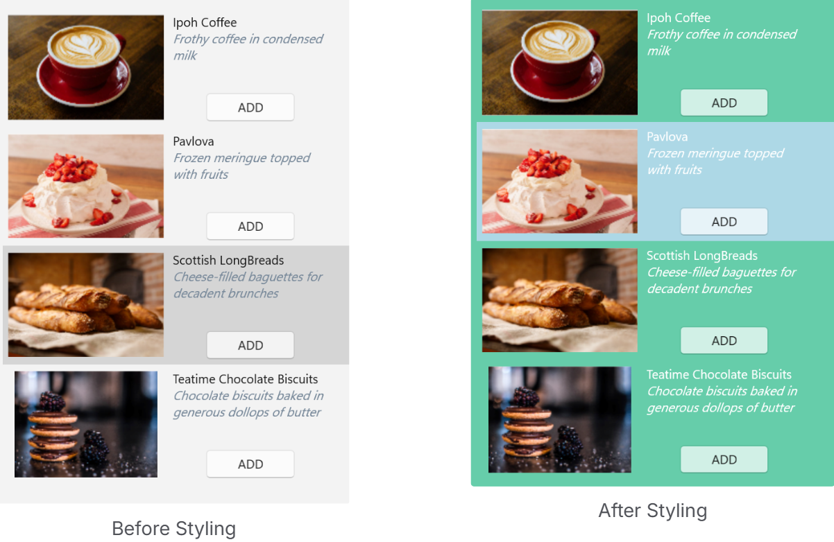
Item Styling
Item appearance and container behavior can be customized using the following properties:
ItemContainerStyleItemContainerStyleSelectorGroupStyleGroupStyleSelector
These properties enable consistent styling, conditional styling, and customization of grouped data presentation.
XML
<Window xmlns:local="clr-namespace:ListViewExplorer">
  <Window.Resources>
      <local:MyStyleSelector x:Key="MyStyleSelector">
          <local:MyStyleSelector.Resources>
              <ResourceDictionary>
                  <Style x:Key="TeamA" TargetType="{x:Type c1:ListViewItemView}">
                      <Setter Property="FontWeight" Value="Bold"/>
                      <Setter Property="VerticalAlignment" Value="Center"/>
                      <Setter Property="ContentTemplate">
                          <Setter.Value>
                              <DataTemplate>
                                  <TextBlock Text="{Binding Name}" Foreground="Red" TextWrapping="Wrap" FontFamily="Arial" FontSize="12" VerticalAlignment="Center" />
                              </DataTemplate>
                          </Setter.Value>
                      </Setter>
                  </Style>
              </ResourceDictionary>
          </local:MyStyleSelector.Resources>
      </local:MyStyleSelector>
  </Window.Resources>
  <c1:C1ListView
    x:Name="C1ListView"
    Grid.Row="1"
    SelectionMode="Extended"
    ItemContainerStyleSelector="{StaticResource MyStyleSelector}"
    ZoomMode="Enabled"
    Orientation="Vertical"
    ShowCheckBoxes="True"/>
</Window>
Guidance
Use
ItemContainerStylefor uniform item stylingUse
ItemContainerStyleSelectorfor condition-based stylingUse
GroupStyleandGroupStyleSelectorwhen grouping is applied