
CheckList
CheckList control displays a collection of items via list box embedded with multiple check boxes (small square shaped selection boxes). It enables multiple selection of items using different states of the check boxes. Additionally, the CheckList control is represented by the C1CheckList class which allows you to perform various operations on the control.
Add and Remove CheckList Items
You can access the item collection of CheckList using Items property of the C1CheckList class and add or remove the objects from the list at runtime. To add an item to the CheckList, you can use the Add method.
The following sample code add items from the CheckList control.
// Add all items to the CheckList control
lCheckList.Items.Add(c1CheckListItem1);
lCheckList.Items.Add(c1CheckListItem2);
lCheckList.Items.Add(c1CheckListItem3);
lCheckList.Items.Add(c1CheckListItem4);
lCheckList.Items.Add(c1CheckListItem5);
lCheckList.Items.Add(c1CheckListItem6);
lCheckList.Items.Add(c1CheckListItem7);
// Assign names to each Checklist item
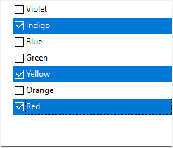
c1CheckListItem1.Value = "Violet";
c1CheckListItem2.Value = "Indigo";
c1CheckListItem3.Value = "Blue";
c1CheckListItem4.Value = "Green";
c1CheckListItem5.Value = "Yellow";
c1CheckListItem6.Value = "Orange";
c1CheckListItem7.Value = "Red";
To remove specific items from the list, you can use Remove method. The following sample code remove items from the CheckList control.
lCheckList.Items.Remove(c1CheckListItem5);
lCheckList.Items.Remove(c1CheckListItem7);
Data Binding
Binding a control with a data source gives you ability to communicate and even update the underlying data through the control. You can bind CheckList using any of the following ways:
- Bind with database
- Bind with Object Collection
Bind with Database
You can bind the CheckList to a data source by following these steps:
Create a connection string and fetch data from a database to a data set.
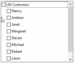
static string GetConnectionString()
       {
           //if process is 32bit use JET.OLEDB otherwise use ACE.OLEDB
            string provider = "Microsoft.Jet.OLEDB.4.0";
           if (Environment.Is64BitProcess)
               provider = "Microsoft.Ace.OLEDB.12.0";
           string connectionString = $"Provider={provider};Data Source=" +
                    System.IO.Path.Combine(Environment.GetFolderPath(Environment.SpecialFolder.MyDocuments),
                    @"ComponentOne Samples\Common\C1NWind.mdb") + ";";
           return string.Format(connectionString);
       }
       DataTable GetDataSource(string selectStatement)
       {
           // Set up connection string
            string conn = GetConnectionString();
           // Set up SQL statement
            string rs = selectStatement;
           // Retrieve data into DataSet
            OleDbDataAdapter da = new OleDbDataAdapter(rs, conn);
           DataSet ds = new DataSet();
           da.Fill(ds);
           // Return data table
            return ds.Tables[0];
       }
Set the DataSource and DisplayMemberPath properties of the CheckList control.
lCheckList.BindingInfo.DataSource = GetDataSource("Select * from Employees ");
lCheckList.BindingInfo.DisplayMemberPath = "FirstName";
After completing the above mentioned steps, you will get the following result.
Bind with Object Collection
To bind the CheckList control to a list of data objects, follow these steps:
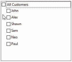
Create a class named Customer using the following code.
public class Customer
{
    string name;
    string customerID;
    string mobile;
    string email;
    public Customer(string _name, string _custId, string _mobile, string _email)
    {
        this.name = _name;
        this.customerID = _custId;
        this.mobile = _mobile;
        this.email = _email;
    }
    public string Name
    {
        get
        {
            return name;
        }
    }
    public string CustomerID
    {
        get
        {
            return customerID;
        }
    }
    public string Mobile
    {
        get
        {
            return mobile;
        }
    }
    public string Email
    {
        get
        {
            return email;
        }
    }
}
Add objects of Customer class to a BindingList and set C1CheckList’s DataSource and DisplayMemberPath properties at Form_Load event.
BindingList<Customer> customers = new BindingList<Customer>();
customers.Add(new Customer("John", "C001", "8888832141", "john@gmail.com"));
customers.Add(new Customer("Alex", "C002", "8888832142", "@gmail.com"));
customers.Add(new Customer("Shawn", "C003", "8888832143", "shawn@gmail.com"));
customers.Add(new Customer("Sam", "C004", "8888832144", "sam@gmail.com"));
customers.Add(new Customer("Neo", "C005", "8888832145", "neo@gmail.com"));
customers.Add(new Customer("Paul", "C006", "8888832146", "paul@gmail.com"));
lCheckList.BindingInfo.DataSource = customers;
lCheckList.BindingInfo.DisplayMemberPath = "Name";
After completing the above mentioned steps, you get the following result.
Selection
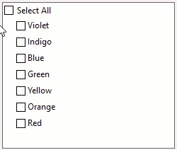
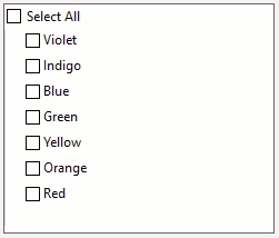
You can select/deselect all items in the list with single selection. To enable this option, you need to set the ShowSelectAll property to true. On setting this property to true, the Select All check box appears on top of the list of items. When you deselect the Select All check box, all items in the list are deselected.
The following sample code shows how to select/deselect all items in the list.
// To show the Select All checkbox
lCheckList.ShowSelectAll = true;
In order to display CheckList control with the selected item at initial stage, you can use the following sample code.
// Make the third item from top appear in the selected state in the CheckList control
lCheckList.SelectedItem = c1CheckListItem3;
You can use the SelectionMode property to determine whether a user can select one or more than one item from the header. This property lets you choose between the following selection modes through SelectionMode enumeration:
- Single: Allows you to select only one item at a time.
- Multiple: Allows you to select multiple items without holding down a modifier key.
- Radio: Allows you to select only one item at a time and deselect the item while holding down the ctrl modifier key.
- Extended: Allows you to select multiple consecutive items while holding down the corresponding modifier key.
The following sample code shows the method to set the SelectionMode property.
// To select multiple items at the same time
lCheckList.SelectionMode = C1.Win.TreeView.SelectionMode.Multiple;
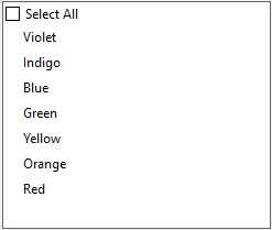
Show or Hide CheckBoxes
You can set the visibility of check boxes in the CheckList control by using ShowCheckBoxes property of the C1CheckList class. The following image displays CheckList items without the check boxes.
The following sample code sets the visibility of checkbox in the CheckList control.
// Hide checkboxes for each CheckList item
lCheckList.ShowCheckBoxes = false;
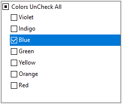
Customize Captions
You can customize the CheckList control as per your requirements. You can change the captions of Select All option using SelectAllCaption property and the caption of Unselect All option using UnselectAllCaption property of the C1CheckList class.
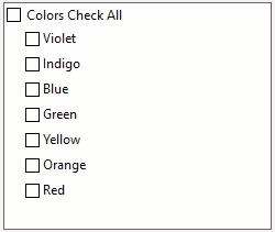
The following sample code sets the SelectAllCaption and UnselectAllCaption property of CheckList.
lCheckList.ShowCheckBoxes = true;
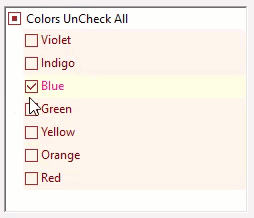
lCheckList.SelectAllCaption = "Colors Check All";
lCheckList.UnselectAllCaption = "Colors UnCheck All";
Appearance and Style
CheckList allows you to change the appearance and style of all items in the control. You can use the BorderColor and BorderStyle property to style the border of the CheckList. In addition, you can also set the style of default, selected and hot state of CheckList control. The following GIF shows the style applied to the CheckList's items.
// Set the color of checkbox
lCheckList.Styles.CheckBoxColor = Color.Brown;
// Set the border style
lCheckList.BorderStyle = BorderStyle.Fixed3D;
lCheckList.BorderColor = Color.Black;
// Gets style for the default state of CheckList
lCheckList.Styles.Default.BackColor = Color.OldLace;
lCheckList.Styles.Default.ForeColor = Color.Maroon;
// Gets style for the selected state of CheckList
lCheckList.Styles.Selected.BackColor = Color.LightYellow;
lCheckList.Styles.Selected.ForeColor = Color.DeepPink;
// Gets style for the hot state of CheckList
lCheckList.Styles.Hot.BackColor = Color.Orange;
lCheckList.Styles.Hot.ForeColor = Color.LightGray;