Appearance and Style
This section provides you with information about customizing the appearance of the TreeView control and its elements. You can customize the control in a number of ways, as explained in the following sections:
Themes
You can apply a number of built-in or custom themes to present TreeView with a consistent and customized look by using Themes for WinForms. For more information, refer to the Themes for WinForms documentation.
Tree Lines
Tree lines, as the name suggests, are the lines connecting the nodes of a TreeView displaying the relationship between parent and child nodes clearly.
TreeView allows you to display or hide the tree lines by setting the ShowLines property provided by the TreeViewStyles class to true or false. In addition, the control enables you to perform customizations, as follows:
Color: Change the color of the connected lines between the nodes by setting the LinesColor property of theTreeViewStyles class.
Width: Set the width of the tree lines by setting the LinesWidth property of TreeViewStylesto integer values.
Style: Specify the style of the tree lines by setting theLinesStyle property of TreeViewStylesfrom the DashStyle enumeration.
The following image shows TreeView with the tree lines customized with respect to their color, width, and style.

The following code snippet enables the visibility of the tree lines and customizes them in terms of their width, color, and style.
'set the ShowLines property
C1TreeView1.Styles.ShowLines = True
'set the LinesWidth property
C1TreeView1.Styles.LinesWidth = 2
'set the LinesColor proprerty
C1TreeView1.Styles.LinesColor = System.Drawing.Color.Orange
' set the LinesStyle property
C1TreeView1.Styles.LinesStyle = Drawing2D.DashStyle.Solid
// set the ShowLines property
c1TreeView1.Styles.ShowLines = true;
// set the LinesWidth property
c1TreeView1.Styles.LinesWidth = 2;
// set the LinesColor proprerty
c1TreeView1.Styles.LinesColor = System.Drawing.Color.Orange;
// set the LinesStyle property
c1TreeView1.Styles.LinesStyle = System.Drawing.Drawing2D.DashStyle.Solid;Styling a Single Node or Node Cell
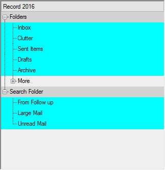
TreeView allows you to change the style of a single node or node cell by using the ApplyNodeStyles and the ApplyNodeCellStyles event of C1TreeView. The ApplyNodeStyles event occurs when you apply styles to a node, while the ApplyNodeCellStyles event occurs when you apply styles to a cell of a node.
To customize a node or a node cell, you first need to specify the node level by using the Level property of the C1TreeNode class. And then you can use the NodeStyles or the NodeCellStyles property provided by the C1TreeViewNodeStylesEventArgs and the C1TreeViewNodeCellStylesEventArgs class respectively, to access properties of NodeCellStyle and TreeNodeCellStyles classes. Using various properties provided by these classes, such as BackColor, ForeColor, Default, and others, you can customize a specific node or node cell.
The following code snippet shows the implementation.
Private Sub C1TreeView1_ApplyNodeStyles(sender As Object, e As C1TreeViewNodeStylesEventArgs)
    If (e.Node.Level = 1) OrElse (e.Node.Level = 2) Then
        e.NodeStyles.[Default].BackColor = Color.Aqua
    End If
End Sub
Private Sub C1TreeView1_ApplyNodeCellStyles(sender As Object, e As C1.Win.TreeView.C1TreeViewNodeCellStylesEventArgs)
    If e.Node.Level = 0 AndAlso e.ColumnIndex = 0 Then
        e.NodeCellStyles.[Default].BackColor = Color.LightGray
    End If
End Sub
private void C1TreeView1_ApplyNodeStyles(object sender, C1.Win.TreeView.C1TreeViewNodeStylesEventArgs e)
{
if ((e.Node.Level == 1)||(e.Node.Level == 2))
e.NodeStyles.Default.BackColor = Color.Aqua;
}
private void C1TreeView1_ApplyNodeCellStyles(object sender, C1.Win.TreeView.C1TreeViewNodeCellStylesEventArgs e)
{
if (e.Node.Level == 0 && e.ColumnIndex == 0)
e.NodeCellStyles.Default.BackColor = Color.LightGray;
}


