
Design-Time Support
InputPanel provides customized context menus, smart tags, and designers that offer rich design-time support and simplify working with the object model.
Tasks Menu
A task menu provides you an easy access to the commonly used properties of a control. To access the C1InputPanel Tasks menu, click on the smart tag ( ) in the upper right corner of the InputPanel control.
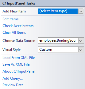
Following table describes all the options provided by the C1InputPanel Tasks menu.
| Option | Description |
|---|---|
| Add New Item | The dropdown box provides a list of input components to choose from. |
| Edit Items | This option opens the C1InputPanel Items Collection Editor to add, move or remove InputPanel components. |
| Check Accelerators | This option opens the Check Keyboard Accelerators designer which lets you check or clear the keyboard accelerators assigned to the InputPanel fields. |
| Clear All Items | This option removes all the components from the InputPanel control. |
| Choose Data Source | The dropdown opens a list of available data sources and allows you to add a new data source. To add a new data source to the project, click Add Project Data Source to open the Data Source Configuration Wizard. |
| Visual Style | The dropdown opens a list box of several built-in schemes for you to choose from. The default visual style is System. |
| Load From XML File | This option opens the Load from XML File dialog box, which you can use to navigate and select an XML file to load the InputPanel layout. |
| Save As XML File | This option opens the Save as XML File dialog box, which you can use to navigate and save the InputPanel layout as an XML file. |
| About C1InputPanel | This option displays the About C1InputPanel dialog box, which indicates the version of C1InputPanel and license details. |
| Add Query... | This option gets displayed when the InputPanel control is bound to a data source. When clicked, it displays the Search Criteria Builder dialog box, which lets you create a SQL query to display data on selective basis. |
| Preview Data... | This option gets displayed when the InputPanel control is bound to a data source. When clicked, it displays the Preview Data dialog that lets you preview the selected object. |
Context Menu
InputPanel also provides some of its commonly-used operations through the context menu, which is invoked by right clicking the control. Hence, in the context menu, some of the options are specific to InputPanel operations.
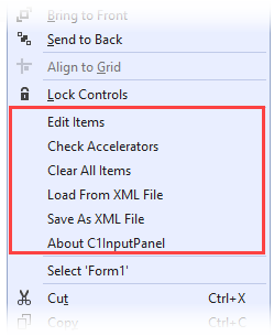
| Option | Description |
|---|---|
| Edit Items | This option opens the C1InputPanel Items Collection Editor to add, move or remove InputPanel components. |
| Check Accelerators | This option opens the Check Keyboard Accelerators designer which lets you check or clear the keyboard accelerators assigned to the InputPanel fields. |
| Clear All Items | This option removes all the components from the InputPanel control. |
| Load From XML File | This option opens the Load from XML File dialog box, which you can use to navigate and select an XML file to load the InputPanel layout. |
| Save As XML File | This option opens the Save as XML File dialog box, which you can use to navigate and save the InputPanel layout as an XML file. |
| About C1InputPanel | This option displays the About C1InputPanel dialog box, which indicates the version of C1InputPanel and license details. |
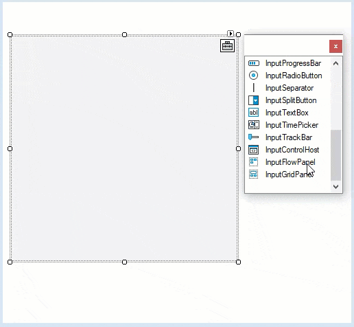
Designer Toolbox Window
InputPanel now provides a useful design-time feature in .NET Framework, to let you drag and drop items from a toolbox-like window onto the InputPanel control.
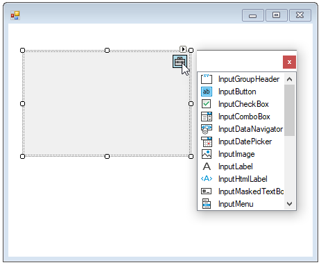
The GIF depicts a scenario where the user adds items like InputFlowPanel, InputGridPanel, buttons, comboxes, rangeslider etc. to the InputPanel using the drag and drop feature at design time.
type=note
Note: WinForms .NET Edition does not include rich design-time support yet. We will enhance it in the future releases.