
Appearance and Style
InputPanel provides eight predefined visual styles and a customizable visual style, so that you can easily achieve one of the most acceptable look and feel for your form.
You can set these visual styles using VisualStyle property of the C1InputPanel class. This property accepts values from VisualStyle enumeration. Setting the VisualStyle property on the InputPanel control also handles the gradients and borders of the components included in the InputPanel.
type=note
Note: VisualStyle is not supported in InputPanel control of .NET edition. So VisualStyles are only applicable to .Net Framework edition. csharp
// Set the visual style
   c1InputPanel1.VisualStyle = VisualStyle.Office2010Black;
vbnet
' Set the visual style
c1InputPanel1.VisualStyle = VisualStyle.Office2010Black
Following table covers all the possible values of the VisualStyle property and the resultant look of the control.
| VisualStyle | Description | Snapshot |
|---|---|---|
| Custom | You can use styles and appearance properties to customize the control. | 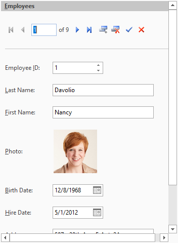 Custom Visual Style Custom Visual Style |
| Office2007Black | The style matches Office2007 Black color scheme. | 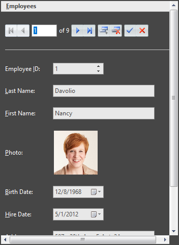 Office 2007 Black Office 2007 Black |
| Office2007Blue | The style matches Office2007 Blue color scheme. | 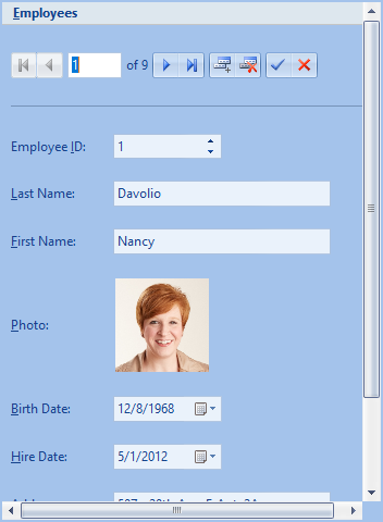 Office 2007 Blue Office 2007 Blue |
| Office2007Silver | The style matches Office2007 Silver color scheme. | 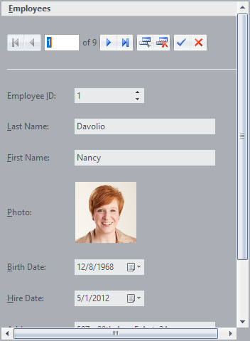 Office 2007 Silver Office 2007 Silver |
| System (Default) | The style matches the current system settings. | |
| Office2010Blue | The style matches Office2010 Blue color scheme. | 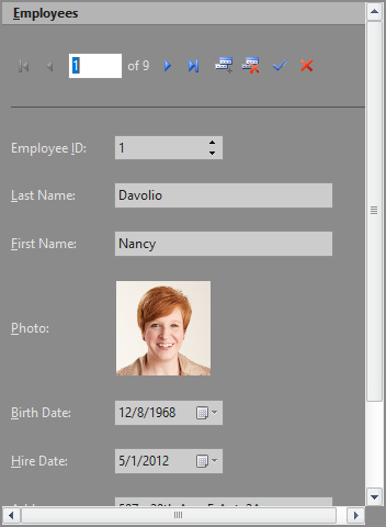 Office 2010 Black Office 2010 Black |
| Office2010Black | The style matches Office2010 Black color scheme. | 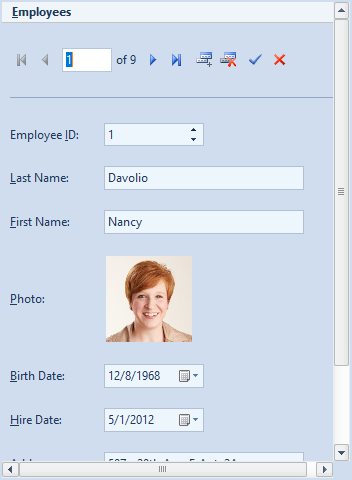 Office 2010 Blue Office 2010 Blue |
| Office2010Silver | The style matches Office2010 Silver color scheme. | 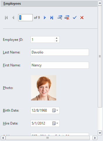 Office 2010 Silver Office 2010 Silver |
| Windows7 | The styles matches Windows7 color scheme. | 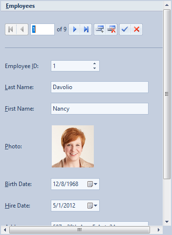 Windows 7 Windows 7 |
In addition to these visual styles, you can use C1ThemeController to apply other themes to the InputPanel control. You could also create your own theme using the ThemeDesigner. For more information on the C1ThemeController, see the Themes for WinForms documentation.
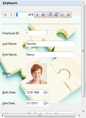
Adding a Background Image
To add a background image to the InputPanel control, you can use BackgroundImage property of the C1InputPanel class. At design time, click the ellipsis button next to this property to open a Select Resource dialog. The dialog lets you select the source of image which can either be a project resource or can be imported from the system. You can also set the layout of image to center, stretch, tile etc. by using the BackgroundImageLayout property.
csharp
// Set the background image
   c1InputPanel1.BackgroundImage = Image.FromFile(@"C:\Resources\sample-image.jpeg");
// Set the image layout
   c1InputPanel1.BackgroundImageLayout = ImageLayout.Center;
vbnet
' Set the background image

c1InputPanel1.BackgroundImage = Image.FromFile("C:\Resources\sample-image.jpeg")
' Set the image layout

c1InputPanel1.BackgroundImageLayout = ImageLayout.Center
Customize Error Frame
By default, InputPanel displays a red error frame around a field which receives an invalid input from the user. You can customize this error frame to change its color by using the ErrorFrameColor property of the C1InputPanel class. You can also change the frame thickness by using the ErrorFrameThickness property.
| Default Error Frame | Customized Error Frame |
|---|---|
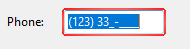 |
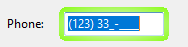 |
csharp
// Set the color of error frame
  c1InputPanel1.ErrorFrameColor = Color.Chartreuse;
// Set the thickness of error frame
  c1InputPanel1.ErrorFrameThickness = 5;
vbnet
' Set the color of error frame

c1InputPanel1.ErrorFrameColor = Color.Chartreuse
' Set the thickness of error frame

c1InputPanel1.ErrorFrameThickness = 5