Accordion Layout
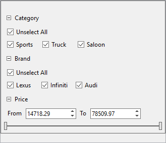
The DataFilter control enables you to create an interactive user interface by organizing the filter conditions (or filters) as a vertically stacked list of items, which gives it the look and feel of an accordion layout. You can easily toggle the display of the conditions associated with each filter separately using expand and collapse icons.

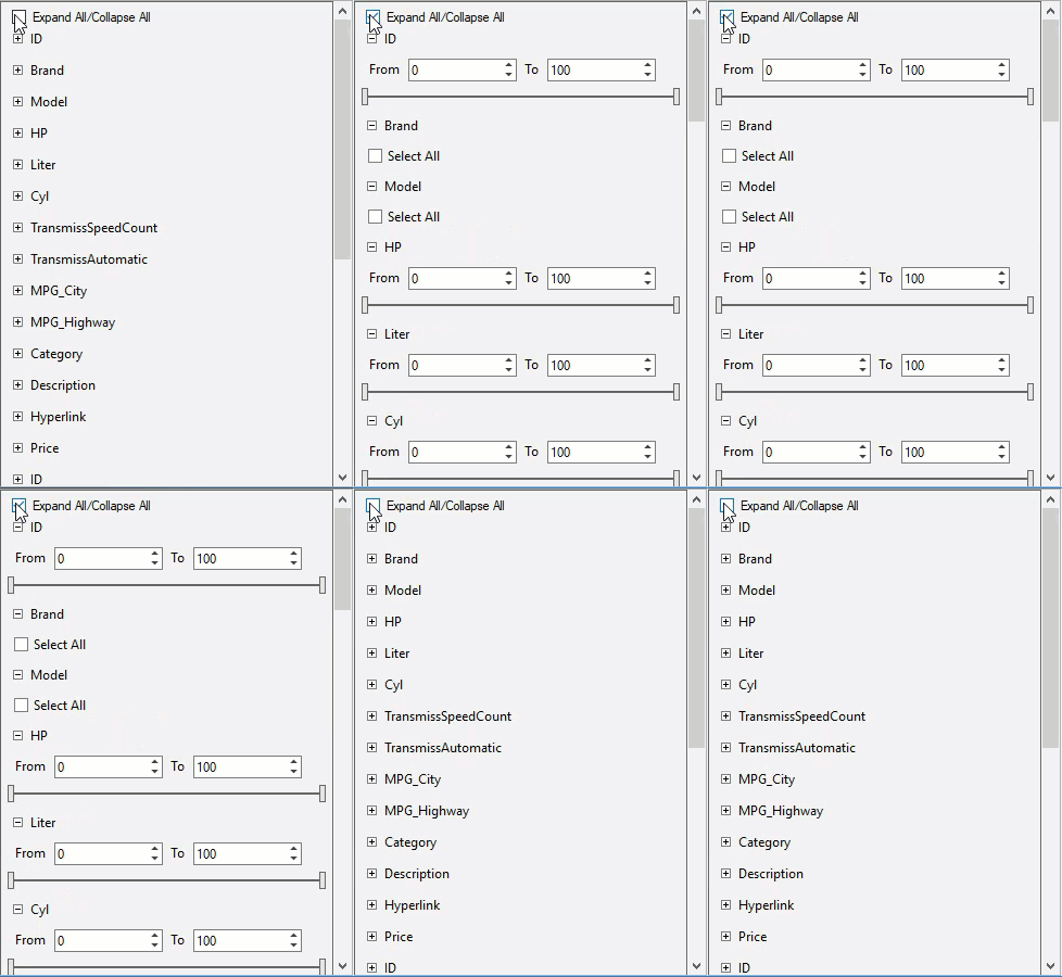
In addition, you can also expand and collapse all of the filter conditions at once using ExpandAll and CollapseAll methods in C1DataFilter class. This makes it convenient to navigate through different filter headers as a group when required.
The following GIF demonstrates the use of ExpandAll and CollapseAll feature.

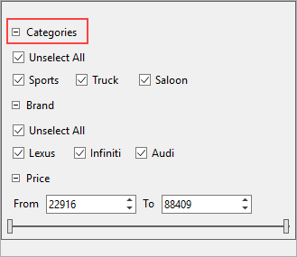
In DataFilter, you can customize the header text of filters using HeaderText property of the C1DataFilter class.
The following image shows the customized header text on using the HeaderText property.

The following code example demonstrates the use of HeaderText property to change the header text:
Private Sub C1DataFilter1_FilterAutoGenerating(ByVal sender As Object, ByVal e As C1.DataFilter.FilterAutoGeneratingEventArgs)
        If (e.Property.Name = "Category") Then
            Dim categoryFilter = CType(e.Filter,C1.Win.DataFilter.ChecklistFilter)
            categoryFilter.HeaderText = "Categories"
        End If
    End Sub
private void C1DataFilter1_FilterAutoGenerating(object sender, C1.DataFilter.FilterAutoGeneratingEventArgs e)
{
if (e.Property.Name=="Category")
{
var categoryFilter = (C1.Win.DataFilter.ChecklistFilter)e.Filter;
categoryFilter.HeaderText = "Categories";
}
}

