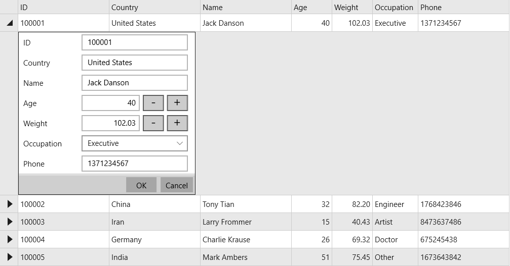
InputPanel supports integration with FlexGrid to display data in details part of a row in a compact layout. The control can be embedded with ComponentOne's FlexGrid control to display the data by means of row details template. Using this template, InputPanel can be embedded with each row of the FlexGrid control, in a collapsible section.
To integrate InputPanel with FlexGrid, you need to define the template where you add the InputPanel control in the RowDetailsTemplate property of the FlexGrid control.
The following image shows an InputPanel integrated with a FlexGrid through RowDetailsTemplate.

| XAML |
Copy Code
|
|---|---|
<FlexGrid:C1FlexGrid x:Name="FlexGrid" Margin="20,50,0,10" HorizontalAlignment="Left" AlternatingRowBackground="{Binding GroupRowBackground, ElementName=FlexGrid}" > <FlexGrid:C1FlexGrid.RowDetailsTemplate> <DataTemplate> <InputPanel:C1InputPanel x:Name="InPanel" CurrentItem="{Binding}" HorizontalAlignment="Left"/> </DataTemplate> </FlexGrid:C1FlexGrid.RowDetailsTemplate> </FlexGrid:C1FlexGrid> |
|