
- Blazor Overview
- Get Started with Blazor
- Free and Open Source Software (FOSS) License
- Section 508 Compliance
- Blazor Project Types
- Adding NuGet Packages to your App
- Controls
- Release History
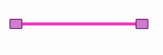
RangeSlider
Add smooth numeric data selection to your Blazor application with RangeSlider for Blazor which extends the basic slider control. RangeSlider provides two thumbs instead of one, allowing you to select a range of values instead of a single value. It enables you to select a range of numeric data with lower-value and upper-value thumbs. RangeSlider can also be used as a standalone control or can be integrated with other controls such as NumericBox, TextBox, etc. It has a simple and easy-to-use API that not only lets you set the range of values, but also provides built-in functionality to change the orientation of the control. Moreover, RangeSlider provides various options to customize its appearance and style to change the look and feel of your application.
Key Features
- Set Min Max Values
With RangeSlider, you can set the lowest and highest values to create the range of permitted values according to your application requirements. - Set Orientation
Change the orientation of the RangeSlider with one simple property. For more information, see Orientation. - Customizable Thumbs
Customize the thumbs of RangeSlider to create custom zooming controls. Moreover, you can also change the way the thumbs moves when you click outside the selected range in the slider track. - Customize Appearance
Style and customize the RangeSlider and all its elements using various properties provided by the C1RangeSlider class. For more information, see Styling.