
DataFilter
Data filtering refers to setting conditions on data so that only specific data is displayed. Filtered data is easier to analyze and allows you to focus on specific information in a large set of data. ComponentOne Blazor provides the data filtering through the DataFilter control. DataFilter allows users to filter data on the basis of filter criterias or conditions. It can be used in conjunction with data-aware controls like grids, lists, treeview, charts, and others. The DataFilter control gives users a way to focus on the subsets of data. There are many components that offer filtering options like column filtering in grids but when users need to filter all the information on the screen, DataFilter can help with quick filtering at one place using different value and expression based filters.
The DataFilter UI provides E-commerce-like filters to accompany any extensive data collection. It can be used to build filters similar to the ones you see in different e-commerce websites where the grid displaying a product listing shows only specific attributes, such as product name and product image. However, you can set filters for a specific brand, category, price etc. using the DataFilter. Such filters cannot be set from column filters in the data grid controls.
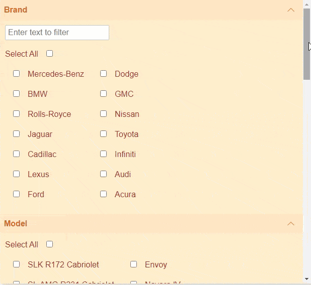
It reads properties of the DataSource and automatically creates corresponding filter types amongst DataRangeFilter, CheckListFilter and RangeFilter as shown in the image below.
Key Features
- Manage groups using accordion layout
The DataFilter control lays out the filters as a vertically stacked list of items. Corresponding to each filter, an accordion tab is added which contains the controls used to filter the data-aware control by a specific field. Each filter element can have header and can be expanded or collapsed to show or hide the associated content. - Use different filters to filter distinct data
DataFilter provides different kinds of filters like ThreeStateFilter, RangeFilter, DateRangeFilter, ChecklistFilter and FullTextFilter to filter different types of data based on values and expressions. For example, to filter Boolean values, the DataFilter control automatically creates a ThreeStateFilter which is represented by a checkbox. Similarly, the control generates filter with range editors for filtering range values. Filters can also be added programmatically to the DataFilter control. - Customize appearance
DataFilter provides dedicated class for each of its element which makes it easier to customize the appearance of the control and its elements. - Easy integration with controls
DataFilter can be easily paired up with any data-aware control like grid, list, treeView, chart or map.