
- Blazor Overview
- Get Started with Blazor
- Free and Open Source Software (FOSS) License
- Section 508 Compliance
- Blazor Project Types
- Adding NuGet Packages to your App
- Controls
- Release History
Quick Start
The following quick start guide is intended to get you up and running with the DateRangePicker control. In this quick start, you start with creating a new application, add the DateRangePicker control to it, set its value and display a date range in it. When you click the drop-down button to open the calendar, the DateRangePicker control shows one calendar months, by default. However, you can change the month count displayed in the control as per your requirements. For more information on changing the number of months displayed in the DateRangePicker control, see Day and Date Range topic.
Create a Blazor App
- In Visual Studio, select Create a new project from the Get started pane.
- In the Create a new project dialog, select Blazor WebAssembly App, and click Next. Alternatively, you can also create a Blazor Server App.
type=note
Note: Blazor Server App or server-side app can be created using the Blazor Server App template. For more details, see Blazor Server topic under Blazor Project Types.
- In the Configure your new project dialog, provide name of the project you want to create in the Project name field and location for the project in the Location field. Click Next.
- In the Additional information dialog, select the target framework from the Framework dropdown, if required and click Create. By default, the selected framework is .NET 8.0.
A new client-side Blazor app is created.
Configure References
In the Solution Explorer, right click Dependencies and select Manage NuGet Packages.
In NuGet Package Manager, select nuget.org as the Package source.
Search for C1.Blazor.DateTimeEditors package and click Install.
Navigate to the wwwroot, open index.html file.
Register the client resources by adding the following lines of code to the <head> tag.
<link rel="stylesheet" href="/_content/C1.Blazor.Core/styles.css" />
<link rel="stylesheet" href="/_content/C1.Blazor.Calendar/styles.css" />
<link rel="stylesheet" href="/_content/C1.Blazor.DateTimeEditors/styles.css" />
Add the following code to the <body> tag.
<script src="/_content/C1.Blazor.Core/scripts.js"></script>
<script src="/_content/C1.Blazor.Calendar/scripts.js"></script>
Right click on Pages folder, click Add | Razor Component to add a new Razor page and then provide a name, say RangePickerQuickStart.
Add the required directives to initialize and use the DateRangePicker control in the new Razor page.
@using C1.Blazor.Input
Configure the DateRangePicker control
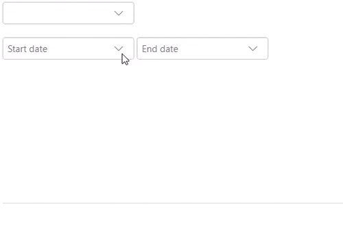
Display a date range in the DateRangePicker control by simply using the Value property of the C1DateRangePicker class as shown in the following code. In this example, the Value property gets the range values from two DatePicker controls bound to the DateRangePicker control, which accepts the start date and end date to be set for displaying the date range.
<C1DateRangePicker Value="_c1DateRangePickerSettings.DateRange"></C1DateRangePicker>
    <span>@_c1DateRangePickerSettings?.DateRange?.ToString()</span>
    <br />
    <br />
    <C1DatePicker @bind-Value="_c1DateRangePickerSettings.DateRange.Start" Placeholder="Start date"></C1DatePicker>
    <C1DatePicker @bind-Value="_c1DateRangePickerSettings.DateRange.End" Placeholder="End date"></C1DatePicker>
<br />
    <br />
@code {
        class C1DateRangePickerSettings
        {
            public DateRange DateRange { get; set; }
            public C1DateRangePickerSettings()
            {
                DateRange = new DateRange();
            }
        }
        readonly C1DateRangePickerSettings _c1DateRangePickerSettings = new C1DateRangePickerSettings();
    }
Build and Run the Project
- Click Build | Build Solution to build the project.
- Press F5 to run the project.