
ComboBox Overview
The ComboBox control combines an input element with a drop-down list. You can use it to select and/or edit strings or objects from lists. The control automatically completes entries as the user types, and allows users to show a drop-down list with the items available.
Some important properties related to Combobox are:
itemsSource : Populates the list of items which can be either strings or objects.
displayMemberPath: Specifies which property of the items is displayed in the list, if the items are objects.
selectedValuePath: Defines which property of the items is used to set the selectedValue property of combobox.
selectedIndex: Determines the index of currently selected item.
text: Determines the text of currently selected item.
isRequired: Determines whether value of control can be set to null by deleting the content of the control. If the value is set to null, the selectedIndex is set to -1.
isEditable: Determines whether users can enter values that are not present in the list.
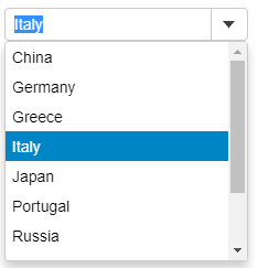
In the example below, we have created and populated a ComboBox using an object array and defining the displayMemberPath.
HTML
<div id="theComboObject"></div>Javascript
import * as wijmo from '@mescius/wijmo';
import * as input from '@mescius/wijmo.input';
import { getCountries, getData } from './data';

function init() {
    // select an item (object)
    var theComboObject = new input.ComboBox('#theComboObject', {
        displayMemberPath: 'country',
        itemsSource: getData()
    });
}
Add Items Automatically
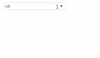
User can dynamically add items to the ComboBox itemsSource by setting the isEditable property to True and then handling the lostFocus event. As soon as user types in a value that does not exist in the itemsSource and moves the focus away from the control, the lostFocus event appends the typed item to the array assigned as the itemsSource of the control.
HTML
<div id="theCombo"></div>Javascript
import * as wijmo from '@mescius/wijmo';
import * as input from '@mescius/wijmo.input';

function init() {
    let countries = new wijmo.ObservableArray(['US', 'Germany', 'UK', 'Japan', 'Italy', 'Greece']);
    //
    new input.ComboBox('#theCombo', {
        itemsSource: countries,
        isEditable: true,
        lostFocus: lostFocus
    });

    // add item to the list when a control loses focus
    function lostFocus(sender) {
        let item = sender.text;
        if (item && countries.indexOf(item) < 0) {
            countries.push(item);
        }
    }
}
The ComboBox control supports the following keyboard commands:
Operating on Input element:
Key Combination | Action |
|---|---|
Down | Change the current value to the next option's value without opening the dropdown list. |
Up | Change the current value to the previous option's value without opening the dropdown list. |
Alt + Down / Alt + Up | Open the dropdown list. |
Printable Characters | Search for items that contain the text typed. |
To better comply with WCAG standards, you can use KeyAction to modify the behavior of the up and down arrow keys.
import * as input from '@mescius/wijmo.input';

new input.ComboBox('#theCombo', {
    keyActionDownArrow: input.KeyAction.OpenDropdown // Open the dropdown list when pressed down arrow key
});
Operating on the dropdown list:
Key Combination | Action |
|---|---|
Enter | Change to the value of the currently selected option and close the dropdown list. |
Escape | Close the dropdown list. |
Down Arrow | Move to the next option and change the value. |
Up Arrow | Move to the previous option and change the value. |
Alt + Up Arrow | Change to the value of the currently selected option and close the dropdown list. |
Page Up | Move up 10 options. |
Page Down | Move down 10 options. |