
List of Features
The features provided by this product are as follows:
Feature | Description |
|---|---|
Data Binding | Supports binding worksheets to data sources, automatically displaying data from various sources such as data tables or data collections. Additionally, it allows you to use the IDataManager interface to add new rows to bound worksheets, add unbound rows to bound worksheets and synchronize them with the data source, as well as add unbound columns to the worksheet. |
File Input/Output | Supports Excel (.xlsx/.xlsm, import/export), CSV (export), PDF (export), HTML (export), and XML (import) formats. |
Header | Supports multi-row and multi-column headers, custom column header heights and row header widths, header cell merging, customizable header styles, and the ability to hide headers. |
Printing | Supports print preview, header/footer settings, the option to display the print dialog, page settings (margins, page orientation, page order, page break, paper scaling, paper size), and print range specification. |
Cell | Supports configuring active cells, merging/unmerging cells, unlocking cells, customizing cell text format, size, background color, borders, fill, and styles. |
Validation | Supports multiple types of data validation, including number validation, decimal validation, list validation, date validation, time validation, text length validation, and custom formula validation. Also supports data warning levels such as Stop, Warning, and Information. |
Sorting | Supports sorting by columns or sorting data within a specified range of cells, rows, and elements. |
Filtering | Filtering via user operation or coding. |
Conditional Formatting | Value specification, comparison with average, date, formula, color scale, string comparison, top/bottom, duplicate values. |
Scrolling | Supports scrolling by row/column and by pixel, scrolling to a specific cell, freezing panes, and splitting panes. |
Group | Supports grouping and ungrouping of rows and columns, as well as collapsing groups and setting outline levels. |
Formulas | Over 500 built-in Excel-compatible functions, supporting both A1 and R1C1 reference styles. |
Interactive Operations | Supports copy and paste, dragging rows and columns, as well as dragging to move and fill cell ranges. |
Table | Supports built-in and custom table styles, as well as structured references. |
Chart | Supports common chart types and allows users to customize chart elements such as titles, legends, axes, data labels, and styles for clearer data presentation. |
PivotTable | Summarize, analyze, and reorganize large amounts of worksheet data using PivotTables. Users can group, filter, sort, and aggregate data dynamically to quickly discover insights and create interactive summary reports. |
Cell Types
Type | Icon | Description |
|---|---|---|
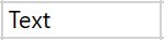
Text Cell |
| Text cells display only text or treat the contents of a cell as text. |
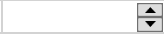
Number Cell | | Input/display format settings, maximum/minimum values, watermark (placeholder), input suggestions, drop-down calculator, spin button. |
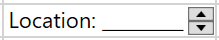
Mask Cell | | Configuration of input masks and automatic character conversion, watermark (placeholder), input suggestions, and enumerated fields (configuration of a collection of allowed input strings). |
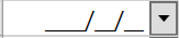
Date-Time Cell | | Configuration of input/display formats, maximum and minimum values, watermark (placeholder), input suggestions, drop-down calendar, and spin button. |
Button Cell | | Displays a gray rectangular button. This cell type can show both text and images on the button. In addition, button cells support command execution—clicking the button will trigger the associated command. |
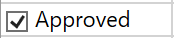
Checkbox Cell |
| A checkbox cell adds a checkbox to the cell, allowing users to toggle options. |
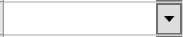
Combo Box Cell | | Displays an editable drop-down list within the cell. |
Data Template Cell | | Customize the appearance of a cell, whether it is being edited or not, using a WPF data template (the image on the left shows an example with a progress bar). |
Image Cell |
| Create an image within a cell. |