
-
Spread Windows Forms Product Documentation
- Getting Started
-
Developer's Guide
- Understanding the Product
- Working with the Component
- Spreadsheet Objects
- Ribbon Control
-
Sheets
- Working with the Active Sheet
- Working with Multiple Sheets
- Customizing the Sheet Name Tabs
- Navigating Sheet Tabs
- Adding a Sheet
- Adding ChartSheet
- Removing a Sheet
- Showing or Hiding a Sheet
- Moving a Sheet
- Selecting Multiple Sheets
- Copying and Inserting a Sheet
- Protecting a Worksheet
- Form Controls
- Adding a Title and Subtitle to a Sheet
- Placing Child Controls on a Sheet
- Displaying a Footer for Columns or Groups
- Adding a Tag to a Sheet
- Working with 1-Based Indexing
- Customizing Clipboard Operation Options
- Rows and Columns
- Headers
- Cells
- Cell Types
- Data Binding
- Customizing the Sheet Appearance
- Customizing Interaction in Cells
- Tables
- Pivot Table
- Understanding the Underlying Models
- Customizing Row or Column Interaction
- Formulas in Cells
- Sparklines
- Keyboard Interaction
- Events from User Actions
- File Operations
- Storing Excel Summary and View
- Printing
- Chart Control
- Enhanced Chart
- Customizing Drawing
- Touch Support with the Component
- Spread Designer Guide
- Assembly Reference
- Import and Export Reference
- Version Comparison Reference
Customizing the Sheet Name Tabs
If there is more than one sheet in the workbook, the tab strip displays the sheet names tabs in a tab strip with the tab for the active sheet highlighted. The sheet tabs provide a way for the user to navigate to different sheets.
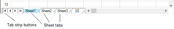
You can customize how and if to display the sheet names in tabs of the Spread component. By default, the tab strip is not displayed because there is only one sheet in the component until more sheets are added.
The contents that can be customized are as follows.
Tab Strip Display
You can set the component to always or never display the tab strip, or to display only when there are at least two sheets.For more information and code examples, refer to these members:
TabStripPolicy property of FpSpread class
ButtonPolicy property of TabStrip class
TabStripButtonPolicy enumeration
Note:
If you are planning to export the contents of the Spread to import into Excel, do not use characters in the sheet name that are invalid in Excel.Invalid Excel sheet name characters include: ? / \ * [ ]
For more information on how to add sheets to the workbook, kindly refer to "Adding a Sheet".
Tab Strip Appearance
Spread Windows Forms supports richer customization of sheet tab appearance, including tab icons, protected state colors, and hover styles. You can customize both the entire tab strip and individual sheet name tabs.
Background Color
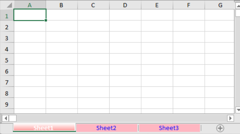
You can set properties for the sheet tab strip, such as the background color (by setting the InterfaceRenderer property of the FpSpread class to Nothing or null and turning visual styles off), as well as the text font for the sheet tabs. The default sheet tab names are "Sheet1", "Sheet2", and so on; you can specify custom names for each sheet, and these will appear on the sheet tabs.
The following example demonstrates how to set the background color of a sheet tab.
C#
// Set the number of sheets to 3.
fpSpread1.Sheets.Count = 3;

// Place the tab strip at the bottom of the control.
fpSpread1.TabStripPlacement = FarPoint.Win.Spread.TabStripPlacement.Bottom;

// Configure the appearance of the sheet tabs.
fpSpread1.TabStrip.DefaultSheetTab.BackColor = Color.LightPink;
fpSpread1.TabStrip.DefaultSheetTab.ForeColor = Color.Blue;
fpSpread1.TabStrip.DefaultSheetTab.Size = 120;
fpSpread1.TabStrip.ActiveSheetTab.BackColor = Color.Red;
fpSpread1.TabStrip.ActiveSheetTab.ForeColor = Color.White;
fpSpread1.TabStrip.ActiveSheetTab.Size = 120;
fpSpread1.TabStrip.ButtonPolicy = FarPoint.Win.Spread.TabStripButtonPolicy.Never;
VB
' Set the number of sheets to 3.
fpSpread1.Sheets.Count = 3

' Place the tab strip at the bottom of the control.
fpSpread1.TabStripPlacement = FarPoint.Win.Spread.TabStripPlacement.Bottom

' Configure the appearance of the sheet tabs.
fpSpread1.TabStrip.DefaultSheetTab.BackColor = Color.LightPink
fpSpread1.TabStrip.DefaultSheetTab.ForeColor = Color.Blue
fpSpread1.TabStrip.DefaultSheetTab.Size = 120
fpSpread1.TabStrip.ActiveSheetTab.BackColor = Color.Red
fpSpread1.TabStrip.ActiveSheetTab.ForeColor = Color.White
fpSpread1.TabStrip.ActiveSheetTab.Size = 120
fpSpread1.TabStrip.ButtonPolicy = FarPoint.Win.Spread.TabStripButtonPolicy.Never
Protected Color
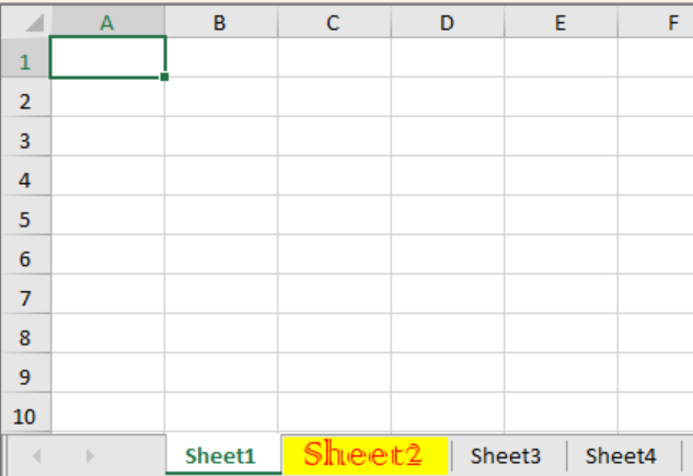
You can set a distinct appearance for protected sheet tabs using the ProtectedStyle property. This allows end-users to easily identify which sheets are protected. This allows end-users to easily identify which sheets are protected.
The following example demonstrates how to customize the style of a protected sheet tab.
C#
// Set the number of sheets to 4.
fpSpread1.Sheets.Count = 4;

// Set the second sheet to protected state.
fpSpread1.Sheets[1].Protect = true;

// Set the style of the tab in protected state.
fpSpread1.TabStrip.DefaultSheetTab.ProtectedStyle = new SheetTab();
fpSpread1.TabStrip.DefaultSheetTab.ProtectedStyle.BackColor = System.Drawing.Color.Yellow;
fpSpread1.TabStrip.DefaultSheetTab.ProtectedStyle.ForeColor = System.Drawing.Color.Red;
fpSpread1.TabStrip.DefaultSheetTab.ProtectedStyle.Font = new System.Drawing.Font("Colonna MT", 20);
fpSpread1.TabStrip.DefaultSheetTab.ProtectedStyle.Size = 100;
VB
' Set the number of sheets to 4.
fpSpread1.Sheets.Count = 4

' Set the second sheet to protected state.
fpSpread1.Sheets(1).Protect = True

' Set the style of the tab in protected state.
fpSpread1.TabStrip.DefaultSheetTab.ProtectedStyle = New SheetTab()
fpSpread1.TabStrip.DefaultSheetTab.ProtectedStyle.BackColor = System.Drawing.Color.Yellow
fpSpread1.TabStrip.DefaultSheetTab.ProtectedStyle.ForeColor = System.Drawing.Color.Red
fpSpread1.TabStrip.DefaultSheetTab.ProtectedStyle.Font = New System.Drawing.Font("Colonna MT", 20)
fpSpread1.TabStrip.DefaultSheetTab.ProtectedStyle.Size = 100
Sheet Tab Icons and Image Alignment
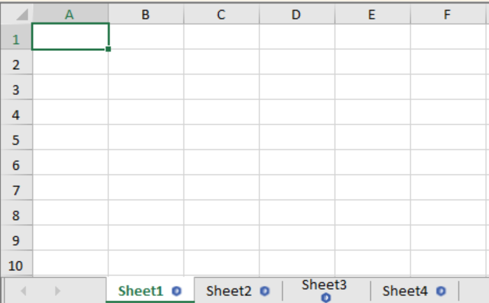
You can customize the icon displayed on each sheet tab and control the alignment of the icon within the tab. By setting the Image and ImageAlign properties, you can achieve various visual effects for your sheet tabs.
The following example demonstrates how to set the default icon and image alignment for sheet tabs.
C#
// Set the default icon for all sheet tabs.
fpSpread1.TabStrip.DefaultSheetTab.Image = System.Drawing.Image.FromFile(@"C:\Image\Image.bmp");
fpSpread1.TabStrip.DefaultSheetTab.ImageAlign = ContentAlignment.MiddleRight;

// Because ImageAlign is not supported for composition.
// We need to set DefaultSheetTab.ImageAlign before creating sheet tab to see it effect.
fpSpread1.Sheets.Count = 0;
fpSpread1.Sheets.Count = 4;

// Set the image alignment of the third tab to bottom center.
fpSpread1.TabStrip[2].ImageAlign = ContentAlignment.BottomCenter;
VB
' Set the default icon for all sheet tabs.
fpSpread1.TabStrip.DefaultSheetTab.Image = System.Drawing.Image.FromFile("C:\Image\Image.bmp")
fpSpread1.TabStrip.DefaultSheetTab.ImageAlign = ContentAlignment.MiddleRight

' Because ImageAlign is not supported for composition.
' We need to set DefaultSheetTab.ImageAlign before creating sheet tab to see it effect.
fpSpread1.Sheets.Count = 0
fpSpread1.Sheets.Count = 4

' Set the image alignment of the third tab to bottom center.
fpSpread1.TabStrip(2).ImageAlign = ContentAlignment.BottomCenter
Sheet Tab Hover Color
You can customize the appearance of the Sheet Tab when the mouse hovers over it.
The following example demonstrates how to set the hover style for sheet tabs.
C#
fpSpread1.Sheets.Count = 4;
fpSpread1.TabStrip.DefaultSheetTab.HoverStyle = new SheetTab();
fpSpread1.TabStrip.DefaultSheetTab.HoverStyle.BackColor = System.Drawing.Color.Yellow;
fpSpread1.TabStrip.DefaultSheetTab.HoverStyle.ForeColor = System.Drawing.Color.Red;
VB
fpSpread1.Sheets.Count = 4
fpSpread1.TabStrip.DefaultSheetTab.HoverStyle = New SheetTab()
fpSpread1.TabStrip.DefaultSheetTab.HoverStyle.BackColor = System.Drawing.Color.Yellow
fpSpread1.TabStrip.DefaultSheetTab.HoverStyle.ForeColor = System.Drawing.Color.Red
Tab Strip Placement
You can customize where the tab strip is displayed in the overall component.
Placement Value | Sample Showing Placement |
|---|---|
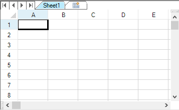
Top(at the top of the component above the headers) |
> !type=note > > If the grouping display is turned on, the tab strip appears below the group bar. |
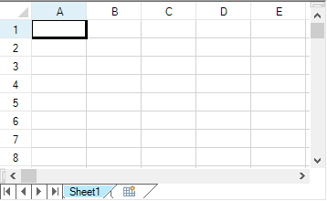
Bottom(under the scroll bar at the bottom of the component) |
|
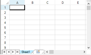
WithScrollBar(alongside the scroll bar at the bottom of the component) |
|
For more information and code examples, refer to the TabStripPlacement property of the FpSpread class.
Tab Strip Width
You can specify the width of the tab strip in relation to the overall scroll bar width, if the tab strip and scroll bar are displayed together in line.
You can set how wide the tab strip is, and therefore, how many sheet tabs are displayed. If the number of tabs exceeds the width of the tab strip, the component displays buttons. Click the buttons to display the next (or previous) sheet tabs. The width is set by setting the FpSpread TabStripRatio property of the FpSpread class, which sets the width of the tab strip as a percentage of the length of the entire component. By default, the ratio is set to 0.50 (area is divided 50% tab strip and 50% scroll bar).
For more information on setting the scroll bar properties, kindly refer to "Customizing the Scroll Bars.
Pointer Display over Tab Strip
You can specify that the pointer changes appearance when it is over the tab strip.Use the TabStrip value of the CursorType enumeration to display a pointer in the sheet tabs.
First Tab in Tab Strip
You can set which sheet tab to display as the left-most tab with the LeftTab property of the FpSpread class.
Tab Strip Events
You can work with the following events and event handlers.
OnSheetTabClick Method and OnSheetTabDoubleClick Method of FpSpread Class
SheetTabClick Event
SheetTabClickEventArgs Class
SheetTabClickEventHandler Delegate
SheetTabDoubleClick Event
SheetTabDoubleClickEventHandler Delegate
The name of the event that occurs when a user clicks on the sheet name tab is the SheetTabClick event.The tab that the user has clicked can be determined by getting the SheetTabIndex value.
The following is sample code to get the tab name (sheet name) from the index of the sheet.
private void fpSpread1_SheetTabClick(object sender, FarPoint.Win.Spread.SheetTabClickEventArgs e)
{
      string name = fpSpread1.Sheets[e.SheetTabIndex].SheetName;
}
Private Sub FpSpread1_SheetTabClick(ByVal sender As Object, ByVal e As FarPoint.Win.Spread.SheetTabClickEventArgs) Handles
FpSpread1.SheetTabClick
Dim name as String = FpSpread1.Sheets(e.SheetTabIndex).SheetName
End SubYou can customize all these features using code, and some can be set in the Spread Designer. For more information on how to work with the tab strip settings in Spread Designer, refer to the Spread Settings, General Tab in the Spread Designer Guide.
Example
This example sets the sheet tabs to always appear, sets the tab strip buttons to only appear as needed, sets the background color of the sheet tabs to Bisque, and sets the width of the tab strip to 60%.
// Set the sheet tabs to always appear
fpSpread1.TabStripPolicy = FarPoint.Win.Spread.TabStripPolicy.Always;
// Set the width to 60%
fpSpread1.TabStripRatio = 0.60;
// Display the tab strip buttons as needed
fpSpread1.TabStrip.ButtonPolicy = FarPoint.Win.Spread.TabStripButtonPolicy.AsNeeded;
// Set the background color
fpSpread1.TabStrip.BackColor = Color.Bisque;
fpSpread1.InterfaceRenderer = null;
' Set the sheet tabs to always appear
FpSpread1.TabStripPolicy = FarPoint.Win.Spread.TabStripPolicy.Always
' Set the width to 60%
FpSpread1.TabStripRatio = 0.60
' Display the tab strip buttons as needed
FpSpread1.TabStrip.ButtonPolicy = FarPoint.Win.Spread.TabStripButtonPolicy.AsNeeded
' Set the background color
FpSpread1.TabStrip.BackColor = Color.Bisque
FpSpread1.InterfaceRenderer = NothingUsing the Spread Designer
From the Settings menu, choose Tab Strip (Appearance section).
Under TabStripPolicy, select when you want the sheet tabs to be displayed or select Never to hide the sheet tabs.
No matter which item you select, inside Spread Designer the sheet tabs are always displayed to assist you in designing your component. When you exit Spread Designer and apply your changes, you can see the effect of the tab settings in your component, or you can see it by previewing the component inside Spread Designer. To preview inside Spread Designer, from the File menu choose Preview.
Set the width of the tab strip by setting the value in the Sheet Tab Percentage box.
Click OK to close the Spread Options dialog.
Select the Spread object.
In the property list, select the TabStrip property to see its properties.
Change the ButtonPolicy property if you want to change when the tab strip buttons are displayed.
Change the BackColor property if you want to change the background color for the tab strip.
From the File menu choose Apply and Exit to apply your changes to the component and exit Spread Designer.