
- Document Solutions for PDF .NET Overview
- Key Features
- Getting Started
- Product Architecture
- Features
- Access Primitive and High-Level PDF Objects
- Render HTML to PDF
- Save PDF as Image
- Barcodes in PDF
- Best Practices
- Walkthrough
- Tutorials
- Samples
- API Reference
- Document Solutions PDF Viewer Overview
- Release Notes
Form Filler
Form Filler feature, in DsPdfViewer, enhances your PDF form filling experience by allowing you to:
Add input validations to custom form input types like min and max length, required field, pattern, validation messages etc.
Add placeholder text
Customise UI Appearance of custom form input types
Add custom content to define any terminology, definition etc.
Fill PDF forms conveniently on small devices due to its responsive web design
While filling PDF forms, you can use either of the following methods:
Fill within DsPdfViewer
Fill using the Form filler dialog (the dialog can also add validations and other properties)
The PDF form field values, when filled in Form filler dialog are reflected in the underlying PDF form. You can also save the filled form on client by using SupportApi.
Note: SupportAPI is only needed if you want to save the filled form on client. Otherwise, load a PDF Form with custom form input types (explained below in this topic), enable the Form Filler dialog, fill the PDF Form within the Form Filler dialog, or even print a filled form on the client without using SupportApi.
Fill Forms using Form Filler Dialog
The 'Form Filler' button is provided in DsPdfViewer toolbar in the mobile layout by default but is enabled only when a PDF form is present in the Viewer.
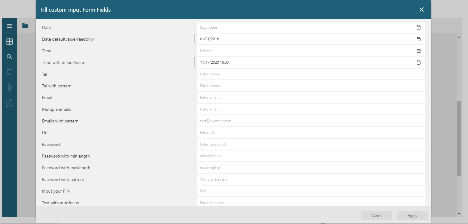
On clicking the 'Form Filler' button, the Form filler dialog is displayed as shown in the below image.
The Form filler dialog can also be displayed by using below code:
if(viewer.hasForm) {
   viewer.showFormFiller();
}
Note: The 'Form Filler' button can be enabled in 'default' view of the toolbar using code. Refer 'Toolbar Layout' section in Migration Guide.
Customize Input Form Types
You can customize the display of custom form input types and add validation options like minimum length, placeholder string, pattern, required field etc. which are displayed in the Form filler dialog. The below example elaborates the same by setting up a DsPdfViewer project as covered in View PDF.
The DsPdfViewer's initialization code needs to be updated to set various formFiller options:
function loadPdfViewer(selector) {
var options = {};
options = setupFormFiller(options);
var viewer = new DsPdfViewer(selector, options);
viewer.addDefaultPanels();
viewer.toolbarLayout.viewer = {
default: ['open', 'form-filler', '$navigation', '$split', 'text-selection', 'pan', '$zoom', '$fullscreen', 'print', 'title', 'about'],
mobile: ['open', 'form-filler', '$navigation', 'title', 'about'],
fullscreen: ['$fullscreen', 'open', 'form-filler', '$navigation', '$split', 'text-selection', 'pan', '$zoom', 'print', 'title', 'about']
};
viewer.open("Commercial-Rental-Application-Form.pdf");
}
function setupFormFiller(baseOptions) {
var options = baseOptions || {};
// Form Filler options:
options.formFiller = {
};
return options;
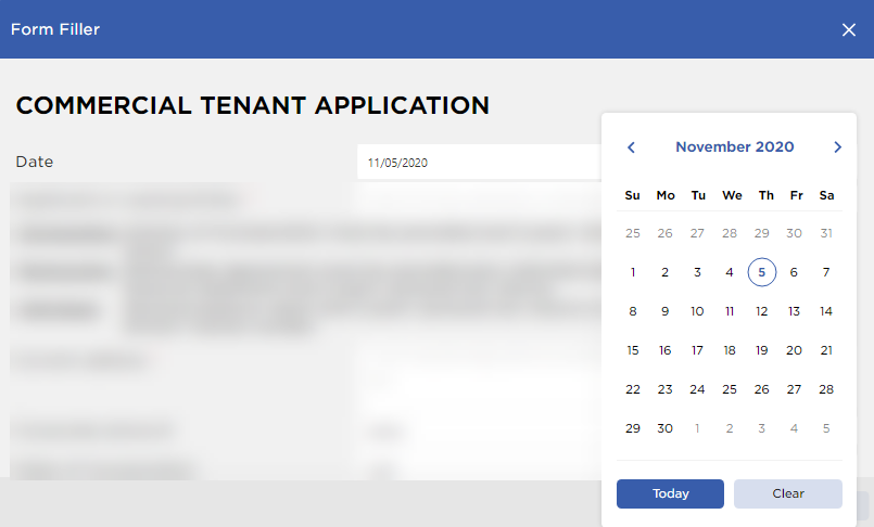
}The sample PDF form used in this example is a tenant application form which seeks the details of a tenant for house rental purposes. You can also download the form here.
Customize UI Appearance and Input Type Behavior
The Date input type in PDF form is customized as:
The input type's display label is set to 'Date' using displayname property and tooltip to 'Application date' using title property
The type of input type is set to date to display the date picker UI for Application Date
The automatic focus is set on the date input type when the Form Filler dialog is opened by using the autofocus property
The default value is set to today's date by using the defaultvalue property
options.formFiller = {
        mappings: {
            'AppDate': {
                  displayname: 'Date'
                  title: 'Application date',
                  type: 'date'
                  autofocus: true,
                  defaultvalue: new Date().toJSON().slice(0, 10)
            }
        }
    };
The placeholder text is set for 'Application or Leasing Entity' field by using the placeholder property.
'Entity': {
          title: 'Name of individual, partnership, or corporation',
          displayname: 'Applicant or Leasing Entity',
          placeholder: 'Name of individual, partnership, or corporation',
 }
The static placeholder is defined with custom HTML content that describes the rules for filling the 'Entity' field.
'CustomContent_Info1': {
                type: 'custom-content',
                content: `<table>
                            <tr><td style='vertical-align:top;'>
                                <i><u>Corporation:</u></i>
                            </td><td style='vertical-align:top;'>
                                <i>Articles of Incorporation must be provided and 2 years' Annual Report and corporate tax return.</i>
                            </td></tr>
                            <tr><td style='vertical-align:top;'>
                                <i><u>Partnership:</u></i>
                            </td><td style='vertical-align:top;'>
                                <i>Partnership Agreement must be provided plus individual partners' current personal financial statement and 2  years' personal tax returns.</i>
                            </td></tr>
                            <tr><td style='vertical-align:top;'>
                                <i><u>Individual:</u></i>
                            </td><td style='vertical-align:top;'>
                                <i>Personal balance sheet and 2 years' personal tax returns must be provided. Must include Drivers' license number.</i>
                            </td></tr>
                        </table>`
            },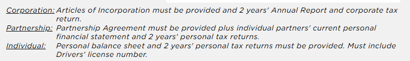
The Address input type is changed to multiline text area by using the multiline property. The hidden property is used to hide the second field from the fields list.
'Addr1': {
                title: 'Current corporate headquarters/home address (For partnership/individuals) (Do not use P.O. Box)',
                displayname: 'Current address',
                placeholder: 'Current corporate headquarters/home address (For partnership/individuals) (Do not use P.O. Box)',
                multiline: true,
                required: true,
                validationmessage: 'Address is required',
                validateoninput: true
            },
            'Addr2': {
                hidden: true,
     }
A full-width field is displayed without a label by using the nolabel property.
'CustomContent4': {
                type: 'custom-content',
                content: '<h4>Please list all hazardous substances that will be on the premises and the approximate amounts</h4>
            },
            HazSub1: {
                title: 'Please list all hazardous substances that will be on the premises and the approximate amounts',
                placeholder: 'List all hazardous substances that will be on the premises and the approximate amount (line 1)',
                nolabel: true
            },
            HazSub2: {
                title: 'Please list all hazardous substances that will be on the premises and the approximate amounts',
                placeholder: 'List all hazardous substances that will be on the premises and the approximate amount (line 2)',
                nolabel: true
            },
            HazSub3: {
                title: 'Please list all hazardous substances that will be on the premises and the approximate amounts',
                placeholder: 'List all hazardous substances that will be on the premises and the approximate amount (line 3)',
                nolabel: true
     }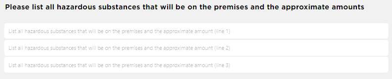
Add Validation Properties for Form Input Types
A required input type validation is added to 'Entity' field by using the required property.
'Entity': {
                title: 'Name of individual, partnership, or corporation',
                displayname: 'Applicant or Leasing Entity',
                placeholder: 'Name of individual, partnership, or corporation',
                required: true
            }
On clicking the Apply button, all fields are validated. You can use validationmessage property to set a validation message and validateoninput property if you want the input type value to be validated immediately during user input. If the validation fails, a failed validation indicator and a validation message is displayed.
'CorpPhone': {
                title: 'Corporate phone number',
                displayname: 'Corporate phone #',
                placeholder: 'Corporate phone',
                type: 'tel',
                pattern: '^[\+]?[(]?[0-9]{3}[)]?[-\s\.]?[0-9]{3}[-\s\.]?[0-9]{4,6}$',
                validationmessage: 'Valid formats: 1234567890, (123)456-7890,\n 123-456-7890, 123.456.7890, +31636363634, 075-63546725',
                validateoninput: true
            },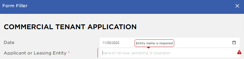
A pattern can be set to validate 'Corporate phone number' input type using regular expression by using the pattern property.
'CorpPhone': {
                title: 'Corporate phone number',
                displayname: 'Corporate phone #',
                placeholder: 'Corporate phone',
                type: 'tel',
                pattern: '^[\+]?[(]?[0-9]{3}[)]?[-\s\.]?[0-9]{3}[-\s\.]?[0-9]{4,6}$',
                validationmessage: 'Valid formats: 1234567890, (123)456-7890,\n 123-456-7890, 123.456.7890, +31636363634, 075-63546725',
                validateoninput: true
            },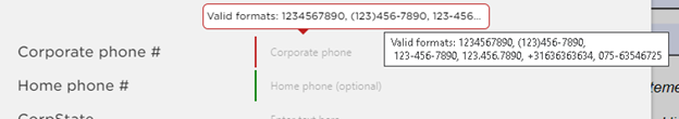
The minimum and maximum number of characters can be validated by defining a validation using the minlength and maxlength properties.
'BankAcct': {
                title: 'Bank account number',
                displayname: 'Account number',
                placeholder: 'Account number',
                minlength: 8,
                maxlength: 12,
                validationmessage: 'Expected value between 8 and 12 digits',
                validateoninput: true
     }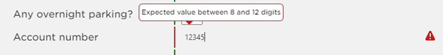
A custom validation using javascript code can be provided by using validator property. The below example allows only 'Delaware' state as the input for 'State of incorporation' input type.
'CorpState': {
                title: 'State where the company was registered',
                displayname: 'State of incorporation',
                placeholder: 'State of incorporation',
                validateoninput: true,
                validator: function(fieldValue, field) {
                    if(!fieldValue || !fieldValue.trim())
                        return 'This field cannot be empty';
                    if(fieldValue.toLowerCase().indexOf('delaware') === -1)
                        return 'Only Delaware state allowed.';
                    return true;
                }
            },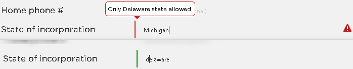
A common validator function is called for each input type in the list.
var viewer = new DsPdfViewer(selector, {
    renderInteractiveForms: true,
    formFiller: {
      validator: function(fieldValue, field) {
          return (fieldValue? true : 'The field cannot be empty');
      },
     mappings: {
            'fld1': {
                title: 'Application date',
                displayname: 'Date',
            },
            'fld2': {
                title: 'Name of individual, partnership, or corporation',
                displayname: 'Applicant or Leasing Entity'
            }
      }
    }
   });
Form Event Handlers
Form filler feature provides various event handlers:
onInitialize - It is called after the list of custom form input types is loaded and initialized but not yet rendered.
beforeApplyChanges - It is called when the Apply button is clicked after the successful validation of all custom form input types.
beforeFieldChange - This event is called right before the input type's value is changed.
Custom Form Input Types
Apart from the form fields supported by standard PDF specification, DsPdfViewer supports custom form input types. These are inherited from the textbox field and are listed below:
date
time
tel
number
email
password
text
url
week
month
range
A PDF form with custom input form fields can be created by using DsExcel Templates or by using GcProps property in DsPdf. The form can then be filled in DsPdfViewer or Form Filler dialog with added validations and other properties.
'Date' Custom Form Input Type
The Date input type provides datepicker interface to choose dates easily. However, there might be issues with 'date' type input because of its limited browser support. Refer this link for more information.
The following table describes the properties which can be applied to a 'date' input type.
Property | Value | Description |
|---|---|---|
type | "date" | Specifies the type of text box. |
autofocus | "true" or "false" | Indicates whether an input type should automatically get focus when the Form filler dialog is activated or when the page loads. |
autocomplete | "bday" "bday-day" "bday-month" "bday-year" | Uses the autocomplete attribute on the date input component when asking for date of birth. Refer this link for details. |
defaultvalue | "2018-01-01" | Default value. |
disabled | "true" or "false" | Indicates whether an input type is disabled, or not. |
readonly | "true" or "false" | Indicates whether the input type is read-only, or not. |
required | "true" or "false" | Indicates whether the form filling is required or not. |
title | "Tooltip" "First line\nSecond line" | Uses the title property to specify text that most browsers display as a tooltip. |
validateoninput | "true" or "false" | True indicates whether validation should be performed immediately during user input, otherwise input validation will be performed on blur event. |
validateonmessage | "The date cannot be empty." | Represents a localized message that describes the validation constraints that the control does not satisfy (if any). |
The 'date' input type and its properties can also be added to a PDF form by using the following example code in DsPdf.
// Create a new PDF document
var doc = new GcPdfDocument();
var page = doc.NewPage();
var g = page.Graphics; TextFormat tf = new TextFormat();
tf.Font = StandardFonts.Times;
tf.FontSize = 14;
var field = new TextField();
field.Widget.Page = page;
field.Widget.Rect = new RectangleF(40, 40, 72 * 3, 24);
field.Widget.DefaultAppearance.Font = tf.Font;
field.Widget.DefaultAppearance.FontSize = tf.FontSize;
field.Name = "dateField1";
field.GcProps[new PdfName("type")] = new PdfString("date");
field.GcProps[new PdfName("required")] = new PdfBoolObject((PdfBool)true);
field.GcProps[new PdfName("validationmessage")] = new PdfString("The date cannot be empty.");
doc.AcroForm.Fields.Add(field);
'Time' Custom Form Input Type
Time input type provides time picker interface to choose time easily. Refer this link for details on browser support and additional attributes.
The following table describes the properties which can be applied to a 'time' input type.
Property | Value | Description |
|---|---|---|
type | time | Specifies the type of text box. |
autofocus | true | Indicates whether an input type should automatically get focus when the Form filler dialog is activated or when the page loads. |
defaultvalue | 18:00 | Default value. |
disabled | "true" or "false" | Indicates whether an input type is disabled, or not. |
readonly | "true" or "false" | Indicates whether an input type is read-only, or not. |
required | "true" or "false" | Indicates whether the form filling is required or not. |
title | "Tooltip" "First line\nSecond line" | Uses the title property to specify text that most browsers will display as a tooltip. |
validateoninput | "true" or "false" | True indicates whether validation should be performed immediately during user input, otherwise input validation will be performed on blur event. |
validateonmessage | "The time cannot be empty." | Represents a localized message that describes the validation constraints that the control does not satisfy (if any). |
The 'time' input type and its properties can also be added to a PDF form by using the following example code in DsPdf.
// Create a new PDF document
var doc = new GcPdfDocument();
var page = doc.NewPage();
var g = page.Graphics; TextFormat tf = new TextFormat();
tf.Font = StandardFonts.Times;
tf.FontSize = 14;
var field = new TextField();
field.Widget.Page = page;
field.Widget.Rect = new RectangleF(40, 40, 72 * 3, 24);
field.Widget.DefaultAppearance.Font = tf.Font;
field.Widget.DefaultAppearance.FontSize = tf.FontSize;
field.Name = "timeField1";
field.GcProps[new PdfName("type")] = new PdfString("time");
field.GcProps[new PdfName("required")] = new PdfBoolObject((PdfBool)true);
field.GcProps[new PdfName("validateoninput")] = new PdfBoolObject((PdfBool)true);
field.GcProps[new PdfName("validationmessage")] = new PdfString("Please, enter time.");
doc.AcroForm.Fields.Add(field);
'Telephone' Custom Form Input Type
Telephone input type can be used to enter and edit a telephone number. Refer this link for details on browser support and additional attributes.
The following table describes the properties which can be applied to a 'tel' input type.
Property | Value | Description |
|---|---|---|
type | "tel" | Specifies the type of text box. |
autofocus | "true" | Indicates whether a input type should automatically get focus when the Form filler dialog is activated or when the page loads. |
autocomplete | "on" "off" "tel" "tel-country-code" "tel-national" "tel-area-code" "tel-local" "tel-local-prefix" "tel-local-suffix" "tel-extension" | A typical implementation of autocomplete simply recalls previous values entered in the same input field. |
defaultvalue | "123-456-7890" | Default value. |
pattern | "^[\+]?[(]?[0-9]{3}[)]?[-\s\.]?[0-9]{3}[-\s\.]?[0-9]{4,6}$" "^[0-9]{3}$" | A regular expression the entered value must match to pass constraint validation. |
placeholder | "Input phone" | Text to display inside the input type when it has no value. |
disabled | "true" or "false" | Indicates whether an input type is disabled, or not. |
readonly | "true" or "false" | Indicates whether an input type is read-only, or not. |
required | "true" or "false" | Indicates whether the form filling is required or not. |
title | "Tooltip" "First line\nSecond line" | Uses the title property to specify text that most browsers will display as a tooltip. |
minlength | 1 | Minimum number of characters which can be considered valid. |
maxlength | 10 | Maximum number of characters to be accepted. |
validateoninput | "true" or "false" | True indicates whether validation should be performed immediately during user input, otherwise input validation will be performed on blur event. |
validateonmessage | "The phone cannot be empty." | Represents a localized message that describes the validation constraints that the control does not satisfy (if any). |
The 'tel' input type and its properties can also be added to a PDF form by using the following example code in DsPdf.
// Create a new PDF document
var doc = new GcPdfDocument();
var page = doc.NewPage();
var g = page.Graphics; TextFormat tf = new TextFormat();
tf.Font = StandardFonts.Times;
tf.FontSize = 14;
var field = new TextField();
field.Widget.Page = page;
field.Widget.Rect = new RectangleF(40, 40, 72 * 3, 24);
field.Widget.DefaultAppearance.Font = tf.Font;
field.Widget.DefaultAppearance.FontSize = tf.FontSize;
field.Name = "telField1";
field.GcProps[new PdfName("type")] = new PdfString("tel");
field.GcProps[new PdfName("title")] = new PdfString("Text area code");
field.GcProps[new PdfName("placeholder")] = new PdfString("###");
field.GcProps[new PdfName("pattern")] = new PdfString(@"^[0-9]{3}$");
field.GcProps[new PdfName("validateoninput")] = new PdfBoolObject((PdfBool)true);
field.GcProps[new PdfName("validationmessage")] = new PdfString(@"Valid format: 3 digits");
doc.AcroForm.Fields.Add(field);
'Number' Custom Form Input Type
Number input type can be used to enter a number. Refer this link for details on browser support and additional attributes.
The following table describes the properties which can be applied to a 'number' input type.
Property | Value | Description |
|---|---|---|
type | “number" | Specifies the type of text box. |
autofocus | "true" | Indicates whether an input type should automatically get focus when the Form filler dialog is activated or when the page loads. |
defaultvalue | "123" | Default value. |
placeholder | "Input number" | Text to display inside the input type when it has no value. |
disabled | "true" or "false" | Indicates whether an input type is disabled, or not. |
readonly | "true" or "false" | Indicates whether the input type is read-only, or not. |
required | "true" or "false" | Indicates whether the form filling is required, or not. |
title | "Tooltip" "First line\nSecond line" | Uses the title property to specify text that most browsers will display as a tooltip. |
min | 1 | Minimum value to accept for this input. |
max | 10 | Maximum value to accept for this input. |
validateoninput | "true" or "false" | True indicates whether validation should be performed immediately during user input, otherwise input validation will be performed on blur event. |
validateonmessage | "The number is incorrect." | Represents a localized message that describes the validation constraints that the control does not satisfy (if any). |
The 'number' input type and its properties can also be added to a PDF form by using the following example code in DsPdf.
// Create a new PDF document
var doc = new GcPdfDocument();
var page = doc.NewPage();
var g = page.Graphics; TextFormat tf = new TextFormat();
tf.Font = StandardFonts.Times;
tf.FontSize = 14; var field = new TextField();
field.Widget.Page = page;
field.Widget.Rect = new RectangleF(40, 40, 72 * 3, 24);
field.Widget.DefaultAppearance.Font = tf.Font;
field.Widget.DefaultAppearance.FontSize = tf.FontSize;
field.Name = "numberField1";
field.GcProps[new PdfName("type")] = new PdfString("number");
field.GcProps[new PdfName("title")] = new PdfString("Enter number between 1 and 100");
field.GcProps[new PdfName("placeholder")] = new PdfString("[1-100]");
field.GcProps[new PdfName("required")] = new PdfBoolObject((PdfBool)true);
field.GcProps[new PdfName("min")] = new PdfNumber(1);
field.GcProps[new PdfName("max")] = new PdfNumber(100);
field.GcProps[new PdfName("validateoninput")] = new PdfBoolObject((PdfBool)true);
field.GcProps[new PdfName("validationmessage")] = new PdfString("The number is incorrect.");
doc.AcroForm.Fields.Add(field);
'Email' Custom Form Input Type
Email input type can be used to enter an e-mail address. Refer ths link for details on browser support and additional attributes.
The following table describes the properties which can be applied to an 'email' input type.
Property | Value | Description |
|---|---|---|
type | "email" | Specifies the type of the text box. |
autofocus | "true" | Indicates whether an input type should automatically get focus when the Form filler dialog is activated or when the page loads. |
autocomplete | "email" | A typical implementation of autocomplete simply recalls previous values entered in the same input field, but more complex forms of autocomplete can exist. For instance, a browser could integrate with a device's contacts list to autocomplete email addresses in an email input type. |
defaultvalue | "email@example.com" | Default value. |
pattern | ".+@globex.com" "\S+@\S+\.\S+" | A regular expression the entered value must match to pass constraint validation. |
placeholder | "Input your email" | Text to display inside the input type when it has no value. |
minlength | 1 | Minimum number of characters which can be considered valid. |
maxlength | 10 | Maximum number of characters to be accepted. |
disabled | "true" or "false" | Indicates whether an input type is disabled, or not. |
readonly | "true" or "false" | Indicates whether the input type is read-only, or not. |
required | "true" or "false" | Indicates whether the form filling is required, or not. |
title | "Tooltip" "First line\nSecond line" | Uses the title property to specify text that most browsers will display as a tooltip. |
validateoninput | "true" or "false" | True indicates whether validation should be performed immediately during user input, otherwise input validation will be performed on blur event. |
validateonmessage | "The email cannot be empty. " | Represents a localized message that describes the validation constraints that the control does not satisfy (if any). |
The 'email' input type and its properties can also be added to a PDF form by using the following example code in DsPdf.
// Create a new PDF document
var doc = new GcPdfDocument();
var page = doc.NewPage();
var g = page.Graphics; TextFormat tf = new TextFormat();
tf.Font = StandardFonts.Times;
tf.FontSize = 14;
var field = new TextField();
field.Widget.Page = page;
field.Widget.Rect = new RectangleF(40, 40, 72 * 3, 24);
field.Widget.DefaultAppearance.Font = tf.Font;
field.Widget.DefaultAppearance.FontSize = tf.FontSize;
field.Name = "emailField1";
field.GcProps[new PdfName("type")] = new PdfString("email");
field.GcProps[new PdfName("title")] = new PdfString("Input your e-mail address");
field.GcProps[new PdfName("placeholder")] = new PdfString("Input your email");
field.GcProps[new PdfName("pattern")] = new PdfString(@".+@globex.com");
field.GcProps[new PdfName("validateoninput")] = new PdfBoolObject((PdfBool)true);
field.GcProps[new PdfName("validationmessage")] = new PdfString(@"The domain must be globex.com");
doc.AcroForm.Fields.Add(field);
'Password' Custom Form Input Type
Password input type provides a way to securely enter a password. Refer this link for details on browser support and additional attributes.
The following table describes the properties which can be applied to a 'password' input type.
Property | Value | Description |
|---|---|---|
type | "password" | Specifies the type of text box. |
autofocus | "true" or "false" | Indicates whether an input type should automatically get focus when the Form filler dialog is activated or when the page loads. |
autocomplete | "on" "off" "current-password" "new-password" "one-time-code" | Allows the user's password manager to automatically enter the password. |
defaultvalue | "anypassword!1" | Default value. |
inputmode | "numeric" | If your recommended (or required) password syntax rules would benefit from an alternate text entry interface than the standard keyboard, you can use the inputmode attribute to request a specific one. The most obvious use case for this is if the password is required to be numeric (such as a PIN). Mobile devices with virtual keyboards, for example, may opt to switch to a numeric keypad layout instead of a full keyboard, to make entering the password easier. |
pattern | "[a-z0-9._%+-]+@[a-z0-9.-]+\.[a-z]{2, 3}$” "^[0-9]{3,3}$" "[0-9a-fA-F]{4,8}" | Regular expression that should match the entered value to pass constraint validation. |
placeholder | "Input your password" | Text to display inside the input type when it has no value. |
minlength | 1 | Minimum number of characters which can be considered valid. |
maxlength | 10 | Maximum number of characters to be accepted. |
disabled | "true" or "false" | Indicates whether an input type is disabled, or not. |
readonly | "true" or "false" | Indicates whether an input type is read-only, or not. |
required | "true" or "false" | Indicates whether the form filling is required, or not. |
title | "Tooltip" "First line\nSecond line" | Uses the title property to specify text that most browsers will display as a tooltip. |
validateoninput | "true" or "false" | True indicates whether validation should be performed immediately during user input, otherwise input validation will be performed on blur event. |
validateonmessage | "The password cannot be empty. " "Password must be 3 digits." | Represents a localized message that describes the validation constraints that the control does not satisfy (if any). |
The 'password' input type and its properties can also be added to a PDF form by using the following example code in DsPdf.
// Create a new PDF document
var doc = new GcPdfDocument();
var page = doc.NewPage();
var g = page.Graphics; TextFormat tf = new TextFormat();
tf.Font = StandardFonts.Times;
tf.FontSize = 14;
var field = new TextField();
field.Widget.Page = page;
field.Widget.Rect = new RectangleF(40, 40, 72 * 3, 24);
field.Widget.DefaultAppearance.Font = tf.Font;
field.Widget.DefaultAppearance.FontSize = tf.FontSize;
field.Name = "pinField1";
field.GcProps[new PdfName("type")] = new PdfString("password");
field.GcProps[new PdfName("title")] = new PdfString("Input your PIN");
field.GcProps[new PdfName("placeholder")] = new PdfString("PIN");
field.GcProps[new PdfName("pattern")] = new PdfString(@"^[0-9]{3,3}$");
field.GcProps[new PdfName("maxlength")] = new PdfNumber(3);
field.GcProps[new PdfName("validateoninput")] = new PdfBoolObject((PdfBool)true);
field.GcProps[new PdfName("autocomplete")] = new PdfString("one-time-code");
field.GcProps[new PdfName("validationmessage")] = new PdfString(@"The PIN must be 3 digits.");
doc.AcroForm.Fields.Add(field);
'Text' Custom Form Input Type
Text input type can be used to create basic single-line text input type. This is the default input type. Refer this link for details on browser support and additional attributes.
The following table describes the properties which can be applied to a 'text' input type.
Property | Value | Description |
|---|---|---|
type | "text" | Specifies the type of text box. |
autofocus | "true" or "false" | Indicates whether an input type should automatically get focus when the Form filler dialog is activated or when the page loads. |
autocomplete | "off" "name" "honorific-prefix" "given-name" "additional-name" "family-name" "honorific-suffix" "nickname" "username" "organization-title" "organization" "street-address" "address-line1" "address-line2" "address-line3" "address-level4" "address-level3" "address-level2" "address-level1" "country" "country-name" "cc-name" "cc-given-name" "cc-additional-name" "cc-family-name" "cc-number" "cc-exp" "cc-exp-month" "cc-exp-year" "cc-csc" "cc-type" | Lets users specify if they need to provide assistance for automated filling of form field values, as well as guidance to the browser about what type of information is expected in the field. |
defaultvalue | "any text" | Default value. |
inputmode | "numeric" | If your recommended (or required) password syntax rules would benefit from an alternate text entry interface than the standard keyboard, you can use the inputmode attribute to request a specific one. The most obvious use case for this is if the password is required to be numeric (such as a PIN). Mobile devices with virtual keyboards, for example, may opt to switch to a numeric keypad layout instead of a full keyboard, to make entering the password easier. |
pattern | "^[0-9]{3,3}$" "[0-9a-fA-F]{4,8}" | A regular expression the entered value must match to pass constraint validation. |
placeholder | "Input here " | Text to display inside the input type when it has no value. |
multiline | "true" or "false" | Set this property to true to use the text area as a user input element. |
minlength | 1 | Minimum number of characters which can be considered valid. |
maxlength | 10 | Maximum number of characters to be accepted. |
disabled | "true" or "false" | Indicates whether an input type is disabled, or not. |
readonly | "true" or "false" | Indicates whether an input type is read-only, or not. |
required | "true" or "false" | Indicates whether form filling is required, or not. |
spellcheck | "true" or "false" | The spellcheck property is an enumerated attribute that defines whether the element may be checked for spelling errors. |
title | "Tooltip" "First line\nSecond line" | Uses the title property to specify text that most browsers will display as a tooltip. |
validateoninput | "true" or "false" | True indicates whether validation should be performed immediately during user input, otherwise input validation will be performed on blur event. |
validateonmessage | "The password cannot be empty. " "Password must be 3 digits." | Represents a localized message that describes the validation constraints that the control does not satisfy (if any). |
The 'text' input type and its properties can also be added to a PDF form by using the following example code in DsPdf.
// Create a new PDF document
var doc = new GcPdfDocument();
var page = doc.NewPage();
var g = page.Graphics; TextFormat tf = new TextFormat();
tf.Font = StandardFonts.Times;
tf.FontSize = 14;
var field = new TextField();
field.Widget.Page = page;
field.Widget.Rect = new RectangleF(40, 40, 72 * 3, 24);
field.Widget.DefaultAppearance.Font = tf.Font;
field.Widget.DefaultAppearance.FontSize = tf.FontSize;
field.Name = "textField1";
field.GcProps[new PdfName("type")] = new PdfString("text");
field.GcProps[new PdfName("title")] = new PdfString("Input text");
field.GcProps[new PdfName("placeholder")] = new PdfString("Input here");
field.GcProps[new PdfName("maxlength")] = new PdfNumber(10);
field.GcProps[new PdfName("validateoninput")] = new PdfBoolObject((PdfBool)true);
field.GcProps[new PdfName("validationmessage")] = new PdfString("The value is incorrect, maximum length is 10.");
doc.AcroForm.Fields.Add(field);
DsPdf Examples for Other Input Types
The 'month' input type and its properties can also be added to a PDF form by using the following example code in DsPdf.
// Create a new PDF document
var doc = new GcPdfDocument();
var page = doc.NewPage();
var g = page.Graphics; TextFormat tf = new TextFormat();
tf.Font = StandardFonts.Times;
tf.FontSize = 14;
var field = new TextField();
field.Widget.Page = page;
field.Widget.Rect = new RectangleF(40, 40, 72 * 3, 24);
field.Widget.DefaultAppearance.Font = tf.Font;
field.Widget.DefaultAppearance.FontSize = tf.FontSize;
field.Name = "monthField1";
field.GcProps[new PdfName("type")] = new PdfString("month");
field.GcProps[new PdfName("title")] = new PdfString("Enter month.");
field.GcProps[new PdfName("placeholder")] = new PdfString("month");
field.GcProps[new PdfName("required")] = new PdfBoolObject((PdfBool)true);
field.GcProps[new PdfName("validationmessage")] = new PdfString("The month value cannot be empty.");
doc.AcroForm.Fields.Add(field);
The 'range' input type and its properties can also be added to a PDF form by using the following example code in DsPdf.
// Create a new PDF document
var doc = new GcPdfDocument();
var page = doc.NewPage();
var g = page.Graphics; TextFormat tf = new TextFormat();
tf.Font = StandardFonts.Times;
tf.FontSize = 14;
var field = new TextField();
field.Widget.Page = page;
field.Widget.Rect = new RectangleF(40, 40, 72 * 3, 24);
field.Widget.DefaultAppearance.Font = tf.Font;
field.Widget.DefaultAppearance.FontSize = tf.FontSize;
field.Name = "rangeField1";
field.GcProps[new PdfName("type")] = new PdfString("range");
field.GcProps[new PdfName("title")] = new PdfString(" Please select a number between 1 and 1000.");
field.GcProps[new PdfName("min")] = new PdfNumber(1);
field.GcProps[new PdfName("max")] = new PdfNumber(1000);
doc.AcroForm.Fields.Add(field);
Properties Supported by Form Input Types
The following table provides consolidated information about properties supported by different input types.
Attribute | Input Type | Description |
|---|---|---|
autocomplete | All | Input type. |
autofocus | All | Automatically focus the form control when the page is loaded. |
defaultvalue | All | The default value. |
disabled | All | Whether the form control is disabled. |
displayname | All | Text label for the input control. Applicable only if the input type appears in the Form Filler dialog box. |
min | number and date | Minimum value to accept for the input. |
max | number and date | Maximum value to accept for the input. |
maxlength | password, search, tel, text and url | Maximum length (number of characters) of value. |
minlength | password, search, tel, text and url | Minimum length (number of characters) of value |
multiline | text | Set this property to true if you want to use the textarea as a user input element. |
multiple | Boolean. Whether to allow multiple values or not. | |
pattern | password, text and tel | Pattern value must match to be valid. |
placeholder | password, search, tel, text and url | Text that appears in the form control when it has no value set. |
readonly | All | Boolean. The value is not editable. |
required | All | Boolean. A value is required or must be check for the form to be submittable. |
spellcheck | search and text | Whether the element may be checked for spelling errors. |
type | All | Type of form control. |
validateonmessage | All | Localized validation message. |
validateoninput | All | Indicates whether validation should be performed immediately during user input. |
To know more about how to create a PDF form by using custom input form types in DsPdf, refer Fill Custom Form Input Types.