


- Document Solutions for Excel Java Overview
- Key Features
- Getting Started
-
Features
- Worksheet
- Workbook
- Comments
- Hyperlinks
- Sort
- Filter
- Group
- Conditional Formatting
- Data Validations
- Data Binding
- Import Data
- Digital Signatures
- Formulas
- Custom Functions
- Shapes
- Document Properties
- Styles
- Form Controls
- Barcodes
- Themes and Colors
- Chart
- Table
- Pivot Table
- Pivot Chart
- Sparkline
- Slicer
- Print Settings
- Logging
- Defined Names
- AI Assistant
- Templates
- Formula Reference
- File Operations
- Tutorials
- Use JDK 8 Date Time API
- Document Solutions Data Viewer
- API Reference
- Release Notes
Column Chart
Column charts are vertical versions of bar charts and use x-axis as a category axis. Column charts are preferred where number of values is too large to be used on an x-axis, while bar charts are preferred where long category titles are difficult to fit on an x-axis. For example, population share of different countries across the globe can be represented using a column chart.
DsExcel supports the following types of column charts.
Chart Type | Chart Snapshot | Use Case |
|---|---|---|
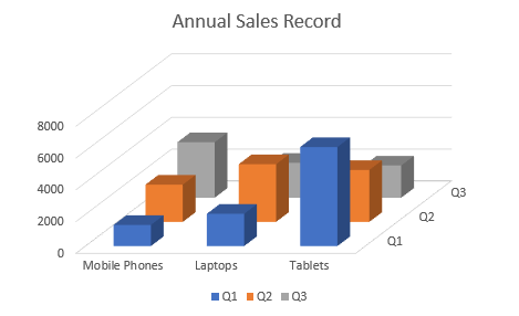
Column3D |
| Column3D chart is used to display the chart demonstration in 3Dwhich is a modification of 2DColumn chart. It does not have a third dimension, it only looks volumetric in appearance. |
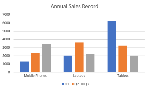
ColumnClustered |
| Column clustered chart is used to compare different values across different categories and show them in two-dimensional or three-dimensional vertical rectangles. This chart can be stacked normally in a regular way just like any other chart. |
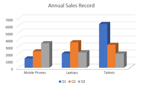
ColumnClustered3D |
| Column clustered chart to represent the ColumnClustered chart demonstration in 3D, which looks volumetric in appearance. |
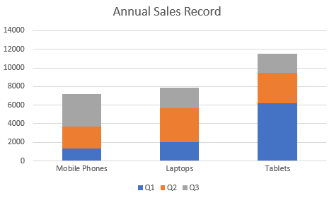
ColumnStacked |
| ColumnStacked chart is used to display the relationship of specific items to the whole across different categories and plot values in two-dimensional or three-dimensional vertical rectangles. This chart stacks the data series vertically (in a vertical direction). |
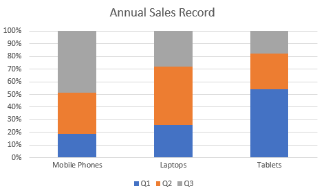
ColumnStacked100 |
| ColumnStacked100 chart is used to perform comparisons of percentages that each of the values are contributing to the total, across all your categories in the spreadsheet. This chart stacks the data series vertically and also equalizes the plotted values to meet 100%. The plotted values are displayed in two-dimensional and three-dimensional rectangles. |
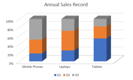
ColumnStacked1003D |
| ColumnStacked1003D is used to represent the ColumnStacked100 chart demonstration in 3D, which is a modification of 2D chart in appearance. |
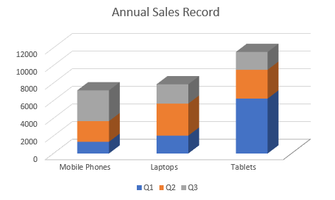
ColumnStacked3D |
| ColumnStacked3D chart is used to represent the ColumnStacked chart demonstration in 3D, which looks volumetric in appearance. |
Using Code
Refer to the following example code to add Column Stacked 3D Chart:
private static void ColumnCharts() {
    // Initialize workbook
    Workbook workbook = new Workbook();
    // Fetch default worksheet
    IWorksheet worksheet = workbook.getWorksheets().get(0);
    // Prepare data for chart
    worksheet.getRange("A1:D4")
            .setValue(new Object[][] {
                { null, "Q1", "Q2", "Q3" },
                { "Mobile Phones", 1330, 2345, 3493 },
                { "Laptops", 2032, 3632, 2197 },
                { "Tablets", 6233, 3270, 2030 } });
    worksheet.getRange("A:D").getColumns().autoFit();
    // Add Column Chart
    IShape areaChartShape = worksheet.getShapes().addChart(ChartType.Column3D, 250, 20, 360, 230);

    // Adding series to SeriesCollection
    areaChartShape.getChart().getSeriesCollection().add(worksheet.getRange("A1:D4"), RowCol.Columns, true, true);

    // Configure Chart Title
    areaChartShape.getChart().getChartTitle().getTextFrame().getTextRange().getParagraphs().add("Annual Sales Record");

    // Saving workbook to Xlsx
    workbook.save("20-ColumnChart.xlsx", SaveFileFormat.Xlsx);