
- Document Solutions for Excel, Java Edition Overview
- Key Features
- Getting Started
-
Features
- Worksheet
- Workbook
- Comments
- Hyperlinks
- Sort
- Filter
- Group
- Conditional Formatting
- Data Validations
- Data Binding
- Import Data
- Digital Signatures
- Formulas
- Custom Functions
- Shapes
- Document Properties
- Styles
- Form Controls
- Barcodes
- Themes and Colors
- Chart
- Table
- Pivot Table
- Pivot Chart
- Sparkline
- Slicer
- Print Settings
- Logging
- Defined Names
- Templates
- File Operations
- Use JDK 8 Date Time API
- Document Solutions Data Viewer
- API Reference
- Release Notes
XY (Scatter) chart
Scatter chart is used to illustrate relationships between individual items or categories. This chart is ideal for showing comparisons for scientific, statistical and engineering data. The data arranged in columns or rows of a worksheet can be plotted in a Scatter chart.
Unlike other charts, a scatter chart displays the actual values of the x and y variables in horizontal axis and vertical axis in the plot area. Typically, this chart combines the x and y values into single data points and displays them at irregular intervals. Also, this chart does not make use of the category axis because both horizontal axis (primary axis) and vertical axes (secondary axis) are value axes.
DsExcel supports the following types of Scatter charts.
Chart Type | Chart Snapshot | Use Case |
|---|---|---|
XYScatter |
| A clustered Scatter chart displays the data points based on a selected data range. This helps the users to analyze and determine the relationship between x and y variables. |
XYScatterLines |
| A scatter chart with straight lines displays a straight connecting line between data points in a particular series without showing the individual points. |
XYScatterLinesNoMarkers |
| A scatter chart with straight lines and no data markers displays a smooth curve that connects all the data points in a particular series. |
XYScatterSmooth |
| A scatter chart with smooth lines displays a connecting line between data points in a particular series without showing the individual points. |
XYScatterSmoothNoMarkers |
| A scatter chart with smooth lines and no data markers displays a smooth curve that connects all the data points in a particular series. |
Bubble |
| A bubble chart is ideal for financial data analysis. It displays the variations of a scatter chart where data points are replaced with bubbles and a third dimension is represented (Z axis) in the size of the bubbles. This chart plots z(size) values as well as x values and y values. Typically, this chart can be used when you want to plot three data series. The size of the bubbles is determined by the values in the third data series. |
Bubble3DEffect |
| Bubble3DEffect chart can be used to display the chart demonstration in 3D,which is a modification of 2DBubble chart. It does not have a third dimension, it only looks volumetric in appearance. |
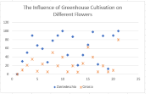 XYScatter chart
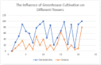 XYScatterLines chart
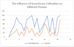 XYScatterLinesNoMarkers chart
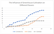 XYScatterSmooth chart
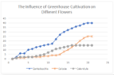 XYScatterSmoothNoMarkers chart
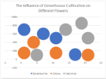 Bubble chart
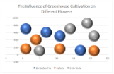 Bubble3DEffect chart
Using Code
Refer to the following code to add a XY Scatter chart:
private static void ScatterCharts() {
    // Initialize workbook
    Workbook workbook = new Workbook();
    // Fetch default worksheet
    IWorksheet worksheet = workbook.getWorksheets().get(0);

    // Prepare data for chart
    worksheet.getRange("A1:D22").setValue(new Object[][] { { "Index", "Zantedeschia", "Celosia", "Calendula" },
            { 0, 0, 0, 0 }, { 1, 2, 1, 1 }, { 2, 6, 1, 2 }, { 3, 6, 1, 2 }, { 4, 10, 2, 2 }, { 5, 11, 2, 2 },
            { 6, 13, 2, 3 }, { 7, 14, 2, 4 }, { 8, 15, 3, 5 }, { 9, 16, 3, 7 }, { 10, 17, 4, 9 }, { 11, 22, 4, 11 },
            { 12, 27, 5, 12 }, { 13, 30, 8, 13 }, { 14, 32, 10, 14 }, { 15, 34, 13, 15 }, { 16, 36, 16, 15 },
            { 17, 37, 20, 15 }, { 18, 39, 23, 15 }, { 19, 40, 25, 15 }, { 20, 40, 25, 15 } });
    worksheet.getRange("A:D").getColumns().autoFit();
    // Add XYScatter Chart
    IShape xyScatterChartshape = worksheet.getShapes().addChart(ChartType.XYScatterLines, 250, 20, 360, 230);

    // Adding series to SeriesCollection
    xyScatterChartshape.getChart().getSeriesCollection().add(worksheet.getRange("B1:B22"), RowCol.Columns);
    xyScatterChartshape.getChart().getSeriesCollection().add(worksheet.getRange("C1:C22"), RowCol.Columns);
    xyScatterChartshape.getChart().getSeriesCollection().add(worksheet.getRange("D1:D22"), RowCol.Columns);

    // Configure Chart Title
    xyScatterChartshape.getChart().getChartTitle()
            .setText("The Influence of Greenhouse Cultivation on Different Flowers");

    // Configure Markers style
    ISeries series1 = xyScatterChartshape.getChart().getSeriesCollection().get(0);
    series1.setMarkerStyle(MarkerStyle.Diamond);
    series1.setMarkerSize(7);
    ISeries series2 = xyScatterChartshape.getChart().getSeriesCollection().get(1);
    series2.setMarkerStyle(MarkerStyle.Star);
    series2.setMarkerSize(7);
    ISeries series3 = xyScatterChartshape.getChart().getSeriesCollection().get(2);
    series3.setMarkerStyle(MarkerStyle.Circle);
    series3.setMarkerSize(7);

    // Saving workbook to Xlsx
    workbook.save("26-ScatterChart.xlsx", SaveFileFormat.Xlsx);